Monday, 27 November 2023

Logitech Wave Keys and Logitech Lift - No Learning Curve Here

How many different devices do you use every day?

It's one of those questions that seems fairly innocuous at first but when you start to add them all up, they really, really add up. Phones, tablets, desktops, laptops - devices at home, devices at work, devices when you're on the road...

Anything that can simplify and streamline all this would surely be welcome.

As an insight to my personal situation, I use a crazy number of different computers at work, including my own laptop and several different PCs - some of which are connected to the same keyboard and mouse - otherwise my radio studio would be full of keyboards and mice and not much else.

When I get home, I use my laptop and desktop together and I'm often reviewing a third computer of some kind - or perhaps a tablet that works with a keyboard too...

See? It adds up.

What's more, some are MacOS, some are Windows - it's no wonder I often feel confused and tired by the end of the day. Thanks to Logitech, I can now add a couple more devices but remove several others, giving my hands, wrists and fingers a break at the same time.


When it comes to computer accessories, there aren't too many names more trusted than Logitech. We're talking years of quality, well designed, innovative products that many people have come to rely on - both at work and at home (and now that's often the same place, obviously).

Logitech has established a reputation for ergonomic design too. For those of us (and these days it's most of us) who spend hours at a time tapping at a keyboard and manoeuvring a mouse, the growing demand for a more natural fit is hardly surprising and it's no wonder we've seen the development of more non-traditional input devices; split keyboards, trackballs and vertical mice are now commonplace in most businesses.

While these ergonomic form-factors are clearly a good idea, they can also seem a bit daunting and alien. The standard shape for a keyboard and mouse has been around for a very long time. Old habits die hard and learning a whole new way to type or control your cursor is a bridge too far for some.

That's why the team at the Logi Ergo Lab has come up with the Wave Keys ergonomic keyboard and the Lift vertical mouse.

Starting with Wave Keys, it looked like a fantastic idea to me as soon as I took it out of the box. Before I even used it, I could tell the combination of the contoured (wavy) keyboard and the cushioned palm rest would guarantee a significantly more comfortable typing experience.

I was also surprised to discover the Wave Keys wasn't that big - yes, because of the attached palm rest, it's longer top-to-bottom than other standard keyboards but it's actually not as wide as the one I've just been using. This is because the keys are in fact closer together and smaller than those on a "traditional" keyboard - even the number pad is more compact.

That doesn't mean you feel at all cramped when using the Wave Keys though - quite the opposite. It's a hard thing to explain, but because the keys are all curved towards where your fingers naturally land, Logitech has been able to reduce the upper surface of each key while keeping the space between them generously wide. This not only means more comfortable typing but it's faster too, because your fingers don't have to stretch as far for keys like B, Z and P - and other keys that aren't directly adjacent to the home keys we've all become used to over years and decades.

Best of all, unlike a split keyboard configuration, there's no issue learning how to use this one. In fact, the only thing that slowed me down initially was I couldn't quite believe how easily I had adjusted to this new device and I kept second-guessing myself, even though my typing had actually improved, not gotten worse.

My experience with the Lift vertical mouse was similarly instinctive - if not more so. The Lift is essentially a standard mouse propped up on its side at a 57° angle. At the Logi Ergo Lab, they call this the "natural handshake position" - who would have guessed? Try it right now, even if you don't have a mouse handy - just rest your hand and forearm naturally on the table or desk in front of you. See how your hand sits on its side? To use a "normal" mouse, you literally have to twist your arm over more and even raise your elbow up and out to get your hand in the correct position.

This is what ergonomics is all about, of course; bringing the device to your body rather than the other way around. Just as with the Wave Keys, using the Lift felt completely normal, right from the start. The two main buttons and scroll wheel weren't anywhere different - just on an angle. The only real change was a big improvement - the forward and back keys have been moved around to the opposite side, just above the thumb rest, making them far more accessible and easier to use. On a standard design, this would have placed them underneath the mouse itself, no use there at all.

Both Ergo mouse and keyboard can be paired with up to three devices, swapping instantly between them with the push of a button. This means you can literally use the same mouse and keyboard for three different computers. They each include a Logi Bolt USB receiver as an alternative to connecting via bluetooth and this can be stored neatly away in the battery compartments.

What's more, if you sign into the Logi Options+ app on each computer you're using, you won't even need to manually select which device you're controlling - there's a Flow option for the Lift mouse that lets you push the cursor from device to device. Logi Options+ also gives you the capability to customise buttons on both keyboard and mouse. You can even set different keys to do different things in different apps - although I find that can get a bit confusing when you're swapping around.

Perhaps the most exciting feature of Logi Options+ is Smart Actions - these are essentially programmable macros you can fire off with any key or button you designate. Do you have seven different apps you always have to open individually at the beginning of every work day? You can create a Smart Action that will do all that at the touch of a button.

Like every Logitech device I've come across in the past, both the Wave Keys and Lift seem very well made, durable and the Lift in particular has a nice, soft-touch, grippy surface to it.

The only thing that raised an eyebrow for me is how they're powered; with a battery. Or in the case of the Wave Keys, two batteries. I kind of thought single-life batteries were on the way out. Most wireless devices I use these days charge via USB-C - including other Logitech accessories I use regularly. Thanks to environmentally friendly packaging and the use of recycled materials, the Ergo range is carbon neutral - and yet these two run on batteries that will eventually die and be thrown out. A puzzling juxtaposition.

There is a payoff though - up to two years' use on a single battery for the Lift and a crazy three years for the Wave Keys. I can't argue - that's definitely more convenient than having to recharge each device every week or two.

In many ways, these two devices are two of the most straightforward I've reviewed all year and yet I've already written more than 1300 words about them. I love them. When design gets this good, what's not to love? Sure, using the app adds a host of other tricky little features but the fact Logitech has managed to take something as fundamental as the keyboard and mouse and tweak it like this is... well, it's art really.


Click here for more information and pricing on the Logitech Wave Keys.


Click here for more information and pricing on the Logitech Lift.

Wednesday, 22 November 2023

Microsoft Surface Laptop Studio 2 - Fast, Flexible and Hot, Hot, Hot

The beast is back.

Microsoft seems to have mastered the art of turning Windows laptops into tablets and back again, with a range of Surface devices to suit most budgets and work requirements.

But when it comes to one laptop to rule them all, if you have the funds, there's really only one option.


The Surface Laptop Studio 2 doesn't look a whole lot different from its predecessor. It's still big, still heavy and still one of the most useful and powerful laptops I've ever come across.

If you're not familiar with this unique form factor, not only can you use it as a laptop, you can pull the screen forward, over the keyboard and magnetise it in place to play video or for gaming, using an external controller. Or thirdly, you can fold the screen down virtually flat, concealing both keyboard and touchpad entirely to use the device as a tablet. An incredibly grunty tablet.

And yes, there have been some upgrades.

For the last few years I've been rather critical of most laptops for their lack of ports - it's really limiting to only have one or two USB-C slots, especially if you're using one of those for charging purposes. So I was quite pleased to see the Laptop Studio 2 had added a microSD card reader and a USB-A 3.1 port. This seems to be a recent trend - bringing back USB-A. A big reason for this is probably due to most wireless mice relying on a USB-A dongle (if not Bluetooth). Despite the Laptop Studio 2's fabulous haptic touchpad, a physical mouse is still likely to be the first accessory most people add to the mix, so it's great not to have to rely on yet another adapter or external hub to plug one in.

It's not all good news though.

By far the biggest downfall of the Laptop Studio 2's design is how it handles heat. It really doesn't. While its unusual inset, elevated base features large vents for cooling down either side, they simply aren't enough. Once the device is put under any amount of stress - when playing comedy first-person-shooter "High On Life" for example - the fans kick in like you wouldn't believe and even they can't prevent the whole laptop from heating up. And I don't just mean warm. This is without doubt the hottest I've ever felt a computer get. Weirdly, it seems to keep functioning perfectly - brilliantly, even. But it literally gets too hot to leave on your lap.

What's really frustrating about this is the fan noise and overheating were issues with the original Laptop Studio - if anything, they're now even worse.

Another major - and lingering- issue is battery life, or lack thereof. Most of the other laptops I've reviewed this year have impressed me with good battery performance and many have actually blown me away. In previous reviews, I've already suggested that 2023 was really the year Windows laptops could finally claim all-day battery life - thanks to a combination of improved battery tech but more significantly, more efficient CPU and GPU performance.

Sadly, this trend has not carried through to the Surface Laptop Studio 2. While it's tricky to be precise when it comes to measuring battery life in real-world usage, my feeling is there hasn't been much improvement from the original model... which was bad. Given the gale force breeze the fans are blowing out a lot of the time and the incredible amount of heat being generated, this isn't surprising, just disappointing.

At least the Laptop Studio 2 charges quickly - as long as you use the supplied 127W brick which still attaches via that weird, magnetic, Microsoft-only Surface Connect cable. Alternatively, you can charge via one of the USB-C USB4 Thunderbolt 4 ports - although charging this way is significantly slower. In fact, while gaming, I was using a GaN charger capable of up to 140W, yet the laptop drained the battery faster than the USB-C charger could top it up and it still went flat. Quite quickly.

But... just as with the original Laptop Studio, I don't really care. That's because this is a computing device that cuts through any task like a hot knife (or laptop) through butter. I've mentioned gaming a few times - and while that's not really what this computer is designed for, between the 13th Gen Intel Core i7 processor and the NVIDIA GeForce RTX 4060 GPU my review model was tricked out with, I couldn't find a game that didn't work fantastically well on it. The 14.4-inch PixelSense Flow Display is super bright and colourful and I didn't seem to have the reflection issues on this model that I encountered with the first generation.

The Dolby Atmos Quad Omnisonic speakers do a fabulous job of throwing 3D audio around and the whole audio/visual package makes for a superb entertainment experience - gaming, streaming... whatever.

But if you're forking out almost NZ$6,000.00 for a machine like this (it starts at NZ$3,752.00, but my review device was equipped with maximum RAM, storage and GPU) you need to know it's going to do the job - whatever business you're in. No problem there; this has got to be a creative's dream device - a responsive, accurate touch-screen you can fold down to use as a tablet - or add the Surface Slim Pen 2 for more artistic control. It will run whatever audio and video editing tools you need without a stutter and when it comes to multi-tasking, the tall 3:2 aspect ratio means plenty of screen space for plenty of windows.

Speaking of Windows, Microsoft has introduced some major A.I.-powered innovations software-wise this year and obviously this is a perfect device to make the most of that well-publicised Copilot integration into tools like Outlook, Edge and other Office 365 apps.

Even the camera has been upgraded with some useful tweaks for those crucial online meetings or live streams. Automatic Framing puts you front and centre, Eye Contact keeps you looking directly into the lens - even when you aren't and Background Effects provides some professional blur to whatever might be distracting viewers who are looking behind you.

The first Laptop Studio was an unstoppable juggernaut - a sturdy, polished piece of transformable tech design, capable of adjusting itself to fit any work environment and meet any computing demands. By adding extra ports, more processing power and a GPU upgrade, the new generation is an even bigger triumph. Let's just hope next time Microsoft figures out a way to cool things down and run the battery a little longer.


Click here for more information and pricing on the Microsoft Surface Laptop Studio 2.

Monday, 20 November 2023

Hisense 75U7KNZ - Welcome to the Country!

It's always exciting when a brand I've been reading about for a while finally makes its way to New Zealand. Ironically, given you're reading this right now, it really isn't until you try something yourself that you can really judge how good it is, no matter how many trusted reviews you read.

In saying that, I wouldn't have been so keen to try my first Hisense TV if I hadn't been so impressed by everything I'd read about them.

Suddenly here was an electronics brand I'd barely heard of more than a year or so ago, seemingly producing very classy TVs, using some of the latest display technology available and selling them at a highly competitive price.

Too good to be true? I had to find out.


Before we even get into the details of how good the Hisense 75U7KNZ is, I really have to start with the price; as I write this article, heading into the Black Friday sales, I've seen this TV on sale for as little as NZ$2791.00 - which seems insanely low for a 75-inch 4K TV of any quality, let alone one I quickly discovered, punches well above its weight.

As I removed the 75U7KNZ from its box (always a fun challenge with a giant telly like this) I quickly discovered this was a solidly constructed TV - still slim but in no way flimsy. I felt no anxiety about tipping it over on its back to install the two feet included in the box, as per the instructions - there was no flex or worrying creaking as I laid it down and lifted it back up, onto my entertainment unit. Each foot has a cable-tidying bracket attached to keep things organised once you've plugged everything in.

Speaking of which... I found it a little strange to find two different I/O consoles at the left side of the rear panel - one facing more conveniently to the outer edge of the TV with the 4 x HDMI ports, USB-A socket, antennae connections and AV in/out sockets.

Meanwhile on a separate, less accessible console right around the back, you'll find the options to connect an ethernet LAN cable, an optical line-out and another USB-A port (perhaps for powering an external dongle).

This second set of ports was virtually impossible to reach once I had the TV set up and I really wished I'd plugged in the LAN cable before I started testing - but I wanted to try out the Wi-Fi capabilities first. (Turns out, I could have opted for a Wi-Fi connection with the ethernet cable plugged in anyway. Oh well.)

Setup was extremely easy - I opted to do so by downloading and using the VIDAA app on my phone, although you can do it all with the remote control instead. The app just makes things a bit more efficient when it comes to typing email addresses and passwords.

I was fascinated to try VIDAA U7 - the operating system Hisense uses in this region - as I'd never come across it before. It certainly has both strengths and weaknesses; as I just pointed out, getting the TV up and running was a surprisingly fast process and adding accessories like a soundbar and 3rd-party streaming devices was effortless.

However, I've never come across a TV with so much pre-installed bloatware before, none of which can be uninstalled. On one hand, it was pleasing to see apps like Plex, Disney+, YouTube, Netflix and Prime Video already waiting to go - complete with their own shortcut buttons on the remote control. On the other hand, I was confronted with app after app after app I would never have installed voluntarily - most of which I'd never even heard of - many featuring endless libraries of foreign language content I have no interest in consuming.

When it came to local content, it was also a good news / bad news story. Freeview, Neon and Sky Sport Now were pre-installed but on-demand apps TVNZ+ and ThreeNow were nowhere to be found - even on VIDAA's somewhat limited app store. Not to worry - I've been assured by Hisense's people those missing NZ apps are on the way and should be available early 2024.

In the meantime, it's easy enough to cast or AirPlay from your phone or tablet.

So at the end of the day, the VIDAA home screen is a bit of a mess - you can customise the order in which the apps appear but that's about it. You can't even remove the apps you don't want from the home screen and there are endless rows of viewing recommendations that are pretty much meaningless if you're not using the apps they're trying to direct you to.

So that was all a bit disappointing.

But, from that point on the story gets a lot better.

One thing I really love about VIDAA U7 is how easy it is to get to the settings menu you want. The remote is quite oversized but that's because there are heaps of shortcut buttons and a full number pad. Other than the app shortcuts I've already mentioned perhaps the most useful is the settings button, which will bring up an abbreviated menu on the left-hand side of the screen while you keep watching whatever you're watching.

This means making adjustments to sound and picture can happen both quickly and unobtrusively - much more so than with most other TVs I've used in the past.

You can set the 75U7KNZ to automatically detect what content is playing and adjust picture and sound accordingly, or you can make those tweaks yourself. The auto setting was pretty damn clever, even picking up Filmmaker mode which looks pretty great on a display of this size.

Who am I kidding? Everything looks pretty great on this screen. Personally, I like to use the Dynamic option which enhances brightness, colour and contrast - all of which the 75U7KNZ provides in spades. If you're looking for a ULED Mini-LED display for daytime viewing in a sunny room, this is easily one of the best I've come across.

Technically, this is achieved by grouping the thousands and thousands of Mini-LEDs into hundreds of dimming zones, but who cares about any of that? The result is a crisp, ultra-clear picture that really pops in almost any lighting conditions.

Plug in a PC or gaming console and the 144Hz Game Mode PRO will kick in to provide an even smoother, low-latency experience. This TV is a lot of fun.

The Dolby Atmos sound solution stacks nicely, with good left, right and height separation and decent bass response for built-in TV speakers. Don't get me wrong, I still ended up connecting my own soundbar, woofer and surround speakers but the default sound system still made for a perfectly watchable, home-theatre experience.

I was surprised to encounter a few ghosting effects when watching action sequences and sports - but swapping from Dynamic to Sports Mode took care of this straight away and as we've established, that's only a couple of button presses away.

The only thing to dampen my energetic enthusiasm for this new, Hisense viewing experience was a bit of buffering - especially when using Plex, which is how I view locally stored content on my home server.

At first, I thought this might be a Wi-Fi problem - the 75U7KNZ is not Wi-Fi 6 enabled so is more vulnerable to interference and overcrowding on a home network. Unfortunately, when I eventually managed to get that damn ethernet cable connected around the back, it made no difference. I then realised this issue was probably due to the larger size of the video files I was trying to play from my local server - sadly, the quad-core Hi-View Engine processor seems to struggle here - and with some higher-definition streaming content as well.

Luckily, I have one or two 3rd-party streaming devices I can plug in to play this stuff and the result still looks absolutely fantastic on that big, bright and beautiful 75U7KNZ screen.

The more I use this TV, the more I love it. I can't believe this level of colour, contrast and brightness - let alone the sheer size of the screen - can be purchased right now for well under NZ$3000. If this is a taste of what Hisense has to offer, I can't wait to see what's next.


Click here for more information on the Hisense 75U7KNZ.

Wednesday, 15 November 2023

One NZ OneNumber - Take Your Watch, Leave Your Phone

By now there can be no doubt the smartwatch has well and truly come of age.

These days you don't have to be some kind of tech geek to wear one - in fact, not only are smartwatches now a routine way to keep up to date with your notifications, calls and messages but they're also considered a genuine fashion accessory, with an ever increasing choice of styles, colours and bands.

And yet, even if you have joined the wrist-wearable club, it's possible - even probable - that you're not making the most of this wonder of modern technology.

Sure, you're probably tracking your exercise and you have it paired with your phone to get all your notifications vibrating subtly on your wrist - perhaps you're even taking advantage of some of the more specific features like controlling the media on playing on your handset or using your smartwatch as a remote for your phone's camera.

But have you considered ditching your phone altogether?

With the right phone and smartwatch combination, One NZ's OneNumber addon plan allows you to do just that.


For years we've seen movie characters like Dick Tracy and James Bond talking into their wrists, using their watches for all manner of crazy antics - from cutting open locks with lasers to literally shooting bad guys.

Smartwatches have come a long way and although perhaps they're still not capable of dispatching super-villains, there's not much else they can't do. The latest devices from both Apple and Samsung are particularly well-endowed with added extras. For example, you can download your favourite Spotify playlists, right onto your watch, listening to them through earbuds you've paired directly to it. Turn-by-turn navigation is another handy one - it's pretty useful getting a vibration on your wrist every time you need to turn a corner, especially if you're walking around a strange city.

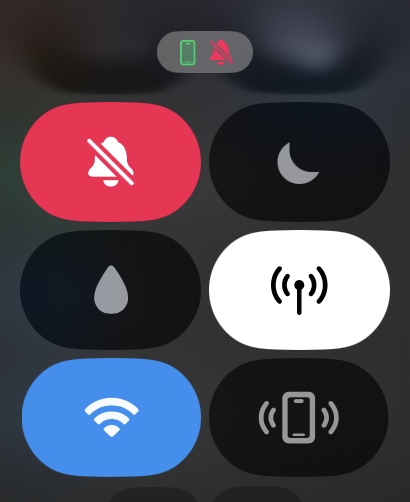
The good news is, thanks to the OneNumber addon, you no longer need to have your phone with you for all those things to keep working. As long as you're on an eligible Pay Monthly plan, for just $5 a month you can connect your Apple Watch or Galaxy Watch directly to the One NZ network, just like your phone, using the same number.

Now I need to point out here; not all smartwatches are created equal and not all have the LTE capabilities required. However, if you already own a Samsung Galaxy Watch5 LTE or newer, or an Apple Watch (GPS + Cellular) going all the way back to the Series 4, you're probably in luck.

Just a warning though... I hope you don't have the issues setting it all up that I did.

The first crucial step is porting your number from a physical SIM card to an eSIM. The best way to do this is to take your SIM into a One NZ store and they'll sort you out on the spot. Being an entitled tech reviewer, I tried to circumvent this first crucial step and that might be why things went so wrong for me.

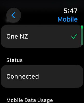
Activating the eSIM on my iPhone 15 Pro was no issue - I was sent the details and verification instructions from my One NZ contact and that all seemed to work as planned.

However, it's then supposed to be an equally easy process to add your watch to that eSIM once you've signed up for the One Number addon...


This persistently failed to work as promised so I asked One NZ's online chatbot, Hana, for help.

She/He/They were no help at all and couldn't seem to understand what I was talking about. Hana then offered to put me in touch with a "real" person who could.

They couldn't. I was encouraged to ring the One NZ helpline instead. This meant another round of account verifications and explaining my issue all over again, only to end up talking to someone (I'm guessing in the Philippines? Definitely not in New Zealand, anyway) who had no real technical skills and seemed to be part of the billing operation instead. Eventually, after enduring the inevitable and frustrating cultural divide one only experiences when forced to deal with foreign call centres, someone did actually manage to get the eSIM activated on both my phone and my Apple Watch Ultra 2.

Or so I thought.

Yes, I could now make and take calls independently of my phone. And yes I was also receiving all my usual notifications etc.

It wasn't until a few days later I realised I'd missed a few calls and suspiciously, none of the callers had left voice messages. On closer inspection, I then discovered this was because my voicemail wasn't working anymore. Not for me. Not for people calling me.

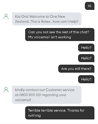
I asked Hana again. She was no help. Again. Reluctantly, I commenced an online chat with a supposed real person named Rotes. This was the result...


So yes, it was off to the Philippines (or wherever) again. Geraldine seemed keen to help. She assured me she'd sort everything out, even though it was a technical problem and she wasn't part of the technical team. So why was I put through to her? Who knows? The important thing is, Geraldine was going to find someone to fix it and she'd get back to me shortly.

She didn't.

The next day I tried again and finally, my latest overseas call centre contact was able to get my voicemail up and running.

Now none of this has anything to do with what a great product One Number is (once it's working). For only $5 extra each month, your watch essentially becomes a phone on your wrist. The only thing it can't do is take pictures, although give it time, I'm sure that feature is moments away.

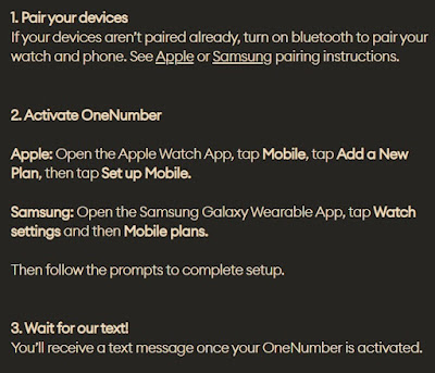
The freedom of being out and about, phone-free is an exhilarating sensation I can't recommend enough. It's possible my teething problems were because my devices were not purchased directly from One NZ. As their website warns...


It's also possible I was just too much of an early adopter. Perhaps by now, word of the One Number plan has filtered through to the crack squad in the Philippines(?) and they've now upskilled to be more helpful. Perhaps I'm just a crusty old racist and the call centre isn't in the Philippines at all - although at one point I did ask if I could talk to someone back in New Zealand and was told, "No. That isn't possible."

Ironic this company changed its name to One NZ. Oh well. I really do love using my watch as a phone and I'm sure if I'd just got off my bum and gone into an actual store everything would have been set up properly in the first place. Don't let my harrowing call centre tale put you off what is otherwise a fantastic (and very reasonably priced) service.


Click here for more information and pricing on One NZ OneNumber.

Tuesday, 14 November 2023

Huawei FreeBuds 5i - Don't Dismiss These Buds

I know what you're thinking...

"Why the hell would I bother reading yet another review about earbuds?"

I don't blame you. If I'm being completely honest, when Huawei first approached me to do this review, my first thought was, "Why the hell would I bother writing another review about earbuds?"

The obvious issue is the absolutely flooded market. I have unquestionably tried more models of earbuds than any other tech category - by a considerable margin. What's more, certain manufacturers - like Huawei - seem to have a "new" version every couple of months.

I've looked it up and in fact, this is completely unfair to Huawei. Technically, they don't do it bi-monthly. it just feels like they do.

Please don't ask me to explain the difference between the numbered models, the "Pro" models and the models with numbers that also have a lowercase "i" at the end. Because I don't understand how any of it works.

All I do know is I reluctantly agreed to review the latest FreeBuds. And I'm glad I did.


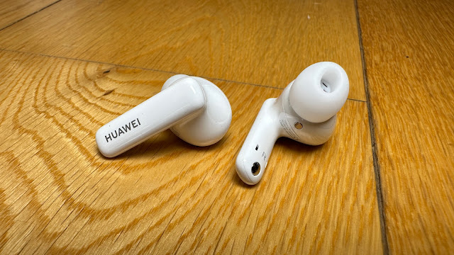
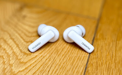
The Huawei FreeBuds 5i are an increasingly familiar form factor; I call it a hybrid fit - although they have the snug, sealed (available in three sizes of gel tips) bits you secure in your earholes, they also feature the external stems more usually associated with an "open" fit. I assume this design choice enhances mic performance and from what I've experienced, also adds extra stability to the fit.

This ties in nicely with the FreeBuds 5i's IP54 splash resistance rating. The secure fit and sweat resistance make them a great choice for exercise. If you're training out on the streets though, you might want to be careful with how much you crank up the ANC (Active Noise Cancellation). It's very effective - as it has been on most of the recent Huawei buds I've tested. Using the Huawei AI Life app, you can set the level of ANC to suit your environment - but where's the fun in that? I like it wound right up all the time and although it's easy enough to cycle through Off, Awareness and Noise-Cancelling modes with a long press on either bud, I love the isolation tuning the whole world out brings.

Huawei's AI Noise Cancellation is put to good work on the microphones too. Definitely no complaints about voice clarity from any of my callers so far.

The customisable touch controls on the FreeBuds 5i are the feature that pleases me the most. Other than the ANC, you can set double taps to answer and play/pause and use responsive swipes up and down for volume - or use the controls to skip, go back or wake your voice assistant. Often tap and swipe controls like these can be a bit finicky on earbuds - but not on these earbuds. They work very reliably indeed.

The AI Life app also offers a fit test to ensure you've selected the right ear tips, there's a basic EQ setting that lets you boost bass or treble and you can select the "Low Latency" toggle for better audio sync when gaming or watching video. This works in perfectly with the FreeBuds 5i's multi-point connectivity - you can connect two devices at once, so an incoming work call will take precedence over that all-important battle royale you're in the middle of.

As for the certified Hi-Res Audio? It's really, really good.

Fleetwood Mac's "Chains" has a whole new feeling to it. With the Freebuds 5i set to their default EQ, the acoustic guitar which is fingerpicked throughout the track has its own space, while the multi-layered vocals seem quite separate. I've never considered these classics to be so cleverly mixed, but it definitely comes through here.

Meanwhile, "Tin Man" by feeble little horse is both subtle and powerful simultaneously. The vocals are clean, clear and easily decipherable, while the dirty, distorted power chords of the guitars boom through in a gritty, effective way that keeps me listening till the end. These earbuds really do a great job of reproducing absolutely everything.

As for "A&W" by Lana Del Ray, if you haven't had a listen to this long, but rewarding sonic journey with some really good headphones or earbuds, do yourself a favour. There's a bit of bad language but wow, the aural trickery and dynamic range on this track are serious art. And the FreeBuds 5i capture it all.

It's not just music appreciation that really works; lately, I've been watching (and thoroughly enjoying) the new Prime Video series, "The Power." Without getting too far into the plot, what I can tell you is the audio mixing and soundtrack are absolutely first-class. I know this because I've been listening on the FreeBuds 5i and. yet again, I've been impressed by how they pick up every detail - left, right and all around. Usually watching video using earbuds is a necessity - something you do to avoid disturbing others around you. I've found with these FreeBuds it actually enhances the experience.

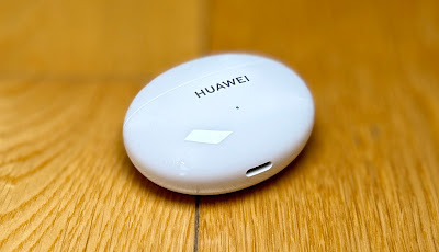
It's quite stunning to get this kind of sound quality for just NZ$179.00 - not to mention all the customisation options I mentioned earlier. The only thing preventing me from recommending these earbuds in the same league as the very best available is the lack of wireless charging - you can only charge the case via its USB-C connection. These days I consider earbuds to be up there with smartwatches when it comes to being the ideal gadget to charge wirelessly. With anything this small, it's a bit of a pain to have to fiddle about plugging in a charging cable - well for me anyway. If you don't charge any other devices wirelessly this probably won't be an issue for you.

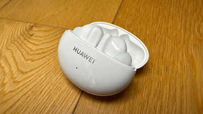
And the case certainly is small - its streamlined, pebble-like shape makes it wonderfully pocketable. Battery life isn't bad either; around 6 hours with ANC on with another 18 or so in the fully charged case.

As I've made clear, I've tried a lot of earbuds over the last few years and unless you're a determined wireless-charging addict like me, I honestly think you'd be hard-pressed to find a better value option than these. They're light. They're comfortable. They fit snugly. They have reliable controls and ultimately, they sound fabulous.


Click here for more information and pricing on the Huawei FreeBuds 5i.

Monday, 13 November 2023

Oppo Pad 2 - Consider the Alternative

I've said it before; I'm not really a tablet guy.

However, these days, every time I say it, the words sound more and more hollow in my ears. This is because tablets have got really good. 

I don't necessarily mean Windows tablets - which are now basically just Windows laptops waiting for a keyboard to be connected to them so you can use them like one.

And I don't necessarily mean iPads, which have always been sort of their own category, mysteriously running a similar-yet-not-quite-the-same operating system to Apple's "real" computers, even though the Pro models are often more powerful than most people's "real" laptops and desktops.

I guess when I think of tablets, and I say I'm not a tablet guy, I really mean Android tablets.

Until quite recently these have often been the poor cousins to flagship smartphones - often woefully underpowered (both in terms of battery life and CPU) and usually lacking in screen quality and storage space. Essentially the main purpose for an Android tablet has often been so you can run certain apps on a larger display... perhaps to operate a specific device in a workplace, provide Nana with a user-friendly way to browse the web and check her emails, or keep the kids happy at the cafe with some simple games and videos.

Typically, Android tablets were cheap and if not nasty, certainly frustrating for power users when it came to multi-tasking or other more demanding use cases.

Giant phones with underpowered chips. That's been my experience over the years.

But now I am wrong.


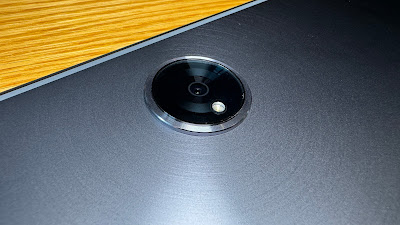
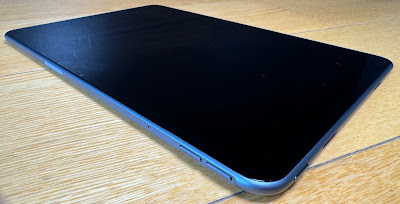
The Oppo Pad 2 is quite striking to look at. I don't mean watching the display - we'll get to that shortly. I mean the thing actually looks quite unique. It's very thin yet its unibody design gives it an extremely durable feel and the "star trail" engraving finish on the rear panel creates a distinctive, shimmery, light-catching effect while keeping the matte surface relatively free of fingerprints and smudges.

The rear camera module is also unusual - a raised, circular affair reminiscent of the cameras on Oppo's most recent handsets; the Reno 10 series and the foldable everyone's talking about, the Find N3. The Pad 2's camera is unusual because of its capabilities too. Still hamstrung by the unwritten rule that you can't have a high-spec camera on a tablet (I don't know why - you'll only ever get ultra-wide and proper telephoto lenses on a phone) the primary shooter on the Pad 2 is a mere 13MP affair, although it's capable of shooting up to 4K, offers zoom controls, even while filming and there are effective digital stabilisation and auto-focus options too. As far as tablet cameras go, it goes good.

It's also interesting to note where Oppo has decided to put that camera; in the centre of the upper side of the device when it's being used in landscape mode. At long last, more manufacturers have got the memo these devices are not giant handsets - most people will be using them in landscape, like a computer display, not in portrait like a phone.

But let's flip over and get back to that display. At 11.61-inches you might think the Pad 2 sounds a little oversized but the 7:5 aspect ratio is also pretty unique. Even when being held in landscape, you still get plenty of height. So the diagonal measurement is a little misleading here; this uber-slim tablet is actually much easier to handle than other shorter-but-wider devices. The extra height (when in landscape) really lends itself to multi-tasking with two apps open at once - something that's easy with the two-finger swipe gesture in the ColorOS software. Anyone who's used a recent Oppo handset will be familiar with this operating system and its intuitive gestures already. A three-finger swipe results in a shareable screenshot while a four-fingered pinch launches the app you're using into a floating window, which you can resize and position over other windows. So effectively, by both splitting and floating you can see three different windows simultaneously.

Not only is there plenty of screen real estate for all this but the display is bright, sharp and colourful to boot. We're talking ultra-high resolution at a refresh rate of up to 144Hz. This makes for a very smooth gaming experience and is combined with an impressively tuned, quad-speaker sound system to produce a classy Dolby Vision and Dolby Atmos entertainment experience. The Pad 2 is the perfect device to take to bed for some late-night binge-watching - and the display is big enough for two people to enjoy what's playing.

There's an excellent front-facing camera built into the upper bezel of the screen - again, in the most sensible position for online meetings or vlogging. As with the primary shooter on the back, you get quite a selection of photo features - even skin smoothing and other AI abilities. Unlocking the device with facial recognition is also snappy and reliable.

None of this is much use without a decent chip powering the whole show and that's where many tablets have fallen down in the past; promising a long list of features but coming up well short in terms of sheer performance.

Not with the Oppo Pad 2.

Here you get MediaTek's latest, the Dimensitiy 9000 and as such, I found every aspect of operation to be smooth, reliable and quick. There's only one storage option but it's more than acceptable for a tablet at 256GB. Connectivity is great; Wi-Fi 6 means a fast, powerful and dependable link to your home or office network and the latest Bluetooth 5.3 protocol is your gateway to a list of lag-free and lossless wireless codecs. In short, I've watched movies and played games wearing my favourite TWS earbuds and experienced no discernable delay with either dialogue or sound effects.

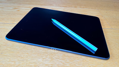
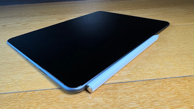
This is a very satisfying, easy-to-use and powerful device - and that's before you add useful accessories like the Smart Touch Keyboard or Oppo Pencil. The latter being a digital stylus that charges wirelessly when connected magnetically to the top of the Pad 2.

Battery life is excellent - although most of us expect that from a tablet if nothing else - that's kind of the point of them. However, because this is an Oppo device, you get the option of SuperVOOC fast charging - and very few companies have mastered the art of fast charging quite like Oppo has.

If you're thinking the Pad 2 might just be the tablet that converts me from a sceptic into a fan, you might just be right. It's light yet sturdy. The display is an unusual yet useful shape. The screen looks good, the speakers sound good and there's plenty of power under the hood to make everything work the way it should. This is no longer just an underpowered, oversized phone. It's a genuinely useful multimedia tool that I've thoroughly enjoyed using.


Click here for more information and pricing on the Oppo Pad 2.

Tuesday, 7 November 2023

Glenn Hart's 2023 Gadget Gift Guide

Regardless of whether you've been naughty or nice, if you're looking to shout yourself or someone close to you a cool device this Christmas, once again I've compiled a list of my best gear of the year.

The weird thing about the 2023 list is I had to put three (technically four) phones on it - just because it was too hard to choose. What's more, some stuff on here is already out of date, with replacement models already announced. Not to worry; the ones I've reviewed are still stellar and because they're on their way out, you might even pick them up at a discount.


 1. JBL Authentics 500


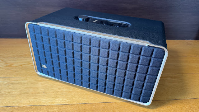
Come on. How cool is the JBL Authentics 500? Just look at it. It's as though JBL was commissioned to create the illustration for the picture dictionary definition of "Retro."

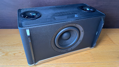
When it comes to sheer power, you'd be hard-pushed to find another smart speaker that crams so much into one enclosure; there are three aluminium tweeters, three mid-range woofers and a big, juicy, downward-firing sub that'll definitely get the floorboards rumbling if you really crank up all 270 watts.

And you can definitely fill a room with this speaker alone. The Authentics 500 is Dolby Atmos-rated for high-res ("lossless") streaming services like Tidal or Qobuz. What's rather unique about the Authentics 500 is it'll connect to virtually anything, via any connection. Want to play audio straight from your phone via Bluetooth 5.3? Too easy. Airplay from your Apple device? Yup, got that covered. Or maybe you're more of a Google/Android kind of person? No problem - you can Chromecast too.

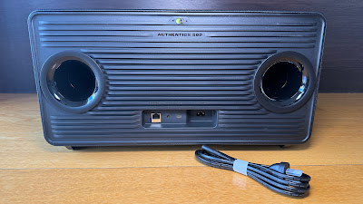
But that's only the beginning of how connected the Authentics 500 can be - not just bluetooth and Wi-Fi - there's even an ethernet port at the back so you can hardwire into your home network. This ensures a more reliable link to your preferred streaming services - especially for the high data transfer rates required for more lossless formats. 

You can use both Alexa and Google Assistant to control the speaker and ironically, I've found the built-in mics on the Authentics 500 to be even more sensitive and responsive than most of the Alexa or Google branded speakers I've tried. Even when the volume is up fairly loud, I can generally get the speaker's attention with just my voice.

But all of this is a waste of technology and design if it doesn't sound good, right?

No worries there. The Authentics 500 sounds every bit as great as it looks. Warm. Rich. Deep. Roomy. Intimate. Powerful. Think of an adjective, I'll add it to the list.

By perfectly blending a combination of the latest connectivity technology, the most iconic retro aesthetics from JBL's long history and truly great audio design, this is easily my favourite device of the year. Perhaps ever.


Click here for more information and pricing on the JBL Authentics 500.


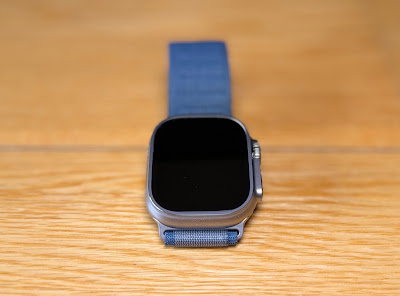
2. Apple Watch Ultra 2


I didn't have the opportunity to test the first Apple Watch Ultra last year, so it was with eager anticipation I unboxed the 2023 version, Apple Watch Ultra 2.

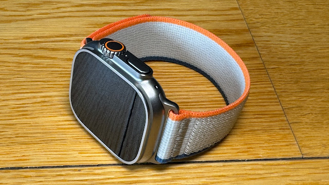
The Watch Ultra 2 is also titanium, in its natural, silvery-grey colour with a brushed finish that seems very tough and scratch-resistant - as is the sapphire crystal display. This is one of the few smartwatches I've tested I haven't managed to damage in any way within the first few days of wearing it.

It isn't just swim-proof, like the other Series 9 Apple Watches, it's rated water resistant to 100m, can be used for scuba diving down to 40m and has been militarily tested against shock, vibration, freezing and extreme heat. The Watch Ultra 2 carries an IPX6 dust resistance rating (which I haven't even heard of before) and can withstand altitudes of up to 9,000 metres and down to 500 metres BELOW sea level. In short, this watch is many times tougher than I am.
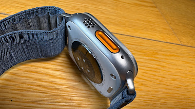
Just like the iPhone 15 Pro and Pro Max, the Watch Ultra 2 has an Action Button - except this one is big and orange. It can be programmed for any of a growing list of functions and shortcuts, or perhaps just to launch your favourite app. In some cases, the Action Button has multiple uses. For example, it can fire off your favourite workout with a single press. You can then mark each new segment of your workout with another press. This is great news for multisport athletes who now no longer have to try and control their watch with wet or sweaty fingers on a small touch screen.

This is a genuine marvel of modern technology and it all fits comfortably on your wrist - well, hopefully. Sadly, the Apple Watch Ultra 2 still only comes in one size, so if you're not into a chunkier bit of wrist-wear, you might be out of luck here. For everyone else, there's a lot to like. A whole lot. And you don't have to be a free diver or a mountaineer to get your money's worth; who doesn't want a tougher watch with better battery life and an extra button?


Click here for more information and pricing on the Apple Watch Ultra 2.


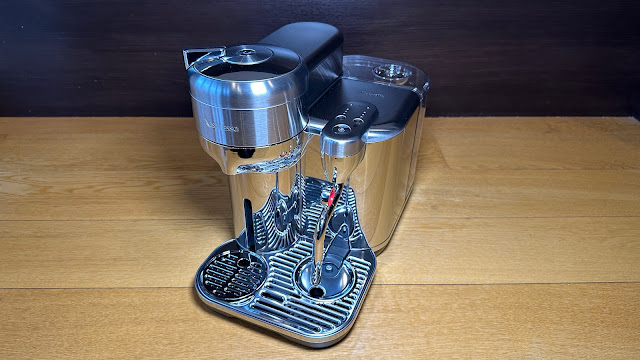
3. Nespresso Vertuo Creatista


The Vertuo Creatista takes capsule-coffee to genuine cafe-level heights, as the machine sports its own steam wand - not an automatic frothing tank the likes of which I've used in the past. A
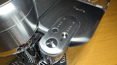
s I soon discovered, this is no ordinary steam wand, it's actually automatic after all - fantastic news as I can only be trusted to steam my own milk correctly about once in every three attempts. Conversely, the Vertuo Creatista gets it right every time and that's what I want more than anything; consistency.

What's more, not only are there three different settings for texture but there are also three settings for heat; yes, this is the first home espresso machine I've used that automatically produces hot - actually hot - frothy milk. That's worth the purchase price on its own.

This machine is so smart, it reads the barcode on the underside of every pod and customises the extraction accordingly. Again, just like with the milk, take my judgement out of the equation and I'm far more likely to get a consistent brew every time.

It's been a while since I seriously tried the capsule coffee thing. I'd given up on it as all too often the results were weak and watery - usually requiring at least two capsules to achieve a robust, long cup of full-flavoured coffee. Admittedly, the system has always been fast and efficient but I always ended up reverting to beans for a more authentic taste.

After the bowl I chugged down this morning I've realised I'm now officially a capsule convert. A pod-person. And this time I don't see any reason to go back.


Click here for more information and pricing on the Nespresso Vertuo Creatista.


4. Samsung QN900C


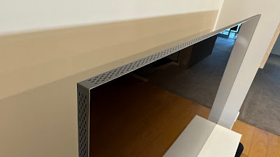
The Neo QLED 8K QN900C is the culmination of years and years of Samsung's determination to produce the best display possible. Many of its features are refinements of relatively new technologies while some are more of a heritage thing - the One Connect box for example. 

This is key to the QN900C's ability to be one of the slimmest TVs I've ever set up. the One Connect box moves all the ports, processing and power supply away from the panel and puts them in a separate unit - connected to the display by a single cable. Although these days, if you prefer, you can still attach the One Connect box to the back of the TV, out of sight, clipped to the stand included in the box. There's even a special clip-on cover to keep any cables as concealed as possible.

Yes, other than the picture itself, perhaps the most striking thing about a Samsung Neo QLED is the "Infinity One Design." Not only is the stand-alone panel a mere 15.2mm thick but the screen is virtually borderless.

Some people seem determined to choose OLED over QLED (or Neo QLED) and it's great Samsung now offers the choice. However, I've seen both TVs in the same room and there's something about the 8K QN900C that gives it a significant edge as far as I'm concerned. Since the advent of Samsung's first 8K QLEDs, some years back, I've found the depth of image to be quite mesmerising. I've often described this effect as being the closest thing to 3D you can get - that feeling you can almost reach into the screen and become part of the action, Tron-style. This sensation, this sense of depth has only intensified over the years, becoming even more tangible once Samsung moved from QLED to Neo QLED, due to the dramatic increase in resolution.

All in all, this is a sublime home entertainment experience.

Added extras like Philips Hue integration and Xbox Cloud Gaming make this such a total package you may never leave the house again.


Click here for more information and pricing on the Samsung Neo QLED 8K QN900C.


5. Technics EAH-AZ80


The EAH-AZ80 earbuds represent the next evolution for Technics.

Technics has made several crucial upgrades that result in a genuinely transcendent audio product - starting with the fit.

Compared with the AZ60M2's - and indeed many other designs - the AZ80's seem somewhat oversized and unwieldy when you first take them out of the case. Ironically, this is all by design, of course - Technics calls the new shape a "Natural Concha Fit." They've certainly done their research - a simple twist sets each bud firmly, yet comfortably in its respective ear canal. There are simply more points of contact so you don't have the unbalanced feel you get with some other buds and because what little weight there is is more evenly dispersed, after a while you can barely feel them at all.

Active Noise Cancelling really is first-rate - and amazingly tweakable using the Audio Connect app. Here you can not only adjust how much noise you cut out but customise the level of ambient sound you let in and how much noise is eliminated when you're on a call to someone else.

But it's Technics' legendary true-to-life sound reproduction we're really here for, right? And that's where the biggest improvements come to the fore.

Each AZ80 bud contains the all-new, 10mm aluminium alloy diaphragm and a surprisingly large acoustic control chamber which together claim to deliver genuine Technics hi-fi sound. I support that claim.

There is no distortion here. No muddy, overlapping of different elements. Just the pure mix as expert studio engineers could only hope to be reproduced on an audio device as good as this. Congratulations, Technics; the AZ80 takes the crown for my new favourite buds.


Click here for more information on the Technics EAH-AZ80.


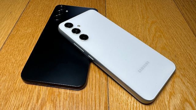
6. Samsung Galaxy A34 and Samsung Galaxy A54


For the sake of comparison, I've been trialling both the Samsung Galaxy A34 5G and the A54 5G - A
 big selling point with both phones is storage; both ship with 128GB of internal space, not to mention the option of adding a microSD (assuming you're not utilising the second available sim tray instead). The 2023 A-Series phones also feature "RAM Plus" - this actually draws on available internal storage to enhance the installed physical RAM (8GB in the A54 and 6GB in the A34).

The result is both these phones work much more smoothly and reliably than similar models of just a few years ago. Most of us have experienced the compromised performance of a "cheap" phone with not enough storage or power. That's simply not the case anymore - not with these two, anyway.

In fact, (although I said I wasn't going to be surprised anymore) I've been surprised how much using both these phones feels just like using a more "high-end" Samsung device. One big part of this is the FHD+ Super AMOLED displays - in true Samsung style colours are vibrant and bright, and the 120Hz refresh rate makes for an extremely responsive screen, although the extra processing power and slight bump in RAM on the A54 gives it a noticeable advantage over the A34 in this regard. Meanwhile the A34's display is technically a bit bigger; 6.6-inches compared with 6.4 - this is because the aspect ratio is slightly wider.

The major difference between these two handsets is camera performance. The camera setups on both phones are very good, it's just that the hardware on the A54 is significantly "gooder". Both phones sport a triple-lens, macro/main/ultra-wide rear camera configuration but the A54 sensors are higher specced and do a better job, particularly in low light.

There seems to be a bit of oneupmanship going on between phone makers when it comes to software updates these days and I'm not complaining, Samsung is promising four years of OS upgrades and five years of security updates so these phones are certainly built to last, inside and out.

And genuinely great value. At NZ$649.00 for the A34 and NZ$799.00 for the A54, unless you're determined to have the absolute best camera on the market, or a flashy folding phone, I don't know why you'd pay more. I'd be inclined to splurge the extra $150 for the superior photo performance of the A54 but neither of these handsets will disappoint. Unless you're addicted to wireless charging. But that might just be me.


Click here for more information and pricing on the Samsung Galaxy A34 5G.

Click here for more information and pricing on the Samsung Galaxy A54 5G.


7. Kenwood MultiPro Go


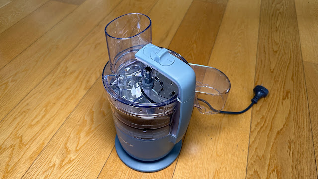
The Kenwood MultiPro Go has given all the unnecessary attachments the chop and sliced away a lot of the bulk of conventional food processors. Oh, don't worry, Kenwood still has other options with all the options but the MultiPro Go is definitely more my style.

Even when it's out on the bench, the MultiPro Go takes up only the minimum amount of space. 20% smaller than Kenwood's next smallest food processor, its 360° design means you can use it right in the corner if you have to.

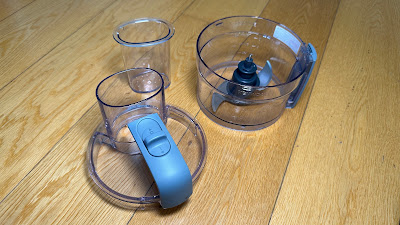
It comes with just two blade attachments - a standard double knife blade for chopping, pureeing and even kneading dough and a reversible slicing/grating blade. I can assure you these blades are extremely sharp. The reason I can assure you of this is that I cut my finger on one just getting it out of the box. This is why I can't be trusted with actual knives and need to rely on machines to do my chopping for me.

There's no doubt I'm saving a significant amount of time and fuss (and possibly fingertips) by using the MultiPro Go as my primary chopper. We tend to buy cherry tomatoes as they're more available all year round but if you've ever tried to slice one, you'll know they're pretty fiddly. The whizzing blade of the MultiPro Go takes care of this in about a second - resulting in the thinnest tomato slices I've ever seen. Nobody likes chopping onions either - and now I don't have to.

Best of all, there's only one control. Slide one way for On. Slide the other way to Pulse. You don't need to be licensed to drive this one. That works for me.

The price also definitely works for me. NZ$129.99 to get all my food prep done in seconds? Bargain.


Click here for more information and pricing on the Kenwood MultiPro Go.


8. Apple MacBook Pro (M2 Pro)


Now I'm just going to come right on out and say it; the MacBook Pro is not the world's most sexy-looking laptop. (Cue gasps of horror from Apple acolytes across the globe) It just isn't. It's only available in Space Grey or Silver - so none of the fun colours we often see with iPads or iMacs. It's not a particularly cool shape - the rounded corners are very Apple-esque but it's actually quite thick and boxy by modern laptop standards. While the lid and screen are super slim, the main body of the MacBook Pro is not and unlike the MacBook Air, it doesn't taper away to a narrow edge when closed.

Oh, and it's pretty heavy. I'm used to reviewing laptops that claim to be the lightest thing going. MacBook Pro does not make that claim. It's 1.6kgs - but you know what?...

I don't care. I don't care about any of that stuff because that stuff is fluff. The main thing you need to know is this is the best laptop I've ever used.

The MacBook Pro with M2 Pro silicon is an excellent solution for pretty much anything you care to throw at it. I've enjoyed working on it so much I keep trying to find new reasons to use it. I'm thoroughly looking forward to upcoming accessory reviews because I can connect them to this laptop and rest assured I'll be editing all my videos on the MacBook Pro from now on. Just like the one below.

This configuration is certainly pricey; the 14-inch, 1GB M2 Pro model I'm using right now is NZ$4,599. In saying that, from what I've experienced so far it's definitely a "you get what you pay for" situation. Yes, that's a lot of money but man-oh-man, this is a heck of a lot of computer. And now the M3 version has been released and I can only imagine what a rocket ship that is.


Click here for more information and pricing on the Apple MacBook Pro (M2 Pro).


9. Satechi GaN Chargers


What is GaN? Have you heard of it yet? Do you even know what it's replacing?

Everything has its limits and more recently we've begun to reach silicon's limits; Moore's law is no longer accurate and the advance of silicon-based technology has started to slow.

This led scientists to look for something else - something better, more efficient. Gallium Nitride was already being used for lighting, lasers and even TV displays. It turned out GaN was also able to conduct electrons up to 1000 times more efficiently than silicon. This meant dramatically more speed and power with a lot less heat.

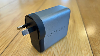
The upshot of all this as far as you're concerned is Satechi can now offer a multi-purpose wall charger, capable of delivering up to 100W to any USB-C-connected device - from phones to laptops. The key advantages here are size and safety; it's not much bigger than any conventional power brick and is definitely smaller than any laptop power supply. It also runs much cooler; this is the peace-of-mind many of us are seeking after hearing so many stories of overheated chargers damaging batteries and even causing fires.

Satechi also offers the 165W USB-C 4-Port PD GaN Charger. Only slightly bigger than its single-port stablemate, the 4-Port version ups the available wattage so you can literally charge a laptop, a tablet, a phone and your watch simultaneously. That means you now need just one wall socket instead of four and because it comes with a conventional, figure-eight external power cord, the wall socket you do use won't be crowded out with a massive brick, preventing you from plugging other things in next to it or placing furniture in front of it.

The efficiency and performance of these chargers are faultless and I'm sure it won't be long before all wall chargers are GaN-based like these. The maths is simple; do you want four bricks in the wall or just one? (Note, Satechi also has a six-port Gan charger now too)


Click here for more information on the Satechi 100W USB-C PD Wall Charger.


Click here for more information on the Satechi 165W USB-C 4-Port PD GaN Charger.


10. OPPO Find N2 Flip


When OPPO embraced the more pocketable "clamshell" form factor, it became apparent it was getting pretty serious about foldables. So serious in fact, this year OPPO is marketing the Find N2 Flip as its New Zealand flagship - if you were hoping for a local release of the Find X6 and Fnd X6 Pro this year, you're out of luck. This makes the Find N2 Flip Oppo's only premium offering for 2023, so it had better deliver. No pressure.

The Flexion hinge allows the Ultra Thin Glass (UTG) screen to unfold with what OPPO describes as "an almost invisible crease." In reality, this is somewhat of an overstatement; depending on the light you can just make out the crease and you can just feel it - but only just. I never notice it at all when using the phone on a day-to-day basis. It's certainly the most crease-free experience I've enjoyed on any foldable device I've tried so far.

OPPO's unique Flexion hinge also means the phone folds together without any gap. This may sound like a small thing but one thing that's really peeved me with other foldable phones I've kept in my pocket is when I get them out and open them, invariably the internal screen is covered in dust and other pocket lint. That simply doesn't happen with the Find N2 Flip as there's no gap for such detritus to penetrate.

Another major win for the OPPO device is its external screen; a 60Hz display that measures in at 3.26-inches - big enough to be genuinely useful - not just a tiny notification window but an auto-rotating AMOLED display that gives you access to large, readable widgets (weather, calendar etc) and most importantly, lets you frame photos and videos at the same orientation you're shooting them in.

Interestingly (well, for me anyway) the Find N2 Flip is powered by the Dimensity 9000+ octa-core chip from MediaTek - not a Snapdragon as other recent OPPO flagships have contained. Although not quite the highest-specced phone brain available in 2023, it's not far behind and I've certainly had no complaints while using the Find N2 Flip.

Without a full-featured camera and options like wireless charging, I'm not convinced this is a genuine, high-end flagship but it has most things people want in a phone and what's more, it'll fit in any pocket or purse. Just when you thought there was only one name in foldables in town, OPPO has definitely joined the party. (Oppo has since launched the Find N3 Flip but that isn't yet available in New Zealand)


Click here for more information on the OPPO Find N2 Flip.


11. Belkin Connect Pro Thunderbolt 4 Dock


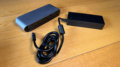
I've tried a few external hubs over the years but unless they have their own power supply, any connected accessories end up relying on the Macbook itself to power them - a problem that's only exacerbated if you want to connect an ethernet LAN line for better internet connectivity.

The Belkin Connect Pro Thunderbolt 4 solved all that instantly and all I had to do was plug it in.

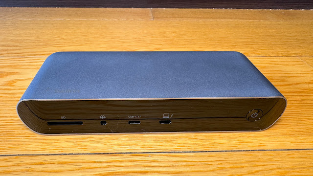
The Connect Pro Thunderbolt 4 is essentially perfect. Let's cover off exactly what you're getting here; an SD card reader, audio jack, 2x HDMI ports, 2x USB-A 2.0, 2x USB-A 3.1, 2x Thunderbolt 4(USB-C), gigabit ethernet and perhaps most importantly, a 3.1 USB-C Gen 2 port with QuickCharge. That last slot will deliver up to 90W of power to your laptop or tablet.

This is a crucial distinction between this dock and other portable hubs that don't come with their own power supply; the Connect Pro Thunderbolt 4 will literally charge your laptop while connecting it to up to 11 other gadgets. Talk about a productivity boost.

The Connect Pro Thunderbolt 4 Dock has streamlined my desk setup with a single cable - I now need fewer chargers and when I get my laptop out I only need to plug in one thing to access eleven. First-world problem solved.


Click here for more information on the Belkin Connect Pro Thunderbolt 4 Dock.


12. Apple iPhone 15 Pro


This year's Pro-model iPhones are significant upgrades if for no other reason than they address some of my personal pet peeves head-on.

Perhaps most well-publicised is the move to a USB-C charging port for the first time. While Apple's MacBooks and iPads have been using the same USB-C standard as everyone else for some time, the iPhone range has been mysteriously holding out, their old-school lightning ports stubbornly incompatible with any convenient USB-C cables lying around the place and also depriving users of the opportunity of shorter charging times and much faster data transfer speeds.


Another feature I've been missing on iPhone over the years is a proper telephoto lens. Again, this year Apple has well and truly stepped up with a 5 X zoom on the iPhone 15 Pro Max and 3 X on the Pro I'm reviewing. This seems to be a matter of simple physics; the Pro Max is just plain bigger, so it can accommodate a larger telephoto sensor. Either way, it now means an extra quick setting in the camera app; .5 for Ultra Wide shots, 1 X, 2 X and now 3 X (or presumably 5 X on the Max? Not sure). This is fantastic news and makes a massive difference for both video and stills - crisp clear shots from distance and also, a new macro setting for extreme close-ups. 

This is easily the best iPhone I've used to date. Physical upgrades like the telephoto lens and USB-C charging port combine with software tweaks like StandBy mode and interactive widgets to alleviate the few final frustrations I still harboured when switching between Android and iOS.

For once, don't believe the hype - well, not the negative hype anyway. As far as I'm concerned, this is a very cool phone.


Click here for more information and pricing on the Apple iPhone 15 Pro.