Wednesday, 13 December 2023

Elgato Wave:3 and Elgato Wave Mic Arm LP - Be Heard and Not Seen

I know it seems ironic but my favourite tech gadgets are the ones you don't notice. I've often written about how much I dislike unnecessary flashing lights, long-winded audio notifications and crazy, out-there designs that don't fit in with anybody's existing decor.

I'm into devices that just get on with the job without shouting, "Look at me! Look at me!" 

Some people feel the need to "flex" - to show off they're using the latest tech and that's fine. It's just not me.

Case in point; should your audio setup be visible in your online video feed or not?

Obviously, the main priority should be the best sound quality possible but are you the kind of person who's happy to wear a gaming headset on camera? 

Or if you've spent all that money on a quality USB mic, why not position it in shot to show it off?

That's not my style. Call me old-fashioned but I still prefer to create the illusion you're hearing me as if by magic... well, I like to keep my mic out of shot, anyway.

So how can you do that, yet still sound great?


Elgato has a simple, elegant answer; by combining the Wave:3 microphone with the Wave Mic Arm LP, most users should be able to position this fabulous streaming mic right in front of them, without it drawing focus on camera.

First up, let's talk about how great the Wave:3 is. Available in black or white, the Wave:3 is sturdily constructed and includes a weighted desktop stand in the box, as well as an adapter so you can attach it to other, non-Elgato booms, brackets and stands if you need to.

In keeping with the general simplicity of design that immediately had me so impressed, from the moment I plugged the Wave:3 in via its extremely generous 250cm USB-C cable I was blown away by the sound quality. My voice sounded clear and natural, right from the get-go. This must be thanks to the input from the respected Austrian sound engineers at LEWITT Audio.

I work at a successful radio station with "real" studios equipped with very expensive, professional microphones and for the first time I feel comfortable suggesting I could record my podcasts at home using the Elgato Wave:3 and I don't think many people would notice the difference.

There's a headphone jack on the back for lag-free monitoring and the controls are simple and easily accessible; the turn and push knob at the base of the mic lets you adjust mic level, monitor level or the mix between mic and computer audio. These levels are shown by a clear (but still subtle) row of white LEDs.

There's a capacitive Mute button on the top of the mic and the volume knob changes from white to red when this is activated.

While it sports a robust steel outer grille, there's a rather ingenious multi-layerd noise shield built into the Wave:3 to keep those pesky, poppy "Ps" and "Ts" under control. And if you happen to be a particularly poppy, close-talker, Elgato also sells an optional pop filter for extra protection.

Then there are the software enhancements available through Elgato's Wave Link desktop app. Yet again, this is a perfect example of simple-yet-effective design. With Wave Link, you can add multiple sound sources and mix them accordingly. There are more than 20 pre-loaded effects (reverb, delay, various EQs etc.) you can assign to the Wave:3 and you can download more. But perhaps the most cunning audio enhancement is Elgato's proprietary Clipguard - a brilliant piece of processing that instantly adjusts levels in real time if you get too excited so your audio doesn't distort or peak out. Genius.

So we have a truly great mic - that's half the equation. The Wave Mic Arm LP is the other half.


On the face of it, there's nothing too complicated about a mic boom like this but once more we find the elegance in Elgato's design - everything we need and nothing we don't.

The all-metal construction, in white or black, is extremely reassuring. Every clamp and joint that adjusts or tightens does it totally securely, meaning you can rely on the mic to be in the right position every time you use it. The ball head allows you to set your mic up at all angles and there are adapters in the box so you can use this boom with any other mic.

I love the Wav Mic Arm LP for all sorts of reasons but the magnetic covers over the cable channels literally made me say, "Wow. That is so cool."

The elbow joint in the middle of the boom offers 360° rotation and although the mic half of the boom sits above the other half, it can be adjusted both up and down to your preference.

As I've made clear, my preference is to position the Wave:3 just low enough to be completely out of shot - although to be sure, this a a mic setup definitely worthy of its own close-up. It look great - especially in the white option I've been sent to try. Best of all, I can easily swing everything out of the way, off to the side when I'm not using it. See? The perfect device; so fun to use when required, so easy to ignore when it's not.


Tuesday, 12 December 2023

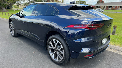
Jaguar I-PACE - Loving the Style... Still a Little Anxious

Four and a half years ago when I was offered the opportunity to review the Jaguar I-PACE, I jumped at it. I figured it might be the only chance I get - did these people not realise I didn't know anything about cars? That I was a mere tech reviewer, who was more likely to be distracted by how the reversing camera works than how fast the car can accelerate?

It was one of the most expensive cars I'd ever sat in, let alone driven, and as such I was completely mesmerised by a host of "luxury" features I would later discover were mostly commonplace with other vehicles in this league (ie: way, way, way out of mine).

The hook was the "E" bit of this particular EV. Remember, this was March, 2019. Nowadays it's not uncommon to be surrounded by full-electric, PHEV or hybrid cars at any given set of traffic lights but back then, if you saw a car like the I-PACE on your commute it might be worthy of a mention at the family dinner table once you got home.

How quickly everything's changed. 

And how surprised was I when Jaguar invited me back for another go?


In a classic bit of "If it ain't broke..." reasoning, the latest Jaguar I-PACE doesn't look dramatically different from the one I took around the block four years ago. These things are entirely subjective, obviously, but I think I could mount a pretty convincing argument that as EVs go, the I-PACE is still one of the best looking on the road.

This is because my personal taste leans towards cars that look like cars - not like something from a 1970s sci-fi vision of how cars might look in the year 2000. For too long too many carmakers have decided to make their EVs look "ultra-modern" instead of just cool - unusual curves, spoilers and odd-shaped doors and windows seem to be compulsory for some reason.

I get that reducing drag improves battery life - but good aerodynamics have always been a crucial part of automotive design.

The I-PACE is an EV exception here. Yes, there are both front and rear spoilers but they're not at all in-your-face and this battery-powered Jag doesn't look so wildly different from many of the other models.

This theme follows through to the interior design - most conspicuously notable with the continued absence of any kind of oversized tablet screen, jammed into the central console. Again, this seems to be a "feature" most other EV manufacturers have deemed mandatory - even more conventional, ICE-powered cars often have stupidly large, ugly screens sticking up out of the dashboard these days. I don't like the way they look. I don't like the space they take up. I don't like the general detritus that tends to accumulate within their unsightly nooks and crannies. And I don't like how much more difficult they make it to keep your console and windscreen clean.

The I-PACE doesn't have a dumb, giant screen like that. It has three much more subtle ones instead.

The smallest screen is part of the climate and seat-temperature control system, situated between the gear controls (a vertical row of clearly labelled push buttons) on one side and the driving mode controls (a vertical row of clearly labelled push buttons) on the other. Like most aspects of the I-PACE, the temperature of both the air and the seats can be adjusted using a very intuitive combination of on-screen touch commands and physical push-pull dials. There's even an MAX AC button which is just the ticket if you're getting into an extremely hot or far-too-chilly car. After I'd been parked in the hot sun the other day, running MAX AC for just a minute or so cooled things to my preferred temp immediately.

Alternatively, I could have used the Go I-PACE app to "pre-condition" the car from my phone - unfortunately, as I don't own the I-PACE, it's paired with somebody else's phone, so I couldn't give the app a try.

The main or "upper" screen is set flush into the dashboard and is quite tweakable. There's a large selection of widgets you can choose to display on the home screen - everything from media controls and navigation to a summary of how your driving style is affecting power efficiency. This is another thing too many EV designs are seemingly obsessed with; are you about to run out of battery? Think about it; running out of petrol is a real hassle too, yet how many ICE cars have a massive fuel gauge taking up most of a TV-sized screen in the middle of the dash? That's why the I-PACE lets you decide whether you want to see that info or not. In fact, you can turn the whole main display off if you want. I love that.

I also appreciate the way you can choose between light and dark modes - just like on your phone. And it goes without saying the I-PACE offers full Apple Carplay or Android Auto connectivity - with a wireless charging pad for your phone tucked inconspicuously underneath the main controls.

The third display is where you'd find the speedometer on most conventional cars. This is also surprisingly customisable. Using the conveniently-placed thumbwheel control on the left side of the steering wheel, you can choose two dials or just one, then select which information panels you prefer. Navigation? Media? Battery stats? Nothing at all? Up to you.

Like many other clever cars, the I-PACE also offers a heads-up display, projected onto the windscreen in front of the driver. This can also be customised slightly, adding media details and navigation commands if you like. HUD systems like this should be mandatory on all vehicles - if you ask me, being able to watch your speed while you watch the road is a big safety upgrade.

Not all safety features are welcome though. The I-PACE makes a mellow yet all-too-audible beeping noise as soon as you put it into reverse. This is to do with EU safety regulations apparently and it can't be deactivated. Perhaps not a big issue for most people but when I leave for my breakfast radio job at 3:15AM each morning, I'm more popular when I don't wake everybody else up just by backing out of my garage.

Reversing and parking generally is aided by an excellent rear camera and an overhead graphic representation of any potential collisions as spotted by the I-PACE's collection of built-in proximity detectors. And when it comes to looking backwards, there's one more tech trick which might just be my favourite.

The I-PACE looks cool but the rear window is not the most practical. It's rather small and if you have a couple of passengers in the back seats, chances are they'll be obstructing what you can see in the interior rear view mirror anyway. That's why Jaguar came up with the Clearsight rear view mirror - flicking it up activates the external camera built into the back of the radio aerial module on the roof. This feed is then displayed on the mirror in bright, crystal clarity - completely free of any obstructions at all. Again, a feature I'd like to see on any car, not just this one.

The seats are adjustable in just about any way you can imagine - not just temperature-wise as already discussed. Again, the controls a quite instinctual; a common sense combo of a horizontal bar for height, a vertical bar to move forward or back and a four-way remote-control-like button to adjust your lumbar configuration. Once you've got everything just right, this setup can be saved to one of the memory buttons on the driver's door - just like a favourite station on the radio.

Of course, the radio is operated via the main touch screen or thumb controls on the steering wheel - again this is very organic. Forget balance and fader sliders - just use the on-screen graphic to place the sound exactly where you want in the cabin.

The I-PACE is connected to the mobile network via its own sim - this means the car's software can keep itself up-to-date and the on-board navigation should always be current too. Although I found Jaguar's map system worked well and looked good on all the displays, I soon reverted to Apple Maps via Carplay because the I-PACE's voice control leaves something to be desired. It never understood my navigation instructions and I'd have to end up typing them in on-screen. Boring. Siri seems to understand me so much better.

As for the driving experience? Well, what would I know? One thing that definitely hasn't changed since 2019 is I still don't know anything about cars. It accelerates way faster than I need it to and can drive at far higher speeds than I dare to. However, I still can't say I'm cured of my range anxiety. EVs have been around for a while now, yet when I get in to find I can only drive 380kms or so on 100% charge - that doesn't seem particularly impressive.

I'm also still somewhat unconvinced by the current state of charging technology - admittedly I don't have a fast-charger installed in my house which meant I really had to keep it plugged into the mains supply whenever I wasn't driving it in order to keep it topped up. This proved relatively expensive - adding as much as $10 a day to my usual household power consumption due to the fact I wasn't able to make use of the I-PACE's scheduled charging options at low-rate times. A fast charge of cheaper power would definitely make more sense and I suppose if I could afford a $129,000.00 car, I could probably afford a high-capacity charger to go with it.

That being said, I never even came close to running out of juice while going about my daily (70km+) commute or other regular driving activities.

In every way, the I-PACE is still an absolute pleasure to drive - primarily because it looks and feels like a real car, not some kind of spaceship on drugs. It still has all the high-tech features you'd expect from a high-end vehicle like this - even individual tyre-pressure sensors in each valve for real-time monitoring - but they're all subtle, and many of them can be turned off and ignored once set up or if you simply don't want to use them. That's why I still love this car; its essential "car-ness" - and why I found it so hard to hand back.


Click here for more information on the Jaguar I-PACE.

Thursday, 7 December 2023

Dyson Solarcycle Morph Desk Light - Great... but Not a Thousand Dollars Great

If nothing else, Dyson does design. From hair care to air care, Dyson's renowned team of engineers consistently comes up with new, innovative and ingenious solutions to everyday, household problems.

This was true of Sir James Dyson's original, ground-breaking (and cleaning) vacuum design and it's still just as true today.

Even after all this time, every year Dyson finds new ways to make humdrum tasks like vacuuming less of a chore and more of a pleasure.

You'll expect to pay a premium for most Dyson devices but in my experience, they're devices that do the job so well, they'd be cheap at twice the price.

So what have they come up with now?


In Dyson's usual style, the Solarcycle Morph doesn't really look like any other desk lamp. I've heard directly from quite a few Dyson engineers over the years and one thing is always crystal clear; function comes first - form follows.

And if I'm going to be completely honest with you, my first impression of the Solarcycle Morph, once I'd taken it out of the box and attached it to its stand was... janky. I'm sorry but it kind of looks a bit janky - a cross between some sort of mic boom and one of those dentist drills on the end of an extension arm.

I'm sure the Dyson team could care less - it's what it does that's important, not how it looks. Although, it's a desk lamp, right? How clever does it need to be? Don't you just turn it on and off? What more do you want?

How about three more things?

It turns out the Solarcycle Morph isn't janky at all. It's surprisingly solid, stable and well-balanced. This enables you to direct the small but powerful LED light in almost any direction. The heavy base and springloaded, jointed extension arm also means you can position the light right where you need it.

I have a lot of stupid gadgets set up on my desk; microphones, laptop stands, phone chargers - all sorts of guff - yet I had no issue standing the Solarcycle Morph off the the side, then snaking it over everything else to illuminate my main workspace.

Dyson calls this "Task Lighting" - just one of four ways you can use this versatile lamp.

By rotating the light up towards a wall or ceiling, you're then in "Indirect Light" mode - which results in a more diffuse, softer, ambient light.

This is not to be confused with "Ambient Light" mode though. This is what happens when you bend the arm completely in half and return it to its magnetic mounting point on the main stem. In this configuration, the whole stem is illuminated in a soft, orange hue to supply enough mellow light to see but probably not enough to read by.

Finally, you can direct the light in a specific place for "Feature Light" mode. This might be useful to precisely highlight a piece of artwork on the wall, for example.

All of this is very clever but it's really just the beginning. How you control and customise each of these four main configurations is where the Solarcycle Morph really comes into its own.

There are physical controls on the extension arm itself - buttons and sliders - but you can also add the lamp to your inventory of Dyson devices in the MyDyson app. From there things get really crazy - you can program the lamp to turn on and off to a schedule of your choosing. Colour temperature and brightness are obviously completely tweakable but you can also automate things - setting the light to adjust according to the time of day and even your age... the older you get, the brighter the light you need, apparently.

But for me, the greatest stroke of Dyson's genius is including a little motion sensor by the controls at the end of the extension arm. Now I can set the Solarcycle Morph to turn off when I leave my desk and reactivate when I return - no human input required.

There's a lot going on here - even a USB-C port on the base for charging phones or other accessories.

This is all brilliant and I love all of it. I mostly use the Solarcycle Morph in its "Task Lighting" position, although I definitely appreciate how subtle the "Ambient Light" supplied in its return-to-base mode would be if the lamp was set up on a side table or in the bedroom instead.

In fact, using the app to schedule the lamp to turn on in sync with your alarm could result in a pleasant artificial sunrise - even if you have to get up in the middle of the night to go to work like I do.

Come to think of it, there's no reason why you couldn't use this as a video light during online meetings or live streams too. There's really no limit to the position, angle, brightness and well... every other setting you can think of.

Despite all that, who's paying NZ$999.00 for a light? I get that Dyson makes great gadgets. I get they can charge a pretty penny because you're usually getting something nobody else does. But a thousand dollars? For a desk lamp? Even a lamp as unique as this? That's quite a flex. And way out of my budget.


Click here for more information and pricing on the Dyson Solarcycle Morph.


Tuesday, 5 December 2023

HP Spectre Fold - Not Just Something New. Something Good

Ah, the trials and tribulations of the early adopter.

In our rush to be among the first users of any technology, how many times have we paid the price? And I mean the literal price; paying an exorbitant fee for relatively untested - sometimes even experimental - technology that always promises so much and yet often falls well short.

I was wearing a smartwatch before anyone else was. Oh, how they laughed. And rightfully so. It was enormous, had terrible battery life and could hardly do anything. But you could take pictures from a tiny camera embedded in the actual wristband. Awful, awful pictures of unusable quality. But still...

I was charging my phone wirelessly before anyone else. This meant I had to buy a separate accessory I then had to install inside the phone. Totally worth it.

As an early adopter I was one of the only people I knew to use a Windows phone. I'm still only one of the only people I know to use a Windows phone. Ever.

And yet, as a tech addict, I keep going back for more - these days trying out groundbreaking tech on your behalf so you don't have pay to be a new-device guinea pig.

It's not all bad news though. Every now and again, something truly innovative comes along that actually works. When that happens, it's a good day.


There's no question the HP Spectre Fold offers something new in the world of personal computing. In fact, it offers many things - all in one package.

I was expecting something pretty high-end - that's what the HP Spectre series is usually about; good, high-speed storage and RAM options, the latest Intel processors and original design choices adding up to an eyecatching laptop that really performs.

The Spectre Fold goes quite a bit further. That's because it isn't just a laptop at all. It's also a tablet. A touchscreen display and an all-in-one desktop PC. Oh... and some other kind of weird thing I don't really have a name for but is essentially a laptop-and-a-half - with extra screen above the keyboard for when one great screen isn't quite enough.

So, by my count, that's about five things. Which is just as well, because like so much other breakthrough tech, it's extremely expensive. The Spectre Fold may be five things at once - but it costs about five times more than any of those things by themselves.

I've done a useless job of explaining exactly what the Spectre Fold is. Imagine a very slim, 17-inch display, that can fold in half. Now slide a small keyboard and trackpad in between the two halves of that folded screen. Physically, that's essentially what you're dealing with.

Again, that doesn't quite describe it.

How about a laptop with a 12.3-inch display? Then, while you're using it, you can slide the keyboard towards you to reveal another, smaller screen underneath. This might be useful for on-screen media controls. Or perhaps a file directory where you have content stored for the project or presentation you're preparing on the main screen.

Then, you can remove the keyboard completely to reveal a whole other 12.3-inch display which is really just the other half of a massive 17-inch screen which can be folded flat to be used as a tablet. It's an OLED IMAX-enhanced touch display, so not only does it look sensational but you can use a stylus for drawing, painting and writing - that stylus is included in the box.

There's also a very subtle kickstand at the back of this "tablet" that folds out so you can use this standalone monitor to display video or perhaps for gaming, with a controller attached.

The now unattached keyboard and trackpad still works, by the way. That means this stunning, foldable, 17-inch monitor is now also the most portable desktop PC I've ever come across.

Is any of this starting to make sense yet?

All of these things seem like a good idea and the concept of a 17-inch screen you can fold away into your briefcase, satchel or purse seems very futuristic and convenient. But surely it doesn't really work properly? Surely a concept as crazy as this is just that; a mere concept. It couldn't possibly be a working, practical computing tool for both business and personal use, could it? 

For that to be the case it would have to have the latest Intel Core i7 CPU - which it does - good battery life - which it also does - and that screen would have to work even better than the folding displays we've seen on the few folding phones that have come along so far.

You guessed it. It does. Well... very nearly. As a viewing experience, I can't fault the display on the Spectre Fold. It's very bright, it's not particularly prone to reflection and the crease in the middle is practically invisible when viewed from front on. In fact, it might be the flattest, most subtle crease on any folding display I've used to date.

The department that seems a bit sub-par is touch response. I find I often have to touch on-screen controls several times to get them to work and while it's refreshing to have a stylus included in the box, it's certainly not the natural, intuitive writing and drawing experience I've encountered with other styluses I've used over the last year or so.

I may have also slightly oversold the Spectre Fold's gaming abilities. There's no dedicated graphics module here - not quite sure where you'd put it anyway. I'm still trying to figure out how HP managed to fit what they did into something so slim. Instead, you get the integrated Intel Iris Xe graphics solution - which will still run good games like Asphalt 9 and High On Life but when I tried to play new release blockbuster, Starfield, it would install but not load.

This is a shame because the concept of a truly mobile, bright, zippy 17-inch monitor is quite a different and appealing way to game - especially when travelling.

But those are really the major limitations to this device. It has 16GB of RAM and a healthy 1TB of PCIe NVMe M.2 internal storage. This means running apps like my preferred audio editor, Adobe Audition was an absolute breeze. The Spectre Fold comes with Intel Unison pre-installed - this is one of the latest crop of apps for pairing your phone with your computer - something Apple devices do automatically of course. Intel Unison is easily the best effort at this functionality I've tried to date - it works for both Android and iOS handsets and not only lets you browse your phone's photo and file storage for easy transfers but also shows your phone notifications on-screen and let's you take calls through the computer.

Microsoft's new Copilot tool has also proved itself to be quite useful; this is an A.I.-powered virtual assistant that picks up where Clippy, Cortana and Bing Chat left off - ask it anything. Not only does it have the full power of all the knowledge of the internet behind it but it's now deeply integrated with Microsoft's Office 365 suite of apps. It's not intrusive, just helpful when you're trying to do something more efficiently.

Which is kind of the philosophy behind this whole device. I've been quite taken aback by how well engineered and durable the Spectre Fold is. I was expecting to have to handle this almost-$10K foldable with kid gloves, but I've found the opposite to be true. Fold it, unfold it, whack the keyboard on and off, pop the stand out - there's nothing fragile here at all.

Yes, you read that right; to be at the bleeding edge of premium computing technology you'll need to fork out at least NZ$9,770.58 - at least you get a helpful USB-C hub in the box, with two USB-A ports, an HDMI slot for a second screen and another USB-C for power delivery.

This is on top of the two built-in Thunderbolt 4 USB-C ports, Wi-Fi 6E and Bluetooth 5.3 connectivity.

As I already mentioned, battery life is really good - especially considering how compact the whole device is. Both keyboard and stylus charge wirelessly when stored magnetically in place, or there's an external charging dongle for the keyboard if you're using the device in "Desktop Mode" for an extended period.

The Spectre Fold is a very tidy little laptop - the 5MP Windows Hello camera provides fast and reliable face unlock and high-quality video, combined with top-notch mic performance. However, you can't really use this camera in desktop mode, as it ends up way over on the left-hand side and shoots in the wrong aspect. Not sure what the solution for this issue would be... a second camera on the top edge somewhere near the fold maybe?

It's not a major as it takes about seven seconds to transform the Fold from a desktop back into a laptop. I can't say I've made a lot of use of the "Expanded Screen" mode - where you slide the keyboard out to create an extra "screenlet" just above it - but I'm sure there's someone out there who's saying, "That's exactly what I need!"

As a tablet, you'd be hard pressed to find one this big (17-inches) this powerful (i7 processor) and this versatile (Windows 11).

And as a standalone display, what a great way to watch Fargo or Beacon 23 in your bedroom. The Bang & Olufsen quad speaker array sounds almost as good as the screen looks.

This is not a Jack of all trades, master of none - it pretty much masters every mode you want to use it in. It's surprisingly sturdy and delivers in almost every area of modern computing requirements except perhaps very high-end gaming and video production. But still.... it can't really be worth ten grand... can it?...


Click here for more information and on the HP Spectre Fold.

Monday, 27 November 2023

Logitech Wave Keys and Logitech Lift - No Learning Curve Here

How many different devices do you use every day?

It's one of those questions that seems fairly innocuous at first but when you start to add them all up, they really, really add up. Phones, tablets, desktops, laptops - devices at home, devices at work, devices when you're on the road...

Anything that can simplify and streamline all this would surely be welcome.

As an insight to my personal situation, I use a crazy number of different computers at work, including my own laptop and several different PCs - some of which are connected to the same keyboard and mouse - otherwise my radio studio would be full of keyboards and mice and not much else.

When I get home, I use my laptop and desktop together and I'm often reviewing a third computer of some kind - or perhaps a tablet that works with a keyboard too...

See? It adds up.

What's more, some are MacOS, some are Windows - it's no wonder I often feel confused and tired by the end of the day. Thanks to Logitech, I can now add a couple more devices but remove several others, giving my hands, wrists and fingers a break at the same time.


When it comes to computer accessories, there aren't too many names more trusted than Logitech. We're talking years of quality, well designed, innovative products that many people have come to rely on - both at work and at home (and now that's often the same place, obviously).

Logitech has established a reputation for ergonomic design too. For those of us (and these days it's most of us) who spend hours at a time tapping at a keyboard and manoeuvring a mouse, the growing demand for a more natural fit is hardly surprising and it's no wonder we've seen the development of more non-traditional input devices; split keyboards, trackballs and vertical mice are now commonplace in most businesses.

While these ergonomic form-factors are clearly a good idea, they can also seem a bit daunting and alien. The standard shape for a keyboard and mouse has been around for a very long time. Old habits die hard and learning a whole new way to type or control your cursor is a bridge too far for some.

That's why the team at the Logi Ergo Lab has come up with the Wave Keys ergonomic keyboard and the Lift vertical mouse.

Starting with Wave Keys, it looked like a fantastic idea to me as soon as I took it out of the box. Before I even used it, I could tell the combination of the contoured (wavy) keyboard and the cushioned palm rest would guarantee a significantly more comfortable typing experience.

I was also surprised to discover the Wave Keys wasn't that big - yes, because of the attached palm rest, it's longer top-to-bottom than other standard keyboards but it's actually not as wide as the one I've just been using. This is because the keys are in fact closer together and smaller than those on a "traditional" keyboard - even the number pad is more compact.

That doesn't mean you feel at all cramped when using the Wave Keys though - quite the opposite. It's a hard thing to explain, but because the keys are all curved towards where your fingers naturally land, Logitech has been able to reduce the upper surface of each key while keeping the space between them generously wide. This not only means more comfortable typing but it's faster too, because your fingers don't have to stretch as far for keys like B, Z and P - and other keys that aren't directly adjacent to the home keys we've all become used to over years and decades.

Best of all, unlike a split keyboard configuration, there's no issue learning how to use this one. In fact, the only thing that slowed me down initially was I couldn't quite believe how easily I had adjusted to this new device and I kept second-guessing myself, even though my typing had actually improved, not gotten worse.

My experience with the Lift vertical mouse was similarly instinctive - if not more so. The Lift is essentially a standard mouse propped up on its side at a 57° angle. At the Logi Ergo Lab, they call this the "natural handshake position" - who would have guessed? Try it right now, even if you don't have a mouse handy - just rest your hand and forearm naturally on the table or desk in front of you. See how your hand sits on its side? To use a "normal" mouse, you literally have to twist your arm over more and even raise your elbow up and out to get your hand in the correct position.

This is what ergonomics is all about, of course; bringing the device to your body rather than the other way around. Just as with the Wave Keys, using the Lift felt completely normal, right from the start. The two main buttons and scroll wheel weren't anywhere different - just on an angle. The only real change was a big improvement - the forward and back keys have been moved around to the opposite side, just above the thumb rest, making them far more accessible and easier to use. On a standard design, this would have placed them underneath the mouse itself, no use there at all.

Both Ergo mouse and keyboard can be paired with up to three devices, swapping instantly between them with the push of a button. This means you can literally use the same mouse and keyboard for three different computers. They each include a Logi Bolt USB receiver as an alternative to connecting via bluetooth and this can be stored neatly away in the battery compartments.

What's more, if you sign into the Logi Options+ app on each computer you're using, you won't even need to manually select which device you're controlling - there's a Flow option for the Lift mouse that lets you push the cursor from device to device. Logi Options+ also gives you the capability to customise buttons on both keyboard and mouse. You can even set different keys to do different things in different apps - although I find that can get a bit confusing when you're swapping around.

Perhaps the most exciting feature of Logi Options+ is Smart Actions - these are essentially programmable macros you can fire off with any key or button you designate. Do you have seven different apps you always have to open individually at the beginning of every work day? You can create a Smart Action that will do all that at the touch of a button.

Like every Logitech device I've come across in the past, both the Wave Keys and Lift seem very well made, durable and the Lift in particular has a nice, soft-touch, grippy surface to it.

The only thing that raised an eyebrow for me is how they're powered; with a battery. Or in the case of the Wave Keys, two batteries. I kind of thought single-life batteries were on the way out. Most wireless devices I use these days charge via USB-C - including other Logitech accessories I use regularly. Thanks to environmentally friendly packaging and the use of recycled materials, the Ergo range is carbon neutral - and yet these two run on batteries that will eventually die and be thrown out. A puzzling juxtaposition.

There is a payoff though - up to two years' use on a single battery for the Lift and a crazy three years for the Wave Keys. I can't argue - that's definitely more convenient than having to recharge each device every week or two.

In many ways, these two devices are two of the most straightforward I've reviewed all year and yet I've already written more than 1300 words about them. I love them. When design gets this good, what's not to love? Sure, using the app adds a host of other tricky little features but the fact Logitech has managed to take something as fundamental as the keyboard and mouse and tweak it like this is... well, it's art really.


Click here for more information and pricing on the Logitech Wave Keys.


Click here for more information and pricing on the Logitech Lift.

Wednesday, 22 November 2023

Microsoft Surface Laptop Studio 2 - Fast, Flexible and Hot, Hot, Hot

The beast is back.

Microsoft seems to have mastered the art of turning Windows laptops into tablets and back again, with a range of Surface devices to suit most budgets and work requirements.

But when it comes to one laptop to rule them all, if you have the funds, there's really only one option.


The Surface Laptop Studio 2 doesn't look a whole lot different from its predecessor. It's still big, still heavy and still one of the most useful and powerful laptops I've ever come across.

If you're not familiar with this unique form factor, not only can you use it as a laptop, you can pull the screen forward, over the keyboard and magnetise it in place to play video or for gaming, using an external controller. Or thirdly, you can fold the screen down virtually flat, concealing both keyboard and touchpad entirely to use the device as a tablet. An incredibly grunty tablet.

And yes, there have been some upgrades.

For the last few years I've been rather critical of most laptops for their lack of ports - it's really limiting to only have one or two USB-C slots, especially if you're using one of those for charging purposes. So I was quite pleased to see the Laptop Studio 2 had added a microSD card reader and a USB-A 3.1 port. This seems to be a recent trend - bringing back USB-A. A big reason for this is probably due to most wireless mice relying on a USB-A dongle (if not Bluetooth). Despite the Laptop Studio 2's fabulous haptic touchpad, a physical mouse is still likely to be the first accessory most people add to the mix, so it's great not to have to rely on yet another adapter or external hub to plug one in.

It's not all good news though.

By far the biggest downfall of the Laptop Studio 2's design is how it handles heat. It really doesn't. While its unusual inset, elevated base features large vents for cooling down either side, they simply aren't enough. Once the device is put under any amount of stress - when playing comedy first-person-shooter "High On Life" for example - the fans kick in like you wouldn't believe and even they can't prevent the whole laptop from heating up. And I don't just mean warm. This is without doubt the hottest I've ever felt a computer get. Weirdly, it seems to keep functioning perfectly - brilliantly, even. But it literally gets too hot to leave on your lap.

What's really frustrating about this is the fan noise and overheating were issues with the original Laptop Studio - if anything, they're now even worse.

Another major - and lingering- issue is battery life, or lack thereof. Most of the other laptops I've reviewed this year have impressed me with good battery performance and many have actually blown me away. In previous reviews, I've already suggested that 2023 was really the year Windows laptops could finally claim all-day battery life - thanks to a combination of improved battery tech but more significantly, more efficient CPU and GPU performance.

Sadly, this trend has not carried through to the Surface Laptop Studio 2. While it's tricky to be precise when it comes to measuring battery life in real-world usage, my feeling is there hasn't been much improvement from the original model... which was bad. Given the gale force breeze the fans are blowing out a lot of the time and the incredible amount of heat being generated, this isn't surprising, just disappointing.

At least the Laptop Studio 2 charges quickly - as long as you use the supplied 127W brick which still attaches via that weird, magnetic, Microsoft-only Surface Connect cable. Alternatively, you can charge via one of the USB-C USB4 Thunderbolt 4 ports - although charging this way is significantly slower. In fact, while gaming, I was using a GaN charger capable of up to 140W, yet the laptop drained the battery faster than the USB-C charger could top it up and it still went flat. Quite quickly.

But... just as with the original Laptop Studio, I don't really care. That's because this is a computing device that cuts through any task like a hot knife (or laptop) through butter. I've mentioned gaming a few times - and while that's not really what this computer is designed for, between the 13th Gen Intel Core i7 processor and the NVIDIA GeForce RTX 4060 GPU my review model was tricked out with, I couldn't find a game that didn't work fantastically well on it. The 14.4-inch PixelSense Flow Display is super bright and colourful and I didn't seem to have the reflection issues on this model that I encountered with the first generation.

The Dolby Atmos Quad Omnisonic speakers do a fabulous job of throwing 3D audio around and the whole audio/visual package makes for a superb entertainment experience - gaming, streaming... whatever.

But if you're forking out almost NZ$6,000.00 for a machine like this (it starts at NZ$3,752.00, but my review device was equipped with maximum RAM, storage and GPU) you need to know it's going to do the job - whatever business you're in. No problem there; this has got to be a creative's dream device - a responsive, accurate touch-screen you can fold down to use as a tablet - or add the Surface Slim Pen 2 for more artistic control. It will run whatever audio and video editing tools you need without a stutter and when it comes to multi-tasking, the tall 3:2 aspect ratio means plenty of screen space for plenty of windows.

Speaking of Windows, Microsoft has introduced some major A.I.-powered innovations software-wise this year and obviously this is a perfect device to make the most of that well-publicised Copilot integration into tools like Outlook, Edge and other Office 365 apps.

Even the camera has been upgraded with some useful tweaks for those crucial online meetings or live streams. Automatic Framing puts you front and centre, Eye Contact keeps you looking directly into the lens - even when you aren't and Background Effects provides some professional blur to whatever might be distracting viewers who are looking behind you.

The first Laptop Studio was an unstoppable juggernaut - a sturdy, polished piece of transformable tech design, capable of adjusting itself to fit any work environment and meet any computing demands. By adding extra ports, more processing power and a GPU upgrade, the new generation is an even bigger triumph. Let's just hope next time Microsoft figures out a way to cool things down and run the battery a little longer.


Click here for more information and pricing on the Microsoft Surface Laptop Studio 2.