Sunday, 31 October 2021

Have I Mentioned How Much I Love This Watch?

I'm pretty new to Apple Watch, I only really tried out my first one a couple of months back but I was immediately impressed with just about everything about it.

When it comes to build quality, ease of use and the colossal number of specifically designed apps available, Apple Watch comes out on top.

All the more impressive given Apple was kind of late to the game in this bit of the market - hard to believe they've only been doing watches since 2015.

Well, there's no sign of them slowing down and given how smitten I've been with the 6th generation device, I was pretty excited to get this year's version on my wrist...


A lot of the hype around the 7th generation Apple Watch has focused on its display, with some justification given it boasts almost 20% more screen area than its predecessor, even though the watch itself is hardly bigger at all. This is thanks to two things; the new display has significantly smaller surrounds and now actually curves into the edges like many high-end smart phone screens have done over the years.

More screen real estate obviously makes the display easier to read and use - illustrated clearly by the fact many native Apple apps have redesigned their button layouts and you can now access a full QWERTY keyboard when creating or replying to messages. Other smartwatches have offered a keyboard option for years and I've always been surprised by how well they work, given how tiny they are. With my first Apple Watch I found it a bit weird Apple didn't have a keyboard - especially given the square form factor. Instead you were restricted to scribbling one letter at a time (very cumbersome) or dictating to Siri (not always accurate given our crazy Kiwi accents). The new keyboard responds to both taps or QuickPath swipes and instantly makes the watch even more of a two-way communication device than it already was.

There are also a couple of new watch faces specifically designed to make the most of the new Retina display - Contour, which is an analogue design featuring numbers that bulge into the curved edges - and Modular Duo, a fully customisable digital face that lets you choose multiple complications and shortcuts to be displayed more clearly than ever before.

The screen is brighter too - not that I had any issues with the last one - and it's significantly brighter when you've set the Watch to Always On Display. Personally, I don't understand why people want their watch on when they're not looking at it but apparently some people do.

On top of the more traditional stainless steel cases in Silver, Gold and Graphite, there's a new range of colours that are right up my alley - Midnight, Starlight, Green, Blue and (PRODUCT)Red all in a muted aluminium finish. The Midnight colour is interesting; it seems black at first but closer inspection suggests a more mysterious, inky blue but why anybody would choose a colour other than (PRODUCT)Red is beyond me.

I feel like I've waited my whole life to own a red watch like this so now I can die happy. Nice to know a portion of all (PRODUCT)Red sales goes to help fund Covid relief too.

Of course, WatchOS has been given an overhaul too. The interface was already great but significant tweaks have been made to things like fitness tracking, guided mindfulness exercises, photo display and watch faces. Sleep tracking has become a lot more intuitive, now including your respiratory rate along with other measurements like heart rate and blood oxygen making the insights here more detailed than before.

It's also now easier than ever to control your smart devices from your Watch. I've really appreciated being able to access my favourite lights with just a couple of swipes on my watch - and some faces even let you place shortcuts to those devices right on the home screen. The future is now.

Apple claims the new Watch is its most durable yet. Already rated WR50 to be fully swim-proof, it now carries an IP6X rating against dust - effectively making it beach-proof too. There's been a lot of hype around this Watch being tough enough to take mountain biking. (Apparently mountain bikers spend most of their time falling off into the dirt. Sounds fun.) As part of this pitch, Apple has now customised its fall-detection feature to react differently to different activities - after all, you don't want the emergency services called every time you successfully block a spike playing volleyball.

And that larger, curvier crystal is supposed to be a lot more crack-resistant too - 50% thicker at its tallest point than the crystal on the previous model.

However...

You can still scratch it.

Within moments of firing this (PRODUCT)Red thing of beauty up, I knew this was the greatest watch I'd ever worn. It looks incredible - especially teamed up with one of the latest Braided Solo Loops or Sports Loops, to match the best colour in the world. 

All the features (so many features) work better than ever, WatchOS has been refined in all the right ways, the larger display is more usable and there's even a fast charger included in the box to keep you topped up, making things like sleep tracking more practical.

I was in smartwatch heaven.

Then the very next day, I scratched it.

Noooooooooooooooooooooooooooooooo!

I don't even know how. I have no memory of bashing the Watch against anything. I didn't even fall off my mountain bike! I just looked down at the screen and noticed a big, ugly scratch stretching from the top left corner right into the centre of the display. I was heartbroken. How could this happen? Hang on... is it just a mark? Just dirt? Something sticky? Wipe, wipe, wipe... Nope. Damn. It's a scratch. Perhaps I should have just left it in the box? Taking it out for viewings on special occasions like a precious work of art?

No.

This device is just too useful not to be used - everywhere and all the time. Over the last couple of weeks I've had to accept scratches happen. Like wrinkles. They're just part of life. I'll get over it. Probably.

The 6th-generation Apple Watch was the best smartwatch I'd ever used. This year's is now the best smartwatch I've ever used. Does that mean you should rush out and upgrade? Tough call. The bigger display and new choice of colours are probably the deciding factors - and perhaps the new IP6X rating if you're the kind who likes to roll around in the dirt. Either way, there's no question the Apple Watch still leaves all the others in the dust.


Click here for more information and pricing on the Apple Watch Series 7.

Wednesday, 27 October 2021

Well, It's Definitely Alien

As a tech geek, I have a kind of shopping list of "Things I'd Like to Review One Day."

You'd think by now I'd have ticked off so many items on that list, it must be pretty short by now but the opposite is true; the trouble with tech is they keep inventing more of it.

So it seems like each time I finally get to play with a gadget on my wish-list, two more bright, shiny objects appear to replace it, as if by magic.

I've also made it pretty clear over the years I'm no gamer. But that's not to say I wouldn't like to be, if I only had the time. 

Luckily, every so often, my wish-list and my secret gaming ambitions converge.

Until last week, I'd never used a purpose-built gaming laptop. But now I have. I had to. It was for work...


Alienware has done a pretty decent job of establishing itself as a go-to brand for gaming enthusiasts. Alienware computers have been out there since 1997, always catching the attention of gamers and critics alike with their high-spec internal components and generally high pricetags to boot.

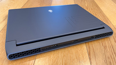
Right out of the box, the m15 R6 is an aquired taste. Remember, I'm comparing it with other business/personal laptops so to me, it seems absolutely huge. And heavy - around 2.5kgs. Alienware machines have always shouted, "I'm built for gaming! Take it or leave it!"

While the m15 R6 doesn't actually look like an alien, as some models of the past have, it does perhaps resemble an alien spacecraft; all graphite and dark grey, with hexagaonal air-flow grills top and bottom and those big air vents at the back. In fact, the rear of the chunky, robust hinge mechanism is surrounded by an LED ring and when it lights up, it's almost as if the laptop is about to launch itself into hyperspace.

Which it kind of is.

Because, as usual, the m15 R6 is specced up the wazoo. Lightning fast PCIe M2 SSD storage (1TB on the unit I was sent to review) and 16GB of RAM. The top-of-the-line NVIDIA GeForce RTX 3080 dedicated graphics card combines with the 15.6-inch ComfortView Plus FHD display to provide unheard-of refresh rates upto 360Hz. And of course, the star of the show is the 11th-gen Intel Core i7 processor.

All of this is accessible via the Alienware Command Centre, where you can customise pretty much every aspect of how the laptop runs - from fan speed to your RGB lighting scheme. The latter features on the keyboard, the rear IO port surround I mentioned earlier and the Alienware logos on both the lid and the power button. I immediately changed mine to red everywhere of course, because why would you want any other colour?

The m15 R6 ships with Windows 10 Home out of the box, so the first thing I did was upgrade it to Windows 11. I figured it would cope.

To be honest, there's not much this beast doesn't cope with. If you're buying it for browsing and streaming and emailing and the like, don't bother. It's just a waste.

As we've established, this machine is built for gaming and it nails it. 

Games start fast and the highest display and performance settings load by default. The crazy high refresh rate of that nice big display (closer to 16 inches than 15) makes everything look smooth with no stutter ever. Whether I'm trying to escape the puzzle rooms and hallways of Superliminal, or the robot guards and security drones patrolling the sewers in Marvel's Avengers, every detail is... well... just so detailed and the experience is totally immersive. 

Funnily enough, as I write this, Intel has just launched its latest 12th-generation chips, effectively making the one I'm using here obsolete. I can't imagine what the new iteration does better.

Well... maybe it'll run a little cooler.

My biggest criticism of the m15 R6 is fan noise. I've never experienced anything quite like it. I get that there's a lot going on under the hood and things have to be kept cool but this is really next level. Luckily most gamers wear headsets while playing because I'm not kidding, when the fans in this thing hit top speed, it sounds like an extractor fan and the only-okay built-in speakers struggle to be heard above the din.

Weirdly, depending on which cooling profile you run, they don't even keep things that cool. Right now both the CPU and GPU fans are reporting 55 degrees - and all I'm doing is typing a review. Let's just say the old lap feels pretty cosy right now.

But maybe game-aholics don't care about that stuff so much. Or maybe, like a muscle car enthusiast, it's actually all about the heat and the noise - the more the better.

For me as a non-gamer, the priority list here is a little hard to fathom. For instance, the touch pad is small and feels cramped to use - especially when it comes to right and left clicking. Given the size of the device, I would have expected to see something much bigger, offering a more detailed and accurate experience. I get most people who buy this laptop will do so primarily for its gaming abilities and therefore will most likely be using some kind of fancy-schmancy mouse or even an external controller - but still, I find it weird the touch pad kind of under-performs on such a beast of a machine.

Battery life is another mystery. Yes, the m15 R6 is infinitely more portable than a desktop PC tower with similar specs but you'll definitely need to take its bulky Dell power supply along with you to keep things running for very long. Apparently there is a smaller adapter available as an optional extra, which might be worth considering if you're planning to use this device in multiple locations.

The camera quality also leaves a little to be desired. Yes it is enabled for Windows Hello login and yes it features a dual-array mic setup so you do sound pretty good if you're talking to team-mates on a multi-player mission. But if you want to host a professional video-chat, the picture quality is a little less crisp than I was expecting.

What I love is the selection of ports - and where they're positioned. Ethernet and headphone jack one side, two Type-A USB 3.2 on the other, with HDMI 2.1, Type-C (Thunderbolt 4) and another Type-A USB 3.2 all out of the way at the back. You can never have too many ports - especially when you're wanting to plug in controllers and external monitors.

The keyboard is another blissful experience. The keys are so well spread out, with amazing travel for a laptop and of course, I can colour them red. Several function keys also double as programmable macros too - very useful in your next close combat encounter.

This is definitely the high-performance V8 of laptops and like those sorts of cars, it's loud, proud and not very economical to run. But in terms of sheer power, it's hard to beat. And when you're trying to avoid both space station pirates and the bloodthirsty alien in Alien: Isolation - you need a machine that just won't quit.


Click here for more information and pricing on the Alienware m15 R6 gaming laptop.

Monday, 25 October 2021

My Favourite Fit Yet

So here we go again, deep diving into the seemingly infinite world of wireless earbuds. I feel like I've stuck more of these in my ears this year than every other year combined - and it's not even November!

But, like most tech, just when you think they can't make it any better, they figure out a way to make it better, sometimes in ways you didn't even realise were possible.

Recently Jabra released not one but three new models in its earbud range. I reviewed the more entry-level Elite 3's a couple of weeks back and was definitely impressed with what was on offer. Which made me wonder how much things could improve at the other end of Jabra's pricing scale?...


Jabra's premium offering this year is the Elite 7 Pro. 

Here's the thing though... The more earbuds I try - and remember; I make sure I spend at least a couple of weeks using them in real life, exercising, gaming, streaming, video calls, housework - the more obsessed I have become with one feature above all else; how do they fit?

This is because, especially in this price range, all the other stuff is pretty much a given. For example, once you're paying over $300, excellent battery life should be a minimum expectation. In this area, the Elite 7 Pro definitely lives up to that expectation - and then surpasses it. Promising up to 8 hours continuous play - even with ANC switched on - and 30 hours total play with a fully charged case, these are figures I'm more used to seeing with full-sized, over-ear headphones, not tiny little buds like these. It's great to have the convenience of a case that charges wirelessly too, especially since Jabra has made the odd decision to put the USB-C charging port at the front, just below the charging indicator LED. This makes it a bit hard to see when you have it plugged in, so wireless is a better (albeit slower) option.

Sound quality is another take-it-for-granted feature. Yes, yes... I know there are sound nerds out there who insist on breaking down every frequency range and are determined to compare every genre of music so they can create the ultimate ranking list of earbuds by sound performance alone but in my humble view, as long as you can can customise the EQ to your preference, which you definitely can via the Sound+ app, if there's a half-decent driver setup, you'll be pretty happy with the results.

6mm doesn't sound big but for earbuds, that size speaker is quite a feat of engineering. And it's not just the EQ you can fiddle with via the app - you can create a personalised listening experience based on the results of the MySound test. As a result, sparse tracks like Lily Allen's "Apples" stay intimate, yet with a lovely sense of space much more reminiscent of larger, over-ear headsets. Soft vocals, finger-picked guitar chords - the tenderness is all there. Meanwhile, if it's bass punch you're after, the Elite 7 Pro's definitely come to that party too. The bass-line driving the almost manic "Dynamo of Volition" by Jason Mraz is bordering on frenetic, yet every note thrums through in all its frantic glory.

What's more, Jabra has completely re-engineered the mic setup; it's a 4-mic array complete with VPU bone conduction sensors that take over in windy conditions to ensure about the clearest voice quality you could ask for on your calls when you're out and about.

Active Noise Cancelling is another area that can be somewhat subjective and again, many critics are determined to find some kind of scientific metric with which to rate one system over another. As far as I'm concerned, again the ANC on the Elite 7 Pro's is first-rate. I was out running today when a kid fell off his bike right in front of me and started screaming. I never heard a thing as I ran right past.

(Hey, don't judge me - his parents were with him. I'm not completely heartless)

Then, when I got home, Domestic Manager was calling out to me from our second-storey balcony and I never heard her either - not until I looked up, anyway. She was annoyed. I was impressed. This ANC definitely does the business.

Like I say though, with each new pair of earbuds I try (and yes, only this morning, a package containing another two sets landed on my doorstep) the single thing that sets the truly great from the rest is how they fit.

I've told you other buds were the best fitting I've ever worn and that was true every time - at that time. Now a new champion has stepped up to claim the crown. Although in this case, Jabra has made a dramatic leap forward. Somehow they've come up with a new design that reaches further into the ear canal than before and the result is only great news.

To begin with, the Elite 7 Pro's are more compact than ever; 16% smaller than their Elite 75t predecessors. Apart from anything else, this makes them the most subtle-looking buds I've worn too, hardly protruding from my ears at all. Smaller also means lighter and the balance once inserted borders on weightless.

Jabra claims to have scanned more than 62,000 ear holes in order to refine the shape and my fear was this more intrusive design may feel weird and uncomfortable but quite the opposite is the case. Because the weight is more evenly distributed, the sensation is almost as if you aren't wearing them at all - even after hours of listening.

You can also confirm you're using the right sized eargels with the MyFit test in the app. Again, these are the best eargels I've tried so far - very difficult to swap out as they are a tight fit on the earbuds themselves but the tapered, rounded shape and soft, flexible material create an almost airtight seal which dramatically enhances both noise cancellation and bass response. What's more, they just don't move. At all. No matter if I'm running, working in the garden or vigorously nodding my head to give Domestic Manager the impression I'm listening to every word she says, these puppies stay firmly in place until I pluck them out.

Don't let my use of the phrase, "Airtight" put you off - there's none of that in-ear claustrophobia some people complain of. The Jabra engineers have included "frequency-dependent pressure relief vents" to ensure that simply isn't an issue and as a result, comfort reigns supreme.

As I sit here listening to the the remastered, deluxe version of the Rolling Stones' "Tattoo You" in all its glory via Apple's lossless audio stream, I hear every high-hat clash and feel each bass drum thump Charlie Watts performed, like he was still alive and kicking and in the room with me.

In terms of controls, Jabra is a bit of a lone ranger, still opting for physical buttons on each bud as opposed to the invisible, capacative controls other manufacturers seem to prefer. Personally I feel reassured by having a button that's definitely pushed or not - each fully programmable via the app of course.

Although pricey, at NZ$319.00, this actually places them below several other competitor products with similar features so it becomes a question of priorities. Perhaps there are earbuds with better battery performance - but not many. Would a purist rate these as the finest examples of hi-fidelity reproduction available? No, but I don't have a degree in audio engineering so I don't really care. Same goes for ANC - if it's good enough to drown out the sound of my robot vacuum cleaner operating in the same room, what more do I need?

My priority is fit and as of today, that's where the Jabra Elite 7 Pro comes in at number one.


Click here for more information on the Jabra Elite 7 Pro.

Wednesday, 20 October 2021

Discovering the World of Robots

I have reviewed a lot of gadgets over the years. Phones. Smartwatches. TVs. Laptops. Even cars. And the earbuds! So many earbuds.

Yet through it all, the Domestic Manager has remained stoically, skeptically and yes, perhaps even stubbornly unimpressed.

In fact, sometimes it's almost as if my tech obsession is kind of... annoying.

Anyone would think taking the entire household's internet connection offline for hours at a time, just so I can try out the latest Wi-Fi router is some kind of inconvenience.

It's not like I do that every day. Probably not much more than twice a month.

And does she not realise how amazing smart speakers are? I suppose it can be a bit confusing when I keep swapping between Alexa, Google Assistant and Siri... but she'll figure it out after a bit of trial and error, right?

As for the excitement of flashing lights as devices reboot themselves in the middle of the night, not to mention forgotten alarms set to go off after I leave the house at 3:25AM... could I be any more loveable???

Then the other day, finally, something arrived at the door that to my surprise, made her exclaim, "That is never going back!..."


What was this magical device? The one electronic toy that finally won my long-suffering Domestic Manager's heart? It was the Roborock S7.

Yes, a robot has literally moved in and taken over my job. And I couldn't be happier.
To be clear, I don't think Domestic Manager was overly impressed when I first took it out of the box. "Where's that supposed to go?" she complained, with some justification. The S7 is certainly a lot larger than I remember robot vacuums being and the docking station comes with a surprisingly short power cable, limiting where you can set it up. 

I was also sent the Self-Empty Dock which is sold as a separate accessory - this replaces the default docking station but is obviously bigger again. The point being, you'll need a decent chunk of floor/wall space for this little robot to call home. At least you get a longer cord with the Self-Empty Dock.

Not that the S7 unattractive for what it is - let's be honest, most devices of this ilk look fairly similar; effectively a low hatbox on wheels. The Self-Empty Dock is actually pretty compact and subtle, considering what it does - but let's not get ahead of ourselves.

Friday is vacuuming and mopping day for me. The glennzb house is a fairly large, two-storey, four-bedroom home with quite a lot of hardwood flooring. I hate vacuuming and mopping but because I'm home by late morning most Fridays, it just makes sense I'm the one to get the house looking reasonable for the weekend.

This has recently become more challenging due to Auckland's extended lockdown - there seem to be a lot of people around working and studying from home. Not only do I not like to disturb them with loud vacuuming noises while they're online, I'd also prefer they didn't wander across my freshly mopped floors while they're still wet.

Even more challenging, the puppy. According to statistics just out, like more than 6,000 other Aucklanders, we've just bought a dog. Cue general chaos. Cue specific mess.

Good luck, S7.

Turns out, it's totally up to it.

You take the S7 out of the box, charge it up (this actually takes a few hours each time, so don't get too excited) and download the Roborock app to create yourself the obligatory profile - or just add the S7 to your household if you're an existing Roborock user.

At that point, technically, you can start cleaning. Simple, right? Seriously - just push the central Power/Clean button on the top of the device and it will set off, vacuuming, mopping and mapping your home. Of course, there are lots of settings you can play with in the app before, during and after that. My point is, you don't have to. That's how smart the S7 is.

As a hybrid machine, the S7 both vacuums and mops (just like me). What sets it apart from many other similar devices is it can do both at the same. I was dumbfounded by how easy-to-use and well designed the mopping part of that process is. The water tank clicks out and is easy enough to fill (with ordinary, clean water). Then there's the removeable Mop Mount - this also simply clicks in and out - so you can slide on the VibraRise Mop Cloth which then valcroes firmly into place.

Obviously the S7 will only mop with the cloth attached and its other big selling point is it will raise the mop out of the way when it detects carpet, so nothing ends up wet that shouldn't be. This is super clever - up to a point - that point being 5mm off the gound. If you're dealing with a deeper pile carpet or a shaggy rug, best to set the S7 to Avoid mode - so it won't do those areas at all if the Mop Cloth is attached.

The S7 maps your home as it cleans - you can then edit that map as you desire, manually dividing it into rooms or letting the app do it for you automatically. You can also specify particular zones that require more or less attention and place "Invisible Walls" on the map so the S7 won't go where you don't want it to - like down the stairs or into the Lego room. (Sadly, not even this robot can do stairs yet. Also sadly, I don't have a Lego room. Sounds fun though.)

This all works very well for the most part - although I have quite a few floor-level windows in my house and this seems the confuse the mapping abilities of the Roborock somewhat. It doesn't seem to spend too much time trying to drive itself through the windows but you do end up with some weird shapes outside because the S7 has scanned through the glass.

The other fun thing that happens with your app maps is you can see exactly where the S7 is and where it's been - it leaves a path on the screen. This means if you've scheduled cleaning to happen while you're out, you can log in and check to see everything is going according to plan.

For me, the only time it didn't was when I let the Roborock loose on my rug. Because the puppy spends a lot of time on the rug, it ends up covered in bits of bark, grass, tennis ball fluff and a bunch of other unidentifiable detritus. Interestingly, the S7 actually does a great job of the rug most of the time, partly due to the fact it automatically increases its suction power when it detects the change from hard floors to carpet. The trouble seems to hit when it bumps up against the furniture and has to quickly change direction. As you can see in this image, it's trying to deal with the rug, the armchair and a pretty steep angle caused by the disparity in floor heights. 

The result? The five-armed side brush gets tangled up in the long pile of the rug and the whole thing eventually jams. That side brush is an important part of the cleaning process as it flicks any dirt or debris from the corners where wall meets floor into the path of the S7's main brush. Unfortunately, it does not get on well with the edges of my rug and as a result, one of its five arms is now significantly shorter. Just as well you can buy a replacement.

In fact, long-term maintenance is my only real concern in using the S7 as my primary cleaning device. Both the instruction manual and the app have a disturbingly detailed maintenance schedule laid out for most of the external components - ranging from regular cleans to the eventual replacement of parts - not something I generally consider with a more conventional vacuum.

Damn, it's convenient though. Especially in conjunction with the Self-Empty Dock - talk about no fuss, no muss. The dock even gives you the option of a bagless or bagged storage bin. I prefer not having to shell out for replacement bags but if you're an allergy sufferer, the sealed bag system will definitely keep things more dust-free.

But what matters most? The S7 definitely does an excellent job of both vacuuming and mopping. In fact, the mopping is quiet, fast and uses water sparingly so the floors are very quick to dry with no streaks. In fact, it was just after my very first Roborock mopping session when the Domestic Manager arrived home, took one look at the results and decided she could find space for it in the living room after all. It was at this moment she said, "That is never going back!" I guess I'd better start saving up. At $1099.00 from PB Tech, it's a significant investment - but still actually cheaper than many other premium, more conventional vacuums.

The results speak for themselves. I think it's worth it. After all, it is Domestic Manager approved.


Click here for more information and pricing on the Roborock S7 smart robot vacuum cleaner.

Click here for more information and pricing on the Roborock S7 Self-Empty dock.

Tuesday, 19 October 2021

The Most Frustrating Thing I've Ever Been Sent

There are two types of people in the world; those who can solve The Cube and those who can get one side if they spend a very long time on it, then get fed up, throw it across the room and never pick it up ever again.

I'm in that latter group.

Actually, to be perfectly honest, I vaguely remember doing two sides on occasion, which definitely would have been a total fluke. And for some reason, there was a Crunchie Bar promotion once that involved sending away for a specially printed cube with pictures from the Cruchie Bar ad on each side. Given I couldn't do the normal cube, I have no idea why I thought I'd be able to solve one made exponentially more difficult by the fact you had to have each panel in exactly the right place - not just the right colour.

Or did I have that wrong from the start? Was that my big mistake?...


So when the makers of the GoCube claimed I could, "Learn to solve the cube in a fun and interactive way (in 1 hour!)." I have to admit, I was pretty intgrigued.

The GoCube is pretty much exactly what you want it to be; a Rubik's Cube that connects wirelessly to your smartphone so the GoCube app can show you how to solve it. In theory.

I was sent the GoCube Edge full pack for review. This includes charging cable, display stand - which the charging cable can fit into, a plush carry pouch festooned with the GoCube logo and of course, the smart-cube itself. Even the box it comes in unfolds like a puzzle, with witty little prompts indicating where all the bits and pieces are.

I was immediately impressed with how well manufactured the GoCube is. Due to my complete lack of ability, I've never used a "speed cube" before - the modified construction allows competitive cubers to manipulate the device at a lightning pace - the second you pick it up it almost takes off on its own accord, seemingly begging to be solved.

Pairing only takes mere moments, although you'll need to create your own GoCube profile in the process. If you choose, you can add your photo, although for some reason when I took mine it appeared upside-down. Every time. Not sure if this is a bug in the app or some kind of cubing joke. Anyway...

From that point, you'll see how much charge is left in your GoCube at the top of the screen - and this seems to last for ages, by the way. There's a light in the middle of the device which you can choose to leave on the whole time or just save for showing off your success in the various tutorials, games and challenges available within the app. This light also pulses on and off when you put the GoCube on to charge - it's pretty bright, so you won't be wanting to do that on your bedside table overnight.

It's hard not to be blown away by how well the app and the GoCube work together. Whether you're training, solving or competing, you'll see a real-time reprensentation of your cube in its current state - instantly responding to every move you make, right or wrong.

Admittedly, things do get a bit out of alignment after a while but this is no biggie as there's one-touch recalibration button in the top right corner to get things all lined up again. Cleverly, the charging stand also acts as a phone stand, making it easier to watch the app and cube simultaneously.

Given I'm a self-confessed know-nothing-bozo, my first stop once I had everything up and running was the "Academy" - the tutorial section of the app that teaches you everything you ever needed to know about solving the cube, step by step, section by section. This means learning the shorthand instructions for manipulating the GoCube, then eventually full algorithms ("algos") or longer sequences of moves that are commonly used to achieve a successful solution.

In about half an hour, I'd passed every step in the Academy, even earning a virtual diploma. Only trouble is, just like back at school, none of it stuck. I remembered the instructions. I even remembered a few of the algorithms. Did I remember how I was supposed to use any of those to do the cube? Nope. Not at all.

So I went back to the beginning and did the Academy all over again. It didn't make any difference. I'm a lost cubing cause, apparently. There's even a practice room, where you are shown a progression of examples to guide you along, accompanied by helpful video tips to jog your memory.

I guess some memories are unjoggable.

Luckily, there's a "Solver" option that walks you through, move by move, getting all the pieces back in the right place bewilderingly quickly.

What's more, there's plenty else to do other than just solve the thing.

There's a whole section of games designed to improve your handling of the GoCube - a Simon-like memory game, a music game where you can play tunes by moving the cube in different ways (the sound comes out of your phone of course, not the cube) even a maze game involving a virtual ball rolling around the outside of your GoCube. These are all fabulous time wasters and I'd argue worth the price of the device all by themselves.

However, if you're unlike me and you actually have a brain, you either already know how to do the cube, or the easy training steps of the Academy have got you up to speed. Then it's time to get competitive.

Not only can you try to beat your own times for both solving and scrambling the GoCube but you can challenge a friend or even participate in the RedBull Rubik's World Cup, taking on other GoCubers from around the globe.

I looked at the leaderboard. How can someone do in five seconds what I can't do at all? AT ALL!!!

I'm determined to get there and I know with enough practice, especially the guided practice offered by the GoCube app, eventually my tired old synapses must make a connection or two and I'll finally retain the knowledge I need to make this thing work.

Not a bad way to kill a few hours in lockdown and a pretty cool stocking-filler for young and old this Christmas.


Click here for more information and pricing on the GoCube.

Sunday, 17 October 2021

Seamless Security Comes at a Price

There are certain gadgets you can rely on to just work.

No fiddling around. No trial and error with setup. Follow the instructions, turn them on and boom, away you go.

In my experience, Google gadgets are like this.

Even from the first generation of Chromecast, Google has always offered the most user-friendly experience imaginable. Even creating mesh Wi-Fi networks is familiar and foolproof with Google Nest routers.

So I had no doubt using Google's latest Nest Aware home security products would be just as pleasurable.


I wasn't disappointed. Over the last couple of weeks, I've been trying out the Nest Doorbell (battery), Nest Cam (outdoor or indoor, battery) and the Nest Cam (indoor, wired). As usual, setting up each of these devices was an absolute doddle - these days the Google Home app is all you need; just press that little plus sign at the top of the screen and follow the step-by-step directions from there.

The most complicated part of the process is decyphering the names of the devices themselves. In Google's efforts to make things appear super simple, it seems to have omitted the fact both the Nest Doorbell and Nest Cam (outdoor or indoor) can, in fact, run in a wired configuration too. But don't worry - the app will talk you through all that as well - even how high to place your doorbell and whether or not to use the angled mounting wedge included in the box.

In fact, let's start with the Nest Doorbell, as it's the most fun. Unfortunately, here in New Zealand these devices are only available in Snow (white) although luckily, my house is also white, so it looks pretty great. There's not much to see; a big camera and a big button. In fact, the button is so big, I had a few couriers miss it completely when I first installed it, trying to press the camera lens instead. This is despite the fact an LED ring around the button lights up whenever someone's within range. Oh well.

The mounting bracket is a bit fiddly at first - there's a special tool to unlock the unit from the base plate - but once you get the hang of it, it's no problem. Which is just as well as the only way to charge the Nest Doorbell (assuming you are running it on battery) is to remove it completely and plug it into the provided USB-C charger. This is a bit inconvenient, as you'll be without a doorbell for the few hours it takes to charge. On the bright side, mine is currently showing four weeks of battery left at 49%, so it's not like you're having to charge it all that often.

If you are replacing wired doorbell, this one will connect to your exisiting chime. However, for me with my battery setup, I get to use any other Google speakers I have to broadcast when I have a visitor - complete with my choice of chime. This means you can easily hear your doorbell anywhere in the house - you just need to scatter a few speakers around.

The Nest Cam (outdoor or indoor) is another typical Googley example of minimalist design; in fact, the shape couldn't be more simplified - a sphere with one flat side for the camera. Again, setup is almost autonomous through the Google Home app but the real beauty of this camera is its versatility - you can put it anywhere. 

It has an incredibly strong magnet in the mounting plate which not only limpets onto the back of the camera at any angle you desire but also onto other metal surfaces like doors, gates and fences for screw-free installation.

Like the Doorbell, you'll obviously need to take the Cam down to charge for a few hours every so often - although there is a battery-saver mode that restricts some features in order to eek a little more out of each charge when there's less than seven days left.

If that sounds like too much of a hassle, there are weatherproof charging cables available in 5 and 10 metre lengths if you prefer a wired solution. Alternatively, the Nest Cam works just as well inside and there's an optional stand that charges the camera too. Oddly, this magnetic stand, while well weighted for balance, only lets you tilt the camera from horizontal downwards, so you'll have to find a high shelf to place it on.

But if you're coming inside, you may as well stick with the Nest Cam (indoor, wired) - a much smaller version which is built onto a similar weighted stand, although with this one you can rotate the camera at any angle which gives you the option of swinging it up, down or sideways.

All three of these devices offer great picture quality, surprisingly useful speakers and mics built in and have excellent viewing angles; up to 160-degree feild-of-view in the case of the Nest Doorbell. But it's the machine learning abilities of these cameras that really sert them apart. You can choose to be notified (or not) of the presence of people, animals, vehicles or any movement at all. My favourite feature is package detection via the doorbell. 

Because I have a house full of people working and studying from home these days, the number of couriers coming and going has skyrocketed. The Nest Doorbell now not only tells me when someone has left a package, it also lets me know when someone has removed it - just so I can make sure it was the right someone.

A big advantage these new Nest Aware devices have over many others is the amount of on-board processing they do. This means the notifications are much more instantaneous.

These notifications can appear as short preview clips on your phone and they come through faster than just about any other camera I've used. My biggest complaint is there's no preview for the smartwatch notifications - I've tested this with Apple Watch, Galaxy Watch4 and an Oppo Watch running Google's own Wear OS - each one shows only text notifications, no preview clip or thumbnail as some other security systems do. Perhaps this is something Google might upgrade down the track.

Speaking of upgrades, there is, of course, a choice of subscription services to make the most of your new Nest Aware devices. While the notifications I've mentioned will happen regardlesss, you can actually train your cameras to recognise people with the Familiar Faces feature - this way you'll get personalised notifications when members of your household come and go. This is part of the Nest Aware subscription, along with either 30 or 60 days of unlimited cloud storage - definitely something to consider given there's no local SD-card storage option. You'll still get three hours of recording history without subscribing but that won't be much use if someone breaks in and makes off with your telly while you're fast asleep in the middle of the night.

The pricier 60-day subscription even offers you 24/7 recording - good peace of mind if you're keeping an eye on your car parked on the street, for example.

The Nest Aware subscription plans start from $9 a month and you get to try the extra features for the first month free, to see if you find them useful enough to pay for.

As clever as these cameras are (and they might just be the cleverest I've encountered yet) it all comes back to the Google Home integration - where you can access each of your Google-enabled devices from one central app. It's easy to set the devices up, easy to navigate to live feeds and video history and if Google can just nail those smartwatch notifications, the relatively high asking prices might well be worth it.


Click here for more information and pricing on the Google Nest Doorbell (battery).

Click here for more information and pricing on the Google Nest Cam (outdoor or indoor, battery).

Click here for more information and pricing on the Google Nest Cam (indoor, wired).

Wednesday, 13 October 2021

Early Adopters... Just Wait a Sec

FOMO.

It's the tech reviewer's curse. When you're supposed to know everything about the latest gadgets, it's a lot of pressure to keep up with all the launches and new releases.

Sometimes, I admit, in an effort to be ahead of the curve, I'll go too far.

Windows 11 has been coming for a while. Even if you didn't know that, I certainly did and once I knew it was out there, I had to have it. 

Fortunately, well for geeks like me anyway, there's a way to access things like Windows 11, before they just magically appear one day in your updates window.

By registering as a Windows Insider, you can choose from either the Preview Release, Beta or Dev channels, to get the updates of the future, right now.

Long story short; I've been using a version of Windows 11 for a while now... and I have a warning for you...


If you're about to buy a new Windows PC or laptop - or maybe even one of the Microsoft Surface 2-in-1 devices that have just launched, it'll probably be pre-installed with Windows 11 and you'll have nothing to worry about - especially if you prefer to use the default Microsoft apps and settings.

Make no mistake; Windows 11 is quite lovely - despite Microsoft telling us Windows 10 would be the final iteration of the OS and everything after would be an incremental update, this latest incarnation looks just different enough to convince you things have indeed evolved a significant step further.

Default desktop themes are the first obvious change - but that's not really a change, just a bunch of new images. Moving on from there though is a new Settings interface making personalisations like Dark Mode and Accent Colours significantly more accessible and easier to find.

Jumping into these settings is smoother and slicker too - as a user, the experience feels less forced, more intuitive, not as clunky.

There are other tweaks - the centrally located taskbar shortcuts for example - not really sure how much practical difference this is going to make to your workday but it's noticeable. The made-over Start Menu also now pops up in the centre of the screen, as does the Search tool, once you click on it.

In fact, the layout of your desktop is perhaps the most enhanced feature of this new version of Windows. A lot of this seems to do with using tablets and touch screens - it's a lot harder to drag windows around and resize theme with your fingertip than it is with a mouse. It even gets fiddly using a trackpad. Now, thanks to the newly revamped Snap Groups feature, just by hovering over the maximise icon you'll get a choice of preset window layouts you can assign your open apps to - a bit like how multi-screen functionality works on a lot of smartphones these days. 

Speaking of which, not only is there a customiseable phone-style widget now pinned to taskbar by default for personalised news, weather, calendar etc but there's also an updated Your Phone app, making transferring files and photos between your Android phone and PC easier. Oddly, many manufacturers already bundle their own version of this app on their devices - some even with iOS compatibility too. I feel like Windows is still catching up with this feature a bit.

Microsoft has also finally fixed stuff that should have been taken care of years ago. Now when you dock your laptop, Windows 11 remembers the way you had things laid out from your last session using that dock and monitor setup. This means if you often use multiple displays at work but you also run your laptop when you're out and about, you're not constantly re-opening and rearranging things. You can just get to work.

There's the option to open multiple desktops - windows within windows almost - again, a similar concept to the scrolling home-screens on a phone - except here different work spaces you can easily swap between. This is accessed via another taskbar shortcut, called Task View, an instant overview of everything you currently have open.

The Microsoft Store is now also a much more pleasurable experience - laid out better with more personalised content. Although... Microsoft still hasn't quite been able to move away from its duplication habit. What I mean by that is, new Windows users always find it confounding there are often three or four ways to do the same thing.

For example - to copy and paste something you can drag it where you want it, right click to choose copy/paste, use the CTRL-C/CTRL-V shortcut or depending on the app, there might even be a drop-down edit menu or a ribbon with specific copy and paste buttons. Overkill? In the case of the Microsoft Store, sure it's now easier to navigate and access your library of apps... but why do Xbox users need their own app for doing all the same stuff? It doesn't even look that different other than it's just for games.

Yes, much of the clutter of previous Windows versions has been cut away but there's still some work to do.

Obviously Microsoft Teams is becoming more and more integrated into the Windows ecosystem. Even if it's not your preferred video-conferencing tool, it's bound to be someone's so you'll need it eventually and the way it integrates with many of the Office 365 apps is undeniably useful.

Now for my warning. Unless any of that stuff I just listed off particularly sets your world on fire, there's no great rush to force your Windows 10 computer into the brave new world of 11. If I was you, I'd just wait patiently for it to appear in your list of updates. Take it from the guy who was so determined to run the new OS before anyone else, not only did I join the Windows Insider Program so I could install it on my private laptop, I even went to the extreme measure of adjusting BIOS settings in the family desktop so I could force it to run on there too. For the most part, it ran really well on my laptop but on the much older desktop, startup times skyrocketed by many minutes and a lot of the bugs and issues I was hoping to solve actually got worse.

This was a hard lesson for me to learn. It seems there might actually be a reason major software updates like this roll out to certain devices at certain times - perhaps to ensure full compatibility with hardware and associated drivers? To make matters worse, because I'd opted for the bleeding-edge, tech-experts-only, warts-and-all Dev channel (as opposed to the much more stable Preview or Beta options) the only way to opt out of the Insider Programme was to do a clean install of the OS, deleting all my files and apps in the process.

In the end, I bit the bullet, did my backups and yes, went for the re-install. The things I do to bring you a fair and balanced review, dear reader. I felt it was necessary, once the official Windows 11 was released, to use it the same way most other people would. And to be absolutely honest, there's something cathartic about a clean install - like a detox for your computer.

Not only is my laptop up and running again - definitely better than ever (I had to hunt down an updated driver for the fingerprint reader - other than that, no issues) I've installed Windows 11 on another device I'll be reviewing in a week or so - also sailing along quite nicely, thanks.

My point is, Windows 11 is great. It looks cleaner, is more efficient and intuitive to use but it's not so different from it's predecessor you'll need a training seminar to learn how to use it. But if your Windows Update hasn't offered it to you yet, don't fret. Many of the new features have either already been rolled out to Windows 10 or are coming in future updates. Especially if your machine is a bit older, there really is no rush. Learn from my mistakes - installing the very latest software on a machine that isn't quite so up to date can actually cause more problems than it solves.


Click here for more information on Microsoft Windows 11.

Click here to learn how to install Microsoft Windows 11.

Sunday, 10 October 2021

Entry Level Goes Next Level

Every now and then, a product is so revolutionary and so successful, it quickly becomes its own category, known only by its brand name, rather than the type of device it is.

The Apple iPad is an electronic tablet, or perhaps even a portable computer… but nobody ever calls an iPad a tablet or a computer. It’s simply an iPad.

For more than a decade, Apple has maintained the iPad’s remarkable dominance in a market it basically created for itself out of nothing. Yes, there are other makes of tablet available but nobody has come close to the market saturation the iPad has achieved and it's because, as always for Apple, it works as advertised. It's easy to use and there's a lot of software created specifically for it.

Of course, the temptation for the producer of any hyper-successful product is line-extension; should we make a bigger one? A smaller one? More storage? Faster? What kind of accessories might enhance its performance?

While that can make you more appealing to a wider market, once you've offered all those extra bells and whistles, why would anyone still want the base model?...


Can you believe we're now into the 9th generation of the iPad? And while a lot of things have certainly changed, there's quite a bit still unerringly familiar about this iconic device eleven years on. In fact, to look at, without powering it up, you’d be hard pressed to figure out which generation it is - similar shape for sure and unlike some of its Apple stablemates, still only available in Silver or Space Grey, although that casing now constructed entirely from environmentally friendly, recycled aluminium. (Strangely, if you go for the Wi-Fi + cellular version, there’s a contrasting panel at the top of the rear cover for connectivity reasons)

The 10.2-inch Retina Display has been that size for three generations now and to my eye, is starting to look a little old-fashioned with those extremely large bezels top and bottom. When turned on, you tend to ignore that somewhat as this is the new True Tone display that adapts to suit your lighting conditions. It’s bright, it’s sharp and pictures and movies look great on it - unfortunately they don’t sound quite as good because although the iPad (9th gen) has reasonable quality stereo speakers, they’re situated right next to each other on the bottom edge of the device. So, too close for decent stereo separation and that’s only the bottom edge while using the device in portrait mode. Who’s watching TV or a movie that way? So turn it sideways and all the sound’s blasting out the right. You sort of get used to it after a while but it’s kind of odd.

The other thing that drives me nuts about the iPad (9th gen) is the Home Button/fingerprint reader situation. I’m completely mystified as to why there’s still a Home Button at all - the latest OS, iPadOS 15 makes working in landscape easier than ever, rotating Home Screen, widgets, apps and icons smoothly and quickly. iPadOS 15 also enables more on-screen gestures than ever - including swiping up from the bottom to return home, just like on pretty much every other iPhone or iPad these days. I get the fingerprint reader is underneath the Home Button and putting Face ID on this device would probably add quite a bit to the price - but there are plenty of handsets and tablets out there with fingerprint readers under their power buttons, located on either the top or side edges. Surely it’s time Apple did away with the Home Button here too, just like it has for the iPad mini, Air and Pros.

There might be a halfhearted argument that some accessories are designed around the traditional Home Button placement - this certainly seems to be the primary rationale for still charging the iPad via lightning cable as opposed to USB-C - again, unlike all the other iPads.

I fear, because Apple has copped flak in the past over updating form-factors and thereby rendering accessories like chargers, cables and covers obsolete, it’s become somewhat gun-shy about making those sorts of changes without good reason. I’d suggest significantly faster charging times and getting rid of a button nobody uses are a couple of pretty good reasons.

Nevertheless, once you get past those two small anomalies, you quickly begin to learn there’s not a lot separating the iPad (9th gen) from it’s siblings in terms of performance.

As I just mentioned, we’re dealing with the latest software - just like the other models use. iPadOS 15 means better multitasking, more useful widgets, the convenience of a self-organising App Library and many other features designed to make life more streamlined and productive. Sure, the A13 Bionic chip is now a generation or two behind those running Apple’s other devices but that doesn’t mean it’s not still a great chip.

Switching from app to app, or even using two simultaneously in split-screen happens instantly and efficiently

Perhaps the most significant upgrade of all is the forward-facing camera - now an impressive 12MP ultra-wide sensor. Due to its 122-degree field of view and Apple’s new Centre Stage feature, this is a device perfectly suited for video calls of all kinds - Zoom, WebEx, FaceTime, TikTok - whether at home or work, you’ll be connected clearly and thanks to Centre Stage, kept in the middle of the shot.

We also have a storage upgrade of sorts - with the base model now starting at 64GB. As far as I’m concerned, considering how useful a creative tool this iPad is, 64GB is still not going to be enough once you save a few photos, videos and presentations locally. It’s a big jump in price ($250 more) to get the 256GB one though, so maybe that cloud storage subscription might be a good idea after all.

This latest iPad is compatible with the first generation Apple Pencil - again, like the lightning cable and the home button, it seems strange to produce something brand new that will only work with older tech - not that the first Apple Pencil isn’t a good stylus - it’s just been refined quite a bit in its second outing. After using the Pencil 2 with other devices recently, the elegance of charging magnetically certainly makes the Pencil 1 look a bit ridiculous when it’s plugged into the bottom of the iPad instead.

Luckily, there’s an adapter for the lightning cable included when you buy the Pencil 1, so you can charge it independently.

And the accessories don’t stop there. 

I’m using the Smart Keyboard to write this with - a robust, if slightly cramped keyboard case that connects magnetically. It’s kind of fiddly to fold into position and it certainly isn’t trying to replicate the experience of a “proper” keyboard but it does the trick. And it protects the screen when you’re not using it. And you can fold it a different way to use the iPad as a standalone, tabletop display.

In keeping with the spending power of the iPad's target market, the original Apple Pencil and the Smart Keyboard are significantly more cost effective than some of the more premium add-ons available for some of Apple's more premium devices - in fact, previously I’ve complained about how pricey some of those optional extras are. No real complaints here.

The iPad in its most basic form, is actually not that basic anymore. It has a pretty great chip, ample storage and solid battery life. The display is a pleasure to use and the camera setup - especially the selfie cam - is first rate. What’s more, you’re getting the same iPadOS experience as on any other iPad. Yet the starting price is just NZ$569 - which I think is outstanding buying and it’s no wonder this is the go-to option for so many BYOD schools.

I mean, all that and a Home Button you don’t even need! What more could you ask for?


Click here for more information and pricing on the Apple iPad (9th generation).