Tuesday, 31 August 2021

The Bug You Want

How did charging get so complicated?

MicroUSB? USB-C? Lightning? Wireless?

Volts or watts?

Actually… what’s the difference?

Why won’t my phone charger charge my laptop?

Why doesn’t that USB port on my laptop charge my phone?

Why does that cable have little plugs on both ends? Where’s the big plug?

And the most important question of all; why do I need so many bricks? One laptop plus one phone plus one smartwatch equals three oversized plugs to pack and remember every time I go anywhere. (You know… when we used to be able to go somewhere?)

Travel gadget gurus Twelve South to the rescue again.


The PlugBug Duo may not look like much (other than it’s red) but it does have a very important trick up its sleeve.

I mean, of course it’s already a pretty useful device - as you can see, there are a couple of full-sized USB charging ports so by packing this single brick, you’re already ahead of the game - one charger for two devices.

The other bit of good news is the PlugBug Duo comes with a selection of five different swappable plug types - well, that’s good news once we can actually get to China again. Or Canada. Or the U.K. Or Singapore. Or Europe. Or Japan. Or the U.S. 

Okay, I realise that could be some time away but you can always try out a few different ones and pretend you’re in another country for a while. You know… if you’ve got a bit of time on your hands.

But seriously, this is a major benefit once we can travel internationally as you won’t need two adapters for two chargers - in fact, you won’t need an adapter at all; just swap out the plug before you go and you’re golden.

Oh, did I say two devices?

Now for the trick…

If you own just about anything Apple, from iPads to MacBooks to iPhones, you’ve probably come across one of those two-piece charging bricks with slide-off plug. In fact, you may not even realise the plug slides off but take a look - if there are two bits joined together, give them a tug.

The really exciting thing about the about the PlugBug Duo is it also comes apart - with a PlugBug tug, if you will. This means the brick for your iPhone, iPad or MacBook will also slide onto it and now our little red wonder is charging three devices simultaneously. From a single outlet.

Ah, Twelve South, once again you’ve taken a simple idea and executed it perfectly.

The elegance and convenience of this concept is not to be underestimated, as clearly pointed out on the Twelve South website… “Imagine how awesome that would be in an airport or a coffee shop where outlets are scarce. No more having to decide which item to charge before you board a plane or on a break at a conference.”

And nobody said you have to use this as a travel accessory - anywhere where power outlets and USB ports are in short supply - like your desk at work, probably - the ability to charge phone, laptop and earbuds all at once seems pretty essential.

Even the bedside table can become a charging station; if you want that phone, smartwatch and eBook to all charge while you’re asleep, without a device like the PlugBug Duo, you’ll need to find three separate power outlets on your side of the bed - or four if you have a bedside lamp as well. With this single brick, you can streamline all that dramatically.

There are limitations, of course. For a start, this isn’t the smallest charger in the world, especially once you’ve piggybacked it onto the power brick for your iPhone or MacBook. So although it stays slim enough to only take up one space on a multi board, you’re not going to fit it easily behind a cabinet against the wall.

And don’t expect super-fast charging if you’re using both USB slots. The top slot alone fires out 12W at 2.1amps but that drops down to 6 watts at 1A per device once you add a second. Unfortunately, that also means you can’t use either USB slot to power a device like Apple HomePod, as that requires its own 20W supply.

However, pretty much anything else that charges via USB will plug in here.

And did I mention it’s red? Why don’t they make everything in red? Surely it’s most people’s favourite colour, right?

At $79.95 right now on the New Zealand Apple Store, I think the PlugBug Duo is pretty reasonable value. I’d consider paying that just for the extensive collection of international plug adapters. Combine that with the ability to charge two devices simultaneously while piggybacked onto another power brick and you’re really getting your money’s worth.

Oh, and don’t forget; it comes in red.


Click here for more information on the Twelve South PlugBug Duo.

Sunday, 29 August 2021

Not Quite the Revolution I Was Hoping For

I’ve been waiting for this watch for a long time.

Back in May, one of the more interesting things to come out of the Google I/O developer conference was the announcement Samsung and Google were teaming up to revamp Google’s neglected (and under performing) Wear OS.

This was exciting to hear as I’ve been a massive fan of Samsung’s smartwatches for many years... but they’ve always had one crucial limitation; content.

Because the Samsung watches run own their own Tizen operating system, app availability has historically been limited to a selection of Samsung-only apps and a mere handful of third-party offerings.

Meanwhile, the various Wear OS watches out there basically gave you access to pretty much any Android app on the market - which creates its own issues because most apps aren’t design to be used on a tiny watch screen being run by an underpowered processor and a teeny-weeny battery.

This invariably resulted in the Wear OS watches being a bit of a mess while the Samsungs worked brilliantly - as long as you weren’t wanting a lot more than what they came installed with.

News of the colab between Samsung and Google gave me hope a new kind of smart watch was well on the way...


For you Samsung fans out there, you may be thinking this is not the design metamorphosis you’d been expecting. And yes, physically the Galaxy Watch4 Classic is still pretty reminiscent of the Galaxy Watch 3 that came before it and even the original Galaxy Watch before that.

For me, that’s just fine. I happen to prefer the slightly bulky casing and round face although I must say I was surprised to find the Watch4 Classic is still quite this thick. There is a smaller model - I’m reviewing the 46mm rather than the 42mm version. There’s also a couple of others in the Watch4 series - without the “Classic” in the title. These versions are slightly slimmer - but they also lack the famous rotating bezel controller and the high-end stainless steel materials.

Back to the Classic - it comes in black or silver with rather plain matching black or light-grey silicon strap. These are interchangeable with any other 20mm band, although because of the slightly oversized collars that attach the band onto the watch, if you’re not swapping out a similarly shaped strap to the original, (ie: one that flares out a little at the sides) the result can look a little anemic. 

There’s just no getting around it, it’s a big watch. As such, I don’t find it comfortable enough to wear to bed, although I have been in order to test its sleep-tracking abilities. This is always a disturbing process given I get up in the middle of the night to go to work in breakfast radio. Sure enough, I got a whopping five hours and thirty-eight minutes last night… Well… that’s if you count the 41 minutes I was actually awake at various times… and the 28 minutes I was “restless.” At least I didn’t snore last night. Yes, as long as you have your phone charging on your bedside table, the watch, the phone and Samsung can record you snoring - actually record it - so you can play it back the next day. I did this after I spent five minutes snoring the other night and re-traumatised my unfortunate Domestic Manager who’d heard it happening live the first time… between 2:20 and 2:39AM!

As you can tell, the sleep tracking couldn’t really be more comprehensive, especially if you activate continuous heat-rate and blood oxygen monitoring.

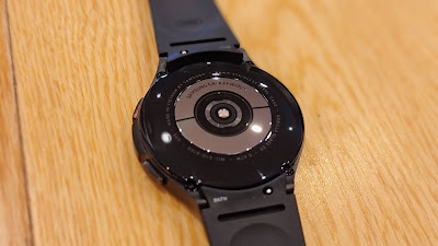
In fact, the Watch 4 Classic measures more than ever before - while the ECG functionality is yet to be activated in the New Zealand market, you can now run a full body composition scan - again, with disturbing results (if you’re me that is). By holding your middle and ring fingers on the two control buttons, you create a magical circuit that reveals your body fat percentage, skeletal muscle rate, fat mass, body water, BMI and BMR. This takes just a few seconds and in my case, the results are so horrifying I may actually have to start doing something about some of my more questionable lifestyle choices.

At least I walk regularly and occasionally run. (Very occasionally) And it’s here I ran into my first major issue with the new operating system. Now remember, this is now a bit like how a Samsung phone is setup - it’s an Android-based phone with Samsung’s own One UI on top. Same for the watch, it’s based on Google’s revamped Wear OS but the interface is actually Samsung’s One UI 3.0. This means it still looks and feels a lot like the previous Tizen-powered watches… but not quite. Yes, the pre-installed fitness app is very comprehensive, tracks more exercises than ever and even includes guided workouts - but it doesn’t look as good as it used to and I can’t get it to show me my split lap times while I’m exercising - only once I get back and look up my workout on the app.

Don’t get me wrong; I like new things… but only if they’re better things and while there’s no doubting the Samsung Health app is more powerful than ever - the actual interface on the watch itself is rather limited compared to how customisable the old one used to be.

I was also disappointed to discover none of my previous Tizen watch faces were able to be restored to the Watch4 Classic. Although, this disappointment soon faded away as I discovered the almost infinite selection of new faces available via the Google Play Store - many completely free. Oddly, this bold new world of availability doesn’t carry over to other apps like it does on previous Android-wear watches.

One thing I was really looking forward to with the Watch4 Classic was downloading apps like Pocket Casts, my preferred podcasting app, direct to my watch so I could access it more specifically than I can just using the generic media controller. Unfortunately, this isn’t possible like it is on previous Wear watches. It seems Samsung must have some strict criteria for app developers to meet in order to be ported over onto the new watch. While you can literally access the Play Store directly from the Watch4 Classic itself, only a limited selection of apps is available.

To be fair, my main gripe with Wear OS devices in the past has been trying to use poorly-designed apps that haven’t been customised properly for the form factor and it’s quite possible apps like Pocket Cast and Rocket Music Player are still being optimised specifically for this device and will indeed eventually be available.

And there are plenty of alternatives; Podcast Republic, Spotify, iHeart Radio and YouTube Music are all downloadable. The Spotify app works particularly well on the Watch4 Classic yet when I try to log into iHeart Radio, I’m told it’s “not yet available in my region.”

This is a feeling a get quite often when using the Watch4 Classic; that the best is yet to come. Not that it’s a work in progress - more like it’s a rocket ship waiting for its full payload.

Sadly, it might be time to say goodbye to Samsung Mail once and for all. It hasn’t been pre-loaded on the last couple of Samsung handsets, requiring you to download it separately from the Samsung store. While you can still get notifications from Samsung Mail on the Watch4 Classic, again, you can’t download the app so you’re limited to how much mail management you can do. On the other hand, there’s Outlook, waiting patiently to take over.

There’s no questioning the build quality and design - it looks fantastic and the rotating bezel controller is a tried and true and beloved Samsung watch feature. The display is bright, colourful and clear under all lighting conditions and the new interface is easier to navigate than ever. I certainly haven’t encountered any performance issues, so the processor-power seems more than ample and the range of sensors is enviable - from GPS tracking to my disappointing but believable BMI results, you can’t help but be impressed with the sheer volume of data available.

If you choose to use these sensors full-time, that’ll cost you battery life of course and again that’s one area where I haven’t seen a great deal of improvement. However, with smart watches I’m always of the opinion unless the battery lasts several days, you’re usually taking it off to charge while you sleep anyway - and there aren’t many watches out there that can do the sorts of things this watch does without needing a power-up at least every second night. Sure enough, the Watch4 Classic is no different.

In the end, I have to admit, this is probably the best watch you can currently pair with an Android phone - especially a Samsung phone. If you’ve owned a Samsung watch before, things will both look and feel familiar. If you were expecting the new Wear OS elements to blow your mind - they probably won’t - at least not quite yet anyway.

But…

Now you can use Google Pay with your Samsung watch. And for a geek like me, there’s nothing more Star Trek than that.


Click here for more information and pricing on the Samsung Galaxy Watch4 Classic.

Tuesday, 24 August 2021

When You're Considering Upgrading That Mic

There's no denying it; Working From Home isn't going away.

But there are frustrations, aren't there? Even if you've got a half-decent picture going for your online meetings, how are you sounding?

Are people constantly asking you to repeat yourself? If it's not a connection issue, it could well be a microphone problem. And that's before you get to the fact most desktop PC's and monitors don't even have a mic built-in.

A dedicated webcam may not even be the answer. If it's clipped to the top of your screen, that's a fair way away from your mouth hole - meaning a lot of background noise can sneak in between you and whatever mic has been built in.

Time to level up...


The first thing I can assure you about the Mdrill Zero from Thronmax is people absolutely love how it looks. Why this matters at all for a microphone, I have no idea. However, almost without exception, when people see my mic for the first time, either in person or when I attend some kind of online meeting, I'm immediately assured, "Wow, that's a cool mic!"

So if first impressions are important to you, especially when streaming or video-calling, it seems like the Mdrill Zero is a good way to go - who cares how it sounds? In fact, team it up with Thronmax's Zoom Boom Arm and you'll look like you're running your own home recording studio.

Which, you basically are.

If you're thinking it can't really be that simple, it really kind of is. That's because there's no special setup involved with the Mdrill Zero, other than plugging it into your computer via USB - and a very luxurious, braided USB cable it is too - nice and long to boot. There's no special app or software to install, simply plug it in and in most cases, your computer will make it your default audio input automatically. If not, it's a simple matter to do so via your sound settings.

At that point, you have a few controls at the ready on the Mdrill Zero itself.

The big dial is how you turn the mic on, setting it to either cardioid or omnidirectional. (Either picking up sound only from the front, or alternatively from all around) Cardioid is the best setting if you're the only one using the mic - which is probably most cases... video calls, live streaming, gaming, recording vocal tracks etc. Omnidirectional is your option for recording or broadcasting several people at once, or maybe a bunch of instruments.

Yes, I'm suggesting you literally can create a recording studio in your computer with this mic - that's how good the quality is. Oh, don't get me wrong - I work at a commercial radio station and I'm pretty sure the microphones we use on air cost a little more than the mere $140 or so the Mdrill Zero will set you back. Make no mistake, I'm not promising miracles. And yet, I can't help but be impressed by the sensitivity and clarity of this mic.

Thronmax claims to use something it calls VERTIGAIN technology, which is supposed to make the most of the fact sound waves travel vertically, ensuring those waves reach the Mdril Zero's three condensers "without being scattered by any microphone mesh." I have no idea how scientifically sound any of that is but the proof is in the sonic pudding.

I've conducted a heap of video calls - from Zoom to Cisco Webex Meetings - and I've come through loud and clear on all of them without exception. I've also recorded some guitar and vocals - for experimental purposes only, I'm not announcing an album or anything - and again, while perhaps not the most mellow or organic sound, it's pretty much all there.

The little dial with the V on it is a nice touch; it controls your playback volume - be that through  speakers or via your headphones - which you can even plug directly into the mic itself. Great news if your computer doesn't have an easily accessible audio-out.

Oddly, the LED ring around the larger dial is always on, once the mic is plugged in - blue for cardioid, green for omni and red for off. I would have preferred off for off but it is what it is.

The desktop stand that comes in the box is a sturdy, solid affair with a plush, padded base to help keep it in place and eliminate unwanted vibrations. Unfortunately, while you can tilt the microphone up to face you, there's no height adjustment which is why the Zoom Boom is such an attractive accessory. Like the mic itself, the Zoom Boom looks a lot more expensive than it is, like something out of a "proper" studio. 

It features dual-suspension springs on each boom arm to keep everything on just the right angle, it rotates through 360-degrees so you can easily swing it out of the way when you're not using it and it comes with plenty of hardware so you can choose to clamp it on or screw it into your desk. The Zoom Boom also has a nifty cable-clamp system to keep the lead in place and tucked away.

Like I say, this may not be the world's greatest sounding microphone (although, for the money, it's decent enough) but it definitely looks a million bucks. And these days, when so often your first impression is being made via webcam, that might actually matter.


Click here for more information on the Thronmax Mdrill Zero.


Click here for more information on the Thronmax Zoom Boom Arm.


Sunday, 22 August 2021

Is Our Future Foldable?

Right now, Samsung owns the folding phone market in New Zealand.

Although, till now, it's hard to say exactly how big that market could possibly be. The first two Galaxy Folds were pretty much the most expensive phones anyone had ever seen, priced well over $3000. Yes, the idea of a phone that folds out to become a tablet was cool but there was an undeniable fragility to them - almost an experimental quality that certainly made them fun to show off at parties but at that price, not so fun if you accidentally dropped yours in the punch bowl.

Samsung's introduction of the Galaxy Z Flip altered the folding landscape a bit - in some ways perhaps this is the device that should have come first; a more familiar form factor, reminiscent of the clamshell-style flip phones of yesteryear, except now with a folding internal screen, rather than a physical keyboard hidden inside.

Each new version of Samsung's folding phone has inspired more confidence, with more robust hinge mechanisms and more durable screen technology.

Now perhaps the third generation of the Fold is less of a risk and more of a dependable tool - and priced more realistically to boot...


I'll say one thing about the Galaxy Z Fold3; it's a head-turner. If I can return to that party scenario (remember when parties were a thing?) I've pulled the Fold3 out to show people photos and the response is invariably, "What the !@#* is that???" Followed quickly by, "That is so cool!" Then inevitably, "How much is it?"

Interestingly, this time round when I tell the interested party the RRP is $2699.00, the reaction is not a comical spitting out of the drink, sitcom style. Instead, most people start doing calculations in their head and I find I can almost read their thoughts as their eyes glaze over... Do I need a new phone?... How much did my last one cost?... This one is still about a thousand dollars more expensive... Maybe I could pay it off?... How could I keep my partner from finding out how much I spent?... I really want one...

How Samsung has magically managed to reduce the price by $700 isn't exactly clear - presumably it's a scale of production thing. I'm guessing the more you make and sell the cheaper they are to produce. The point is, this is a phone that's now competing with more conventional high-end flagships... as far as the price goes anyway.

There's certainly nothing left wanting in terms of the engine room either; the Fold3 sports the Qualcomm Snapdragon 888 chip - pretty much the best available right now - and a healthy 12GB of RAM. Admittedly, this is what it takes to pull off some of the nifty tricks a folding phone promises - things like apps resizing between the outer and inner screens so they can stay open, for example. 

The spinoff is, this level of processing power means you're never short of sheer grunt for any of the other things you want to do with this phone; shooting, streaming, gaming, multi-tasking - it all happens instantly, seamlessly and reliably. Just like Samsung's other flagships, the Fold3 runs One UI 3.1.1 on top of Android 11 - pretty much the most versatile, customisable and user-friendly interface available.

Apart from the new chip and the slash in price, there are two other big upgrades to discuss.

Firstly, the Fold3 now has an IP rating - IPX8 - that means it'll survive being submerged in 1.5metres of water for up to half an hour. Important to note this is not a dust-resistance rating, only water. That's still significant as I never really felt comfortable taking previous Folds running with me for instance, just in case I got all sweaty or ran into a bit of weather. Now that's something I don't even have to think about - or that party punch-bowl either.

The other big enhancement is S-Pen capability. There's a slight asterisk here, as you'll need the purpose-built S-Pen stylus with the retractable nib - this is to reduce the risk of damage to the protective cover on the internal screen. What's more, the S-Pen is an optional extra - it doesn't come with the phone or inside the phone like it has done in the past on Galaxy Notes. Instead, if you pay for a pen, you'll want to buy the case with the slide-on S-Pen holder too. Yes, I know this is all starting to sound a bit complicated but a lot of people complained they couldn't use a stylus on the first two Folds so this is Samsung's answer right now.

There have been other modifications of course - screen upgrades both inside and out, both now offering a smoother, more game-worthy 120Hz refresh rate. The outer screen is now pretty-much edge-to-edge and is covered in Corning Gorilla Glass Victus, the toughest available. Unfortunately, that's not possible for the folding, inner display although the new protector is noticeably firmer adding further to the feeling of durability this version of the Fold conveys.

Can you spot the new selfie-cam? (Look up and to the right of the lightbulb reflection)
The camera array is a little confounding - but then, neither of the previous Folds promised the ultimate photographic experience either. If you're not familiar with this form factor, it's worth pointing out there are two selfie-cams to deal with because of course, there are two screens. What's fascinating with the Fold3 is Samsung has debuted its first under-display sensor, for the internal front-facing camera. Essentially, this means no cutout or notch whatsoever, ensuring a more continuous viewing experience. The Samsung engineers have achieved this by no longer using a polarised layer in the screen composition in combination with a lot less pixels on top of the 4MP camera sensor. This means yes, you can still see where the camera is but no, unless you're looking for it, you won't really notice it anymore. 

Admittedly, there's quite a drop in quality here - although I'd argue not as much as some critics have been suggesting. If you can ignore the subject, these shots were taken with the under-display camera... not the worst I've seen be a long stretch.

Even Samsung itself has suggested this camera is there primarily for video chats, not stellar self-portraits. Besides, who cares when there are two other ways to shoot selfies with this device? Obviously, there's the more conventional 10MP cut-out cam on the cover screen but I don't really get why you'd use that when with the touch of a button you can easily utilise the triple-lens main shooter instead. Here's what one of those shots looks like instead.

No matter which of the five cameras you're using, the real beauty of this setup is, as usual, the Samsung Camera app. So many options, so easy to use. With features like Single-Shot and Director's View, it's still probably the best camera interface on any phone today.

So it's not the camera you're buying this phone for per se, more like the way you use it. And that's true of most things you do with the Fold3; even just browsing a web page or scrolling through your Insta feed in bed on a Sunday morning - it just feels a bit more immersive on that great big screen. Sure there are a few compromises here and there - a larger screen definitely chomps through your battery life, the cameras aren't the absolute best available and the S-Pen is useful without being totally integrated like it is on a Note - but none of those things matter when you're showing someone photos at a party.

Whether you choose Phantom Black, Phantom Silver or the new Phantom Green, none of your friends has a phone like this and that might be all the reason you need to take the plunge - especially now the Fold can literally survive a plunge.


Click here for more information and pricing on the Samsung Galaxy Z Fold3 5G.

Wednesday, 18 August 2021

The Big Upgrade That's Far Too Small to See

Well Dyson have really done it to themselves this time.

The Pure Hot+Cool was pretty much the perfect heater, combining the brilliance of Dyson's blade-free fan technology with everything its design team has learned about filters along the way.

The result, a Wi-Fi connected tower fan-heater that looks stylish, runs efficiently and can be controlled via app from anywhere.

It's a great heater (and fan). It warms most rooms within minutes and has more fan settings than you can wave a remote at. Blow hard or soft, or even out the back - schedule when you want it to turn off or on and keep an eye on exactly what's being filtered out of your air and when.

Sounds pretty awesome - and it is. So has Dyson found a way to make it even awesomer? How is that even possible?...


I have to confess, I'm not a huge fan of Dyson's naming policy. Admittedly, the Dyson Purifier Hot+Cool Formaldehyde accurately describes what it is... but zero points for creativity. What's more, it kind of ruins the surprise. I guess we may as well crack into it then...

Yes, Dyson has now come up with a way to filter formaldehyde out of your home. So... is that good?

Well, according to the C.D.C. in the U.S., formaldehyde is "an eye, skin and respiratory tract irritant. Inhalation of vapours can produce narrowing of the bronchi and an accumulation of fluid in the lungs." That definitely sounds like something to avoid if possible.

But what is formaldehyde? Where does it come from? Why would it be in my house in the first place?

It's a very effective fungicide, germicide and disinfectant and is sometimes used as such on a commercial scale. It's also the liquid you see in specimen jars in laboratories and is used as a preservative in mortuaries. Okay... but unless you've got some odd hobbies, that still doesn't explain how it would get into your house.

The answer is simple; plants and furniture. You got any plants and/or furniture? Then you've probably got some formaldehyde. It's very common for pressed wood products to be held together with a formaldehyde-based resin and a lot of furniture is constructed from some kind of pressed wood product.

The trouble is, at low levels, formaldehyde is almost impossible to detect - the particles are literally microscopic. Talk about your hidden enemy. That's where the Dyson team comes to the rescue.

Not only can the new Purifier Hot+Cool Formaldehyde sense the F-word - Dyson has invented a whole new kind of filter to destroy it at a molecular level. Come on - how baller does that sound? Dyson calls this process Selective Catalytic Oxidisation and the best thing about it is it uses oxygen from the air to regenerate so the filter never needs replacing. 

Formaldehyde, done.

That's on top of the more conventional HEPA filters, which grab practically everything else - not just dust and pollen but even bacteria and viruses. I don't know about you, but a machine that sucks bacteria and viruses out of the air sounds like it could be pretty useful right about now. Unfortunately, the HEPA filters will need replacing after a while - but the whole device is now HEPA H13 certified so you know for sure nothing's sneaking through.

Especially because the Purifier Hot+Cool Formaldehyde is constantly sampling the air around it - even when it's not running - and you can see the results via the Dyson Link app. This displays your air quality as an easy-to-read graph, which you can then split up into particle-size, Volatile Organic Compounds, Nitrogen Dioxide and of course, our chemical of the day, formaldehyde.

Suffice it to say, we're better off not inhaling any of those things if we can avoid it.

Oh... and there's the temperature too. Almost forgot this thing works as a fantastic fan and heater as well, with all the smart settings of its predecessor devices.

Fabulous device. Pity it's so ugly. There, I said it. White, silver and bronze? Seriously guys - can't we just have a black one and a white one and call it a day? Ah well, as long as it does the job - and it certainly seems too - who really cares about the colour combo, or the name?


Click here for more information and pricing on the Dyson Purifier Hot+Cool Formaldehyde.

Monday, 16 August 2021

The No-Frills Little Workhorse

Bells and whistles. Nice-to-haves, not have-to-haves. Doohickeys. There's a lot of stuff you can add onto a laptop to make it do all kinds of crazy things. Extra RAM and storage space are the easiest ways to give a PC more grunt. A whizzy processor and dedicated graphics card are good for gaming. Then there are display options... LCD? OLED? Touch? How 'bout those speakers?

And that's before you get to how the thing actually looks. Does it come in your favourite colour? Is it extra slim? Does it light up in weird places?

The real question is... do you need any of that stuff?

Do you want a laptop that turns heads, or just turns on?...


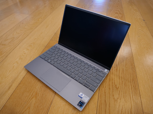
The Dell Inspiron 13 5310 might be the perfect compromise.

It isn't the lightest laptop around but it is light.

It isn't the most stylish-looking device on the market but it is attractive.

Its battery won't last forever but it does have good battery life.

What I like about it most is it does everything I want it to, really well.

This is due mostly to the 11th Gen Intel Core i7 processor. I've come across this latest generation of chips in several devices now and I've been impressed every time. Stutters, freezes and crashes just shouldn't happen and I certainly haven't experienced any using the Inspiron 13 5310.

The device I've been sent to review has a slightly unusual configuration compared to what seems to be available on the Dell New Zealand website - I'm running 16GB of RAM but without the dedicated graphics card - which actually just goes to show how far the Intel processors have come. The built-in Iris Xe graphics option is truly more than enough for my requirements - I had a fine time playing Outer Worlds yesterday afternoon, with no glitches to report. In fact, I had such a good time, I ended up playing more than an hour longer than I intended to when I was supposed to be working on this article. I mean, I was working on this article... just leaning a little too heavily on the graphics research while not really doing all that much typing.

The point is, not too many generations ago nobody would be suggesting you could run a resource-heavy first-person-shooter on an Inspiron. Now you can.

Although it doesn't look quite as luscious as it would on a purpose-built gaming device with a high-refresh-rate, 4K OLED display. Here we're dealing with a much more toned-down, 16:10 QHD+ screen that definitely still has its advantages. It's anti-glare and actually gets very bright, making it quite a good option for outdoor use.

Not a touch screen though - if that's something you definitely need, you'll have to look elsewhere.

In fact, I'm not sure I'd recommend the Inspiron 13 5130 as a video-streaming device either - not because of the screen but more due to the speaker array. The low-powered, stereo setup is fine - but there's limited dynamic range, not much bottom end and things tend to distort if you wind up the volume too high. No problem for video calls but not great for listening to your favourite playlist.

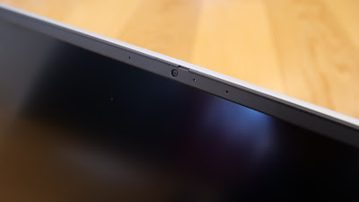
On the other hand, the 720p HD camera surprised me with its quality - even in backlit conditions - and when combined with the dual-array mics added up to a very decent video-call experience. There's a physical slide at the very top of the display's frame to shutter the camera for privacy - it's super narrow because, to be fair, all the bezels, while just ugly dark grey plastic, are extremely slim.

And that's something this laptop achieves quietly yet effectively - it's compact but not in a cramped way. This is most clearly evident when using the keyboard. I'm a fan of Dell's keyboard layout anyway and on the Inspiron 13 5130, although it's only a 13.3-inch device, the keys are really well spaced out and are nice and clicky. I've experienced next to no mis-types which is unusual for me; I'm a terrible typist. 

The dedicated power/fingerprint key in the top-right corner works well, although it's a bit frustrating you have to wait for the computer to boot into the login screen before it will read your fingerprint - many other devices are a bit more proactive and remember your print from the first touch of the button.

Another area where Dell is to be commended is port selection. There are plenty of small form-factor laptops out there with only one or two USB-C ports and not much else. On the Inspiron 13 5310, There's the usual headset jack, both USB-C's are Thunderbolt enabled, there's a full-sized HDMI port, as well as a nifty pull-down, full-sized USB 3.2 Gen 1 slot. Admittedly, you'll need to use one of those Thunderbolt ports for charging but not super-often - battery life is pretty good. Not world-beating but pretty good.

Which kind of brings us back to where we started; this is not the laptop that breaks all the battery life records, or aces all the speed tests, or has the flashest screen or the loudest speakers... but as a result, you'll save a few bucks along the way. You'll pay less but without having to compromise on the most important thing; the brain. That 11th Gen Intel Core i7 is what keeps this device from being just average and elevates it to a truly solid performer. Maybe the Inspiron 13 5310 can't pull off all the high-end, flashy tricks but it still has a few up its sleeve - like the newly updated Dell Mobile Connect app, which gives you fuss-free desktop access to your phone, regardless of whether it's an Android or iPhone.

I've transferred large files to and from various cloud services, I've edited long audio files and yes, I've been to the Outer Worlds, shot a bunch of Marauders and stayed there for hours on end. This is a computer that does what it does and does it well.


Click here for more information and pricing on the Dell Inspiron 13 5310.

Monday, 9 August 2021

PC Clean at a Nice Price

Why does everything slow down as it gets older?

Me, for example. Every day, basic tasks become more arduous. Some mornings, even the distance between the bed and the floor seems insurmountable... and that's gravity assisted - well, apart from the actual standing-up bit obviously.

There was a time when I could remember every item on a list without having to actually look at the list. Now I'm lucky if I can remember there's a list at all.

As for sleep; why can't I ever seem to get enough? When did it become the most important thing in my life? Did I always need this much sleep to function?

The more I think about it, the more I'm like a PC. As time goes on, memory fails, I slow down, I can't think straight and a take forever to get started. In fact, if I was a computer, you'd definitely be looking to upgrade me by now. I don't even think you'd get much for a trade anymore.

Sadly, unlike a PC, I can't just download an app to get me going again...


Norton Utilities Ultimate is a suite of computer tuning tools packaged together by NortonLifeLock - the renowned cyber-security specialists. Utilities Ultimate is not really about security though - instead, it lets you access a wide selection of settings, tweaks and protocols that can keep your PC running more smoothly, more efficiently and above all else, faster.

I've used products like this in the past because, when you like to fiddle around your computer's setup the way I do, it's not unusual to end up making things worse rather than better. Adjusting the wrong start-up behaviour or installing a program that uses up more of your PC's resources than it should is easy to do, yet can be a real challenge to identify - let alone rectify.

That's why I've really appreciated the stripped-back, easy-on-the-eye Norton Utilities Ultimate interface. When you open the app, a simple dashboard appears, offering you the option to analyse your PC to see if there are any issues that need dealing with. This only takes a few seconds, after which you're presented with a list of things that can be fixed up. These vary from broken registry entries, to unnecessary startup items, to misconfigured internet settings.

It's a pretty comprehensive catalogue and the first time you run it, you might be alarmed to discover just how much junk is lurking around just below the surface, clogging both RAM and ROM, not to mention tanking your startup speeds and contaminating your browsing experience.

You can then elect to "fix" all these issues automatically, with the click of a button, or investigate each one more thoroughly before taking action.

A lot of this stuff is already available to you as part of Windows... if you know where to look. You can list all the programs that run automatically at startup, for instance. But that's a slightly complicated process and when you get that list, you certainly don't get any information about how necessary those programs are and whether other users consider them important. This gives you a lot more confidence when it comes to turning them off - again, a super straight-forward, one button process.

It turns out many programs are set to check for updates the moment you turn your computer on - this can really slow down startup and is often unnecessary given those programs can usually be set to update when you start them manually. Utilities Ultimate makes all this extremely easy to see and understand.

Junk files can be tossed secure in the knowledge there's also an option to recover deleted data if you were a bit hasty nuking it - although, I certainly haven't encountered any issues to date. If you're still using hard-drives instead of SSD, there are defragging tools at hand to reorganise your data in a more efficient way and there are several options to delete files and uninstall programs permanently, which is good news if you share your PC with other users.

As a reviewer, I've often had issues resetting computers back to their factory settings before returning them - Utilities Ultimate has an option to help you do that too.

Gamers, editors and other power users will be most interested in the Real Time Boost section - this is where you can free up memory and increase write speeds, again with a single click.

There's one feature missing though - I would've like to have seen the option to check for driver updates, as out-of-date device software is often responsible for system slowdowns, stutters and crashes. Admittedly, many new laptops and PC's come with the manufacturer's tool to do this preinstalled but often it's tricky to find all the drivers you need on older machines.

On the plus side, Norton Utilities Ultimate is currently just $39.99 for the first year which allows you to use it on up to ten devices. Yep, ten. This makes it a fantastic family solution compared to many other similar packages.

The question is; does it work? I think it's well worth the price tag for the simple management of your startup programs alone - this is often where unwanted malware and resource-hogging update services will hide. With Utilities Ultimate, you can deactivate these startup pests easily and without risk. I've also found the Performance Boost options have noticeably improved launch times for many of my apps across the board and swapping between different programs definitely seems snappier.

Best of all, it only takes a minute or two to run and you're done - you can even set it to analyze your system automatically on a schedule of your choosing.

Yes, you can probably achieve a lot of this stuff manually by fiddling around with a long list of hidden settings but it'll take you much longer and if you don't know what you're doing, you might even make things worse. Trust me; I've been that guy.

If your PC or laptop is starting to feel like it's struggling to get out of bed in the morning, Norton Utilities Ultimate might just be the tonic to give it a new lease on life.


Click here for more information and pricing on Norton Utilities Ultimate.

Wednesday, 4 August 2021

At Last, a Camera that Connects

There's a long list of reasons why I'm woefully unqualified to be a tech reviewer. A big one is I know next to nothing about photography.

Lucky for me, phones these days take amazing pictures without you having to think about it. Well... fairly amazing pictures, anyway.

Okay, sure I'm aware there are still actual cameras out there and allegedly, they take proper pictures and shoot real video. But it seems like you need to be licensed to drive one and in my experience, getting the stuff you've shot out of the camera and onto your social feeds can be a real mission.

It looks like I'm in for a reality check...


If you're already into "proper" cameras, this is not the review for you. I'm not going to do a deep dive on specs and sensors and frame rates and shutter speeds because to be perfectly honest, I have no frame of reference. I've used a few DSLM cameras in my time... but only a few.

So I'm coming at the Panasonic LUMIX GH5M2 from the point of view of a total rookie... A smartphone-to-camera convert, if you will. As such, I can't even compare this camera to the original GH5, so please forgive me if I point out features that aren't as new and exciting as I'm finding them.

The LUMIX GH5M2 I've been sent to try came with a 12-60mm lens to test it with... yes, that's how flash I am now - I have a camera that doesn't work unless you screw another bit onto it.

Okay... maybe I'm overcooking the naive newbie act a bit but let me start by saying I'd forgotten how heavy these things are. The GH5M2 weighs in at 727 grams... and that's without the lens - so it's a solid piece of kit. Not in a bad way though... there's a rubberised durability to this device that inspires confidence - it's also spash and dust-proof which means it'll probably cope with a bit of weather. All the compartments (battery, SD card, external ports etc) seal up nice and tight to keep bad stuff like moisture out. I'm definitely impressed with the build quality.

My only real concern, hard-knocks-wise, is the 3-inch LCD monitor screen - and that's only because it pops out and flips over for selfies. Not that I've had any issues with this mechanism at all and on the plus side you can flick it back and tuck it away completely if you want to use the OLED Live View Finder instead. This has built-in eye detection so you can choose to swap between screen and view-finder automatically if you want.

In terms of controls, everything is well set out and within easy reach. If I was to be super critical, I'd have to suggest there may be too many controls! There's a button or a dial for pretty much every function - most of wich you can also access on the touch-screen itself. This doesn't really bother me, although it does mean things seem a little cluttered and I have occasionaly pushed the wrong button - swapping the view-finders instead of choosing a filter for example. This sort of thing is down to muscle memory though and I'm sure I'd make far less of those fat-finger mistakes after a few more weeks' use.

The double up of physical and virtual controls is obviously common to cameras like these as I've encountered it on similar devices in the past. Of course, in the case of the LUMIX GH5M2, there's a third option... remote control.

Using the LUMIX Sync app, you can easily connect your phone to the camera - and I do mean easily. Every camera I've ever used before that's promised to connect via bluetooth or Wi-Fi has failed dismally. For me there's nothing more frustrating than unreliable connectivity like that - often the connection takes forever to set up and then drops out when you need it most. Well, not this time. The LUMIX Sync app makes pairing simple and the connection is infinitely more stable than what I've encountered previously.

Once connected you have total functionality available to you via your phone's screen. Kind of essential given one of the GH5M2's big selling points is its ability to live-stream straight to Facebook or YouTube. In fact, the camera has a lot of little tweaks that add up to a very user-friendly streaming tool - you can plug in a power supply via USB-C while you're using it so you're guaranteed not to run out of juice mid broadcast. There's also a full-sized HDMI-out port for monitoring purposes and obviously jacks for external mic and headphones too. There's even an optional plug-in remote if you need a fourth method of control.

Connecting via the app also means you can browse and import images and videos so you can edit and upload to your feeds while you're on the go. Again, yes I realise this is a feature other cameras offer but in my experience, not at all reliably. Using LUMIX Sync with the GH5M2 has been nothing but fast, efficient and a pleasure.

As for picture and video quality... well... you'd expect something pretty decent from a $3000+ camera and the GH5M2 delivers all over the spectrum. Although I was surprised to find there's no built-in flash (once you've laid out out that kind of coin, what's another few hundred for a proper flash, right?) I was equally surprised how well the camera adjusts to low light shooting, even without one.

There are certainly more video shooting modes than I know what to do with - when it comes creating something cinematic, this is the real deal. The surprises kept coming here too; even without the use of an external microphone, the audio delivered by the built-in stero mic was crystal clear. There's even the option to reduce wind noise when shooting outdoors.

I love the fact there are two slots for SD cards and as I already mentioned, being able to charge the battery while you're using the GH5M2 is yet another way Panasonic has made this one of the more user-friendly cameras I've used - at least one that isn't built into a phone anyway.

At the end of the day, this is what sets the LUMIX GH5M2 apart for me; when I've forced myself to use DSLR or DSLM cameras instead of just my phone, that's always been exactly how it felt - like I'm forcing it. I don't like devices that make you use them a certain way - I want to do things my way. This camera gives me all the options I want... and more. But most refreshingly of all, the app actually works. Finally, this is a camera that seamlessly fits into my digital life instead of disrupting it.


Click here for more information on the Panasonic Lumix GH5M2 hybrid mirrorless camera.

Monday, 2 August 2021

JBL's Ear Gear Is the Real Deal

Not only have I reviewed more earbuds than any other kind of device over the last year or so, I feel like I've complained about it too much too.

That's not because I don't enjoy trying them out - far from it. No, the challenge is differentiating one set of earbuds from another. Frankly, most of them have more in common with each other than they do unique features and selling points.

Yep, it's a pretty crowded market.

And even when you're talking over-ear headsets, there are a lot of options too - sometimes even from the same manufacturer!

There was a time you could narrow things down a bit... ANC or not? Wired or wireless?

Now it's a bit more complicated than that...


JBL has quickly become a go-to brand when it comes to options - there are currently sixteen different models of True Wireless earbuds available on its website as I write this, so if there isn't a pair for you, it's possible you don't have ears. (No judgement, by the way. You just might need another way to listen to music)

That means if you weren't already confused about which buds were right for you, JBL has only made things worse. The good news is, I'm about to make things easier because I've tried a fair few of them now and the ones I'm using now might be the best yet... maybe the best JBL's anyway.

They're the Live Pro+ TWS and they caught me completely off-guard. Firstly, they look really cool... Well, if you have them in black, like I do anyway. While the earbuds are plastic, there's a kind of gunmetal, off-black finish to them which sets them apart from others I've used. (Don't worry boring people; they also come in white)

The squareish pillbox charging case is not the smallest I've encountered but it's curvy enough to be easily pocketed and it charges via USB-C or wirelessly - with a simple three-LED indicator on the front to let you know how much charge is remaining. While we're here, you'll get up to seven hours playback with the Live Pro+ with another 21 hours in that case. This is right up there with some of the best performing true-wireless buds on the market.

But it's the form-factor that has me rethinking what my preferences are when it comes to earbuds. The Live Pro+ are kind of a hybrid - at first glance they look like a stem-based, open fit but in fact, there are five different silicon tips to choose from to ensure a tight, passive noise cancelling seal. This is not only the first step towards keeping outside disturbances out of the mix but goes a long way to boosting the bass response, something JBL is usually pretty focused on. The result, for me anyway, is perhaps the most comfortable and secure fit I've experienced yet.

This is due to the tight seal of exactly the right sized tip combined with the weight of each bud comfortably balanced on the lip of each ear canal, positioned in just the right place due to the stems. I honestly think this best-of-both-worlds shape is my new favourite. I've certainly found them comfortable enough for many consecutive hours use and secure enough to last my 5km run without any adjustment. Everyone's different of course - hopefully I've been able to describe it enough to give you a bit of an idea.

I used to consider JBL earbuds to be more of a mid-range option but there's no compromise here - not in terms of appearance, fit and comfort anyway.

Meanwhile, in the over-ear range, the Live 660NC is not quite in the same league. 


One place there's still a little work to do is the comfort factor on this headset. Not that it's bad - I've just worn others that feel lighter and don't squeeze my skull quite so hard. Because I wear glasses and I have a truly massive head, I've found the Live 660NC does squish my ears a bit. Also, while the headband is covered in an attractive, woven material, there's not actually much padding, so the I've found the whole thing becomes a bit of an endurance test after an hour or so. At least it's light and the memory-foam ear cushions are very soft and I've found them quite breathable, so they don't heat up too much.

As for battery life, the Live 660NC offers up to fifty hours on a single charge. You can't ask for much more than that.

It certainly feels like a durable setup and build quality seems excellent. I appreciate the luxurious braided AUX cable but the carrybag included in the box is a weirdly tight fit, making it unnecessarily fiddly to get the headset in and out.

Time for a listen.

So the new Billie Eilish album... right from the track one, "Getting Older" - I was utterly entranced - by both the exquisite production of the track and the way it sounds on the Live 660NC. In Billie's (and brother/producer Finneas') usual style, everything is stripped back to its barest form, from bass to vocals. On that first song there are some pretty nifty, revolving stereo effects too and the Live 660NC does an impressive job of giving these video-game like effects the 360-degree, surround space they deserve. It's not just a matter of left and right, there's also a variation in distance that's pretty darn clever.

Most Eilish tracks tend to lean heavily on very deep bass hooks and the Live 660NC headset is certainly up to the task; these lowest of the low tones are clear, warm and powerful - really powerful - without any muddiness at all. Because the sense of space is so... well... spacious, it doesn't feel like the bass is overpowering the rest of the track either.

As I write this, I've been swapping between the Live 660NC over-ears and the Live Pro+ earbuds, just to compare things like ANC and bass response. The earbuds hold up surprisingly well, even providing some genuine bass pressure on some of the gruntier tracks that borders on uncomfortable at high volume. (That's a good thing, by the way. Loud music is supposed to hurt you sometimes)

Funnily enough, I thought the wheels had fallen off when I got to the penultimate track on Eilish's album, the title song, "Happier Than Ever." I was listening on the Live Pro+ earbuds and I assumed the over-distorted guitar mix had got a little too big for the 11mm drivers so I swapped back to the Live 660NC to check. No, turns out it was just a production decision to overload the mix and make it sound as noisy, jangly and angry as possible. I get it now. Irony.

You can customise both the Live 660NC and Live Pro+ using the JBL Headphones app - this helps you finetune the EQ to your satisfaction, select your voice assistant, adjust Active Noise Cancellation and for the Live Pro+ you can even test your fit and customise your on-board controls.

I'm stoked with the range of controls there are to choose from although it's a bit frustrating you can only delegate a certain type of control to each earbud. I have playback controls on the right and volume on the left. That leaves out voice assistant control and ambient sound control - you can't do it all with gestures so you have to leave some adjustments to the app.

Of course, the controls are physical buttons on the Live 660NC headset and are quite easy to find by touch when you're wearing it.

ANC seems pretty comparable on both devices - that means great. While not achieving complete silence, I certainly found the most annoying sounds - fans, keyboard tapping, conversation, engine noise - all these things are pretty much taken care of. While there is some detectable hiss when ANC is activated and there's no sound playing, this pretty much disappears as soon as you push play and it's worth it for the uninterrupted listening experience.

Interestingly, you can adjust the bluetooth connection for higher-quality music listening or more lag-free gaming and video - important to choose the right setting as there's definitely a slight delay on that music option.

As you can tell, both these devices offer a swag of features, they look and feel like genuinely high-end products, yet their price tags come in well below the flagship alternatives from some other brands. Don't get me wrong, depending on special offers, you're still looking at $250 and up but there are plenty of other headsets and true-wireless buds priced over three and even four-hundred dollars. Here, JBL proves you may not need to empty your wallet all the way to get the fit and sound quality you're looking for.


Click here for more information on the JBL Live 660NC wireless, over-ear NC headphones.

Click here for more information on the JBL Live Pro+ TWS true wireless noise cancelling earbuds.