Wednesday, 30 June 2021

Time to Clean Up Your Mesh

So you're working from home. Or some of the time, anyway. Or maybe you've got kids working on assignments. Maybe you've got kids who are aspiring professional gamers and have somehow managed to divert your entire home's internet resources towards that end - and into their room.

So you're at the other end of the house connected via some kind of extender. Trouble is, it's has a different network name and every time you want to print, you have to go back downstairs and connect to the other Wi-Fi.

What's more, you're trying to run all your stuff through that old extender your best friend's nephew lent you... your work laptop, your phone and yes, it'd be nice to finish the first season of Mare of Easttown somewhere in there too. 

And why is it sometimes your smart speaker will talk to you and sometimes it won't?

Definitely time to set up one of those mesh networks you've heard about... but how much new hardware does that actually require?

Maybe you can just replace that one old extender...


The first thing you'll notice about D-Link's new DAP-X1860 AX1800 Wi-Fi 6 mesh range extender is it looks so much nicer than those old ones. No weird antennae sticking out all over the place in fact, it's slim and subtle, with pleasingly curved edges and corners. To be frank... it's pretty nondescript. But isn't that just what you want?

I've said it often enough before but it's worth repeating; my ideal device is one that goes about its business quietly and efficiently without any fuss and preferably without being noticed at all. Potentially, the DAP-X1860 is one of those devices.

Firstly, setup could be as easy as pushing the WPS buttons on the extender and your router. Remember, this is a Wi-Fi 6 device, the latest Wi-Fi version, so you'll want to be sure the router (or other mesh devices) you're connecting it to is Wi-Fi 6 too. I've discussed the benefits of Wi-Fi 6 before - mostly it's about being able to support more devices on the same network simultaneously, ultimately leading to a more stable network with less dropouts.

You can also use the D-Link Wi-Fi app for setup, although I'm starting to get slightly frustrated with how long it takes via this method. When using the app to guide your setup, you're forced to wait for arbitrary periods so the device can do things like boot up and connect to your existing network - even when it's clear the DAP-X1860 has already completed these steps and is waiting for you to catch up. It's not a big gripe but I've noticed it's a common issue with the last few D-Link devices I've used and I would have thought it's something that would have been streamlined a bit by now.

You can choose to create your mesh network by connecting to the base router via Wi-Fi, or you can just use the DAP-X1860's ethernet port to create a Wi-Fi access poAint. You can also use the D-Link Wi-Fi app for firmware updates or to control connected devices - even scheduling when certain gadgets can and can't access the net. Best of all, you can turn the LED indicators off - there's a status light and a signal strength indicator - both only small but pretty obvious if you have the extender plugged in in a bedroom and it's the middle of the night.

In terms of performance, the DAP-X1860 definitely stacks up. I've tried it out a few different ways; as a hard-wired access point, as a mesh extender paired with the base router and as part of a mesh network with other devices. While I haven't experienced any earth-shattering speeds when connected through this device, I certainly haven't come up short either. Most importantly, I've found the connection to be rock solid - consistently strong and reliable and in these uncertain times, I'll take all the consistency and reliability I can get.

My only issue with this device is the same issue I have with so many plug-in devices; despite its supposed "Space-saving wall plug design," there is absolutely no way to plug the DAP-X1860 into a double wall socket and leave enough space for something to be plugged into the other space. It doesn't matter if it's a side-by-side or vertical power point, this thing will block the lot. It's all the more frustrating because if the plug part of the device was a bit deeper, this problem would be solved - sure, the device might stick a bit further out from the wall but at least you'd be able to power up that other thing you were going to connect to it.

That's pretty much my only issue though, other than a slightly sluggish setup app. The DAP-X1860 looks modern, is inconspicuous and it provides you with a fast, strong, reliable mesh network in a matter of minutes. That makes it a solid replacement for the best-friend's nephew's extender if you ask me.


Click here for more information and pricing on the D-Link DAP-X1860 AX1800 Wi-Fi 6 mesh range extender.

Monday, 28 June 2021

Confessions of an Anti-Apple Bigot

Okay, a bit of background. Although I've been doing these for many years, I've really only been half a reviewer. You might think I've covered it all... phones, watches, laptops, tablets, speakers, lights, games -  you name it, if it plugs in, charges up or connects to the internet, I've given it a go. Right?

Well... except for one pretty obvious omission; Apple.

For some reason I can't fully explain, I've always been out of the loop when it comes to Apple. Don't get me wrong, I'm certainly interested in Apple. I've followed all the launches and devices over the years and in fact, I even owned the first two generations of the iPod Touch (like the original iPhone, without the phone part).

My daughters both got a lot of use out of their iPod Nanos and they attended one of New Zealand's first BYOD-based schools, so they've been through a few iPads. 

The musician one now uses a MacBook while the exercise-junkie has an Apple Watch and iPhone permanently attached.

So I guess you could say I'm Apple adjacent.

Looking back, it's hard to explain exactly when or why I became an Apple critic. If I'm going to be totally honest with myself, I'd have to admit like most prejudice, it was probably born mostly out of ignorance. The more I used Android and Windows, the more I liked them, the more I assumed I didn't like Apple. I became the kind of person I usually despise; reading all the negative stories and reviews while writing off anything positive as biased propaganda. I'd even make fun of Apple users, laughing at them with my other Windows and Android-based friends - in effect, creating an echo-chamber that didn't really have too much to do with facts and more to do with propping up my own, ill-informed arguments.

Then recently I was presented with an interesting opportunity; to actually try some of this gear out.

Let me assure you, this was no quid pro quo situation. This isn't Apple flicking me a bunch of toys in exchange for some positive press. In fact, in my exchanges with the Apple representatives I've dealt with, not one of them has even asked what I'll be reviewing, how I'll be reviewing it or even if I'll be reviewing it all. I kind of got the feeling they just really wanted me to give it a go. So I did...


Deep down, part of me knew I'd have to end up eating at least some of my words but I tried to keep an open mind as I went about setting up an iPhone 12 Pro, an Apple Watch 6 and a bunch of AirTags.

Firstly, can I just say, they've definitely got the packaging thing right.

For you existing Apple owners out there, I get why you love this part so much. As a tech reviewer, I spend half my day taking things out of their boxes or worse, putting them back in to send them back. Take it from me, there aren't too many boxes that trigger an endorphin response like these white blocks of cardboard manage to. Each item is exquisitely protected and presented. It felt a lot like Christmas.

Shall we start small? AirTags are Apple's take on a concept that's been around a while; a small device you can attach to your most prized possessions so you can keep track of them. I haven't used any competitors' products, so I don't have anything to compare them to but I was keen to try them out because only the previous day, I lost my security card and couldn't get into work - always a pain at 3:45AM. It turned out to be lying on the floor of my car in the back seat but I couldn't see it in the dark. If only I'd had an AirTag on it. Using the Find My app on your iPhone, not only do you get a map with a pointer on it but if you have a phone running Apple's latest U1 chip, a mode called Precision Finding will lead you to the item's exact location - and I mean within centimetres. Better still, just make it play a sound. That would have been so handy at 3:45.


Of course, the true beauty of these devices is when something gets really lost - then Apple's impressive billion-device Find My network joins forces to locate your AirTag wherever it is in the world. In fact, if someone else finds it, they can easily send you a message to let you know. Friendly. But not too friendly. There's a bunch of privacy protocols built in so nobody else can track you and you can't track anyone else.

AirTags are quite reasonably priced and you can use them by themselves or attach them with funky accessories like key rings and luggage tags. Order them online and you can even get them engraved for free. This is my kind of device because it's simple and it works.

Okay Apple. You've got my attention.


I can't quite believe I'm using an iPhone for the first time. Obviously I've had a go with other people's but all these years I've never used one as my own.

I had concerns. Would the battery life be any good? I feel like iPhone owners are always complaining about that. Would I be able to use all my regular apps the same way I usually do? Worst of all... what if I actually liked it?...

To prove this isn't just some suck-up puff piece, I can honestly say I don't love everything about the iPhone 12 Pro. For starters, it feels kind of brick-ish to me. It's noticeably heavier than a lot of other handsets I've used recently and I'm not a fan of its sharp corners. No, I realise it has rounded corners - that shape's pretty iconic - I'm talking about the corners that run along between the back, sides and screen. I know some other iPhone models have been curvier than this and I think I'd find that more comfortable to hold. The surgical steel on those edges is pretty rock-star though and the rear camera module is not anywhere near as obvious as I was expecting. 

It's hard not to be impressed by the display quality and the 6.1-inch Super Retina XDR OLED display is very hard, thanks to a technology called Ceramic Shield - which helps protect drop damage. It looks amazing in all light conditions although the massive notch is still massive - that I don't get.

Unusual for there to be no fingerprint sensor on a phone these days but then the face unlock is so fast and reliable, I can't say I've missed it - and I love being able to use Face ID for things like logins and payments. There you go, I said it; I "love" something about this phone. Okay. There's quite a lot to love.

This is not a full-on phone review - after all, this is last year's model right? Let's just say, I'm both impressed and frustrated. I can't fault the performance - obviously Apple knows how to make a chip. Battery life has blown me away - most days there's still more than 70% in the tank by bedtime. I love the MagSafe accessories - especially the wireless charging - but I hate having to change to lightning cables instead of USB-C.

Moving from Android to iOS wasn't fun. There's an app but it doesn't help as much as I would have liked. Yes, all the important stuff migrated; pictures, contacts, messages and call history but no apps or settings at all - which was what I expected, given these are very different operating systems. Let's just say setting everything up again took a little while. On the bright side, I quickly made a stunning discovery; a lot of the apps I've been using for years were obviously designed for iPhone first, then mangled over to the Android platform. I can tell this because many of them work way better on the 12 Pro - especially things like my security camera notifications. These are much more reliable and come through quite a bit quicker now, making them a lot more useful.

I miss my old widgets - iOS now has widgets too, although there's a lot of catching up to do in terms of selection and how customiseable they are. In fact, my only real niggles with the 12 Pro are about customisation and compatibility with other devices but you know what? Apple is definitely starting to embrace both those challenges and I haven't been nearly as annoyed about it as I thought I would be.

I've found the camera on the iPhone 12 Pro to be slightly limited compared to other flagships I've used. Not so much in terms of picture quality - which I suppose is the most important thing - more in terms of the range of shooting options and the usability of the interface. Again, I'm not going to do a deep dive here - let's save that for the new iPhone later in the year. What I will say is, I've been more than happy with the pictures I've ended up with. I've just found it a bit more challenging to take them.

As for the Apple Watch 6? Simply the best smartwatch money can buy. I've tried a lot of them so I feel like I can say that with certain degree of authority. Everything about the Watch is great and try as I might, I couldn't find anything wrong with it. At all. It looks fabulous. It's comfortable to wear. It's easy to use. And pretty much everything on your iPhone is available to you on the Watch. For days after I first started using it, it kept surprising me with cool new tricks. Spotify? Podcasts? Exercise? None of it's a problem and everything's easy. My favourite? Paying for my groceries by waving my wrist over the key pad. Very sci-fi. A bit like the AirTags, the Watch 6 is my kind of design; it works reliably all the time. Admittedly, as many critics have pointed out, Apple might have a bit of work to do here in terms of battery life but lasting the day is all I ask and the Watch handles that with ease.

Oh and unlocking your computer with your watch is pretty nifty too... but that's a story for another day.

So what's happening here? Have I been turned? Have I suddenly become some Apple stooge, spurning all my previous years of Android and Windows fandom in one fell swoop?

Don't be silly. This is just me growing up and finally admitting Apple might actually know what they're doing after all. The real question is; why have I been taking this all so seriously? They're only toys. Ah, but such wonderful toys...


Click here for more information and pricing on the Apple iPhone 12 Pro.

Click here for more information and pricing on the Apple Watch Series 6.

Click here for more information and pricing on Apple AirTags.

Thursday, 24 June 2021

Turning Your Game Into an Experience

My favourite kind of tech? Things that work so well, you don't even really know you're using them.

I don't need voice responses and flashing lights. I just want it to work.

It's like the Wi-Fi for example. If you've got good coverage from decent routers then you don't need to think about it. It's only when it doesn't work the way you want it to that things get frustrating.

So much tech is like that - and I'm not just talking phones and computers.

A coffee machine that pours the perfect morning latte at the touch of a button has got to be preferable to faffing around grinding, tamping, pouring and steaming, right? Power tools that run reliably on a good battery are just so much easier than dealing with a petrol can or an extension cord.

And because I'm not really a gamer, you've got to make it easy for me or I'm going to go and find something else to do...


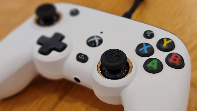
When I plugged in the new RIG Pro Compact controller, then plugged in the RIG 500 Pro HC Gen 2 headset into that... well... the real world just went away.

It's been a long time since I spent a long time playing computer games. Usually there's a nagging thought in the back of my mind that there's probably something more important I should be doing. But pretty much from the moment I flapped away on my giant bird in the Falconeer, time lost all meaning and this became the more important thing I should be doing.

First, let's have a little look at this gear - it's pretty impressive. RIG has been putting together gaming accessories since 2015. The company's ethos is all about "competitive performance" - building devices specifically to give users an edge, either over their competitors or the games themselves. Like good sportswear, the idea is performance first, everything else second. This has led to a reputation for products that not only work better but last better too - with considerations like durability and comfort taking precedence over aesthetics and pretty lights.

No wonder Nacon snapped RIG up recently. As Europe's leading manufacturer of third-party PlayStation controllers, RIG was a great fit - excuse the pun.

Don't get me wrong about how these things look by the way... I think they look fantastic. The 500 Pro HC Gen 2 has a kind of brutal, industrial quality to it - all steel and webbing - almost like something they'd wear to pilot those magnetic hoverships in the Matrix. Everything's modular and fully adjustable - you can even remove the earcups completely should you need to replace them. The two-piece headband design ensures a perfectly balanced distribution of weight. I'd go so far as to say when you're wearing the headset it feels like it weighs almost nothing at all. This is complimented perfectly by the dual-material ear cushions - both plush and pleather, the best of two feels combining to keep things cool and comfortable, even after hours and hours of game play.

The passive noise isolation is great and purchase of the Pro Compact controller earns you a Dolby Atmos membership, so you can take full advantage of the 360-degree effects many games are now mixed with. Nowhere is this more useful than during my Falconeer dogfights - mid-air battles are the ultimate 3D combat environments and using these headphones means I can hear my enemies wherever they're attacking from; above, below or behind - and react accordingly. You see? This is the kind of competitive advantage RIG gear has always been designed for.

Mic quality is actually pretty decent too - the very bendy boom flicks up out of the way when not in use and unlike the after-thought mics you find on many headsets, the sound quality here is definitely just as useful for your next Zoom meeting as it is in the heat of gaming combat.

The 500 Pro HC plugs into the Pro Compact controller via a generously long, tangle-free, ribbon cable. The controller, in turn, sports a whopping three-metre, high quality, braided cable which gives you plenty of space between you and your Xbox console or Windows PC, while still maintaining totally lag-free, wired performance.


The name is slightly misleading; the Pro Compact is not dramatically smaller than any other controller, it's more the layout that's compact, meaning you can move from button to D-pad to joystick just that little bit more quickly. Certainly I've had no issue changing stations on my car radio while drifting through icy corners playing Forza Horizon 4. In fact, this is a game where the combination of total control, awesome surround sound and thunderous haptic feedback combine to create the surreal out-of-body experience most gamers crave.

Set to their maximum, the vibration motors are almost capable of rumbling this thing right out of your hands. This means you actually struggle for control on the dirt and shingle roads of Forza Horizon 4 and you really feel it when you smash through roadside walls and flip down banks. I love it.

In fact, you'll have no issue keeping a grip on the Pro Compact as it's very ergonomically shaped and has a unique textured surface on the back. Only thing is, there's a choice of white or black and I went with white - I'm wondering if this was a mistake as surely that textured surface will be coated with my gross hand goobies in no time. Look hard at the picture and you'll see a few small bits of dust and fluff adhering themselves to it already - and I took that pic straight out of the box!

The Pro Compact app makes this one of the most customiseable controllers I've used too. I like the way the simple interface is actually navigated by the controller itself. Not only can you remap all the buttons but you can adjust the range for joysticks and triggers, not to mention the intensity of vibrations as I just mentioned. There are even preset settings you can choose for different styles of game - what works well for racing might not be the ideal setup for hand-to-hand combat.

Like the 500 Pro HC headset, after using it for a while, the Pro Compact feels so comfortable and tuned to your needs, you kind of forget you're using it. For me, this is the ideal scenario - I want accessories like these to be as invisible as possible, completing the illusion you've become part of the game. 

Best of all, these are not bank-breakers by any stretch of the imagination. At $149 for the headset and just $99 for the controller, I really urge you to consider RIG if you're looking to enhance your gaming experience.


Click here for more information on the RIG Pro Compact wired controller.

Click here for more information on the RIG 500 Pro HC Gen 2 gaming headset.

Monday, 21 June 2021

How Smart Can a Speaker Get?

There must be a lot of pressure when you design tech gadgets... especially when everybody already loves the ones they already have. Commercially, it's understandable a brand needs to keep innovating and reinventing itself, otherwise sales will eventually slow to a standstill.

If the evolution of the smartphone has taught us anything, it's that many consumers aren't satisfied with owning a product that works - they want the newest version available, with the very latest features.

Of course, this phenomenon is nothing new. Take cars for example; some people are happy to drive their trusty, second-hand set of wheels till those wheels fall off, while others must have the new model the moment it comes out, every single year.

Other big-ticket items are more utilitarian. I've never heard of anyone rushing out to replace their perfectly functional dishwasher or clothes dryer just because the latest design has hit the shelves. Most normal people wait till those things break down or at least until they're redecorating.

My question is... does that apply to smart speakers too? Do you think of your sound system as a luxury sports car... or a toaster?...


Amazon has definitely taken an "if-it-ain't-broke" approach to its second-generation versions of the Echo Show 5 and Echo Show 8 smart speakers. Certainly, to look at, I was pretty confused when I first took them out of the box - without seeing them side by side, both devices look almost identical to their predecessors, other than the fact the Echo Show 5 is now available in Deep Sea Blue as well as Glacier White and Charcoal - although the blue version might be a bit hard to come by here in new Zealand. Whichever colour you choose, it's good to know Amazon is now using a lot of recycled materials in the construction of the devices which, when you're as big as Amazon, makes a massive difference.

To be honest, the colour isn't a major issue - if you've seen one of these Alexa-enabled smart displays before, you'll know the front is all screen anyway - albeit with fairly sizeable bezels. None of that has changed - although the screen quality has definitely improved somewhat - especially on the Echo Show 8.

Only trouble is, in New Zealand, there's not much to watch.

Don't believe everything you read on some retailers' websites - services like ABC iView are not available in this market and while you can stream audio from other devices to the Echo Shows, there's no way to cast video, so you're pretty much limited to Prime Video, Netflix and anything you can access via the built-in browser. (Please note, a previous version of this article stated Netflix was unavailable but Amazon has since updated the devices to enable it)

This will be fine if you ask Alexa to find you a recipe for lasagne, just don't expect to binge-watch your favourite show unless it happens to be on Prime Video or Netflix. To be fair, even the larger, 8-inch screen isn't really comfortable for a prolonged watch - although it turns out it's fantastic for video calling.

Now before you get too excited - I'm not talking about taking Zoom or Teams calls here - although once again, it seems Zoom may actually be an option in other markets - but if you have contacts with Echo devices themselves - or even just the Alexa app on their phone - you can ask Alexa to give them a bell. In fact, Alexa now offers a Group Calling function so up to seven friends or family members can be on the same call at once. In the coming months Amazon is also introducing in-call AR effects, so you'll be able to shower people with virtual confetti or lovehearts with a touch of the screen.

One very noticeable upgrade to these 2nd-gen devices is the camera quality - doubling from a paltry 1MP to 2MP on the Echo Show 5 but a massive improvement from 2MP to 13MP on the Echo Show 8. That's a pretty decent camera now and it also pans and zooms digitally to keep you as close to the centre of the frame as possible, even if you're moving around the room. Conversely, there's a physical privacy shutter for peace of mind and muting the mic turns the camera off too.

Don't be too hasty with that though, as the new Echo Shows will also appear in your list of Alexa devices as cameras - meaning you can access them remotely to check on things when you're not home. Unfortunately, this isn't super useful where I currently have the Echo Show 5 - on top of the microwave in the kitchen. Because of the angle of the screen, all I see when I activate the camera is the kitchen ceiling. Good to know the kitchen ceiling's still there, I guess?

The other significant improvement is sound quality - both speakers sound better to me, warmer and fuller. The Echo Show 8 now sports a stereo speaker array and provides a pretty decent, room-filling, ambient soundtrack. As always, you can literally fill your house with Echo speakers and group them easily for a cost effective, whole-home sound system. The on-screen interface has become more user-friendly too - especially for linked services like Spotify. There are now more easily accessible suggested playlists - perhaps a concession not everyone wants to subscribe to Amazon Music.

Interestingly, both new speakers have lost their 3.5mm AUX jacks - so you no longer have the option of connecting them to exterior speakers or headphones. Based on my own experience, I'd say Amazon realised nobody was using this feature much so it wasn't really worth continuing. 

Of course, other than streaming music, the other main purpose for devices like these is controlling your smart home. Again, this is something Alexa gets better and better at all the time. Small caveat here; not every smart device is Alexa enabled - just most of them. Make sure you double check before stocking up on bulbs or security cameras. Speaking of which, both the Echo Shows are a great way to monitor your cameras or your door-cam, just by asking Alexa to show you.

My main issue has been getting Alexa to listen to me. If there's been any improvement in the performance of the far-field mics I haven't seen it. The music doesn't have to be up very loud before Alexa simply ignores your voice commands and you're reduced to shouting across the room or having to actually touch the device to control it. How last decade.

But if that's my only gripe, it's certainly not a gamebreaker. The Echo Show 8 and Echo Show 5 are priced pretty fairly, especially given they have been upgraded in terms of screen and sound quality - not to mention the dramatically souped-up cameras. It's frustrating we still don't have access to the video streaming services other markets do but that could change in the future.

Have either of these devices been upgraded enough to warrant turfing your first-gen models out and replacing them? No, probably not. But if you're looking to expand your Alexa system into other rooms around your home, this is a good time to do it. And if you haven't jumped on the smart-display bandwagon yet, these are certainly great options to get you started.


Click here for more information and pricing on the Amazon Echo Show 8 (2nd Generation).

Click here for more information and pricing on the Amazon Echo Show 5 (2nd Generation).

Wednesday, 16 June 2021

The Greatest Buds Since the Last Ones

Back in 2019, when Sony released the WF-1000XM3 I was both impressed and confused. 

I think these were probably the first buds I'd tried to feature Active Noise Cancelling technology and being Sony's ANC, it set a pretty impressive benchmark few have managed to match since. Sony has been pushing hard to set the standard when it comes to ANC, with both its over-ear and in-ear headsets. Not to mention the brand has already established itself as a senior player when it comes to overall headphone sound quality - after all, who was really using earbuds to listen to music before the Walkman came along. What's a Walkman?... Shut up, kid.

Anyway...

Unfortunately, with the WF-1000XM3, I felt Sony had put so much effort into making the experience sound great and above all else, noise-free, they'd forgotten about some of the other stuff... like appearance, fit and durability.

In fact, for many consumers, how their wireless buds look, feel or last is even more important than how they sound.

So after setting the standard for ANC, it was time for Sony to lift its game...


Right off the bat, it's easy to see Sony went right back to the drawing board with the WF-1000XM4 buds.

For a start, they're buds - not weird, surfboard-shaped tabs like their predecessors. While balancing the previous, oblong models in your earholes left plenty of space for the Sony logo, it just felt plain odd.

Also, because there was no IP or IPX rating, wearing them out in any kind of weather or while exercising risked water damage which is not really what you want from a pricey piece of kit like this.

In fact, if asked I would have actively discouraged anyone from purchasing the older model if they were planning on using them while running or at the gym.

That's all changed now - and I do mean all.

The WF-1000XM4's carry an IPX4 water resistance rating, so you no longer have to worry about splashes or rain or sweating them to death. Today I actually went running in the rain to test this. Unpleasant, but there's nothing I wouldn't do for you. Most importantly, the new form-factor is much more conventional, meaning the fit is much more secure - not to mention way less crazy-looking.

With a caveat... you have to know how to wear them. That may sound strange but it wasn't until I read about one crucial step in another review I realised I'd been using the WF-1000XM4's all wrong - so listen up, this is an important Public Service Announcement;

When I used to work on my dad's apple orchard, I used to operate a lot of very loud, heavy machinery. This meant wearing ear plugs to protect my hearing. For those of you who haven't tried them before, earplugs like that are made of a special kind of plasticky-foam material that you roll between your fingers to make them narrow enough to insert into your ears. Then you hold them there for a few seconds while they return to their original shape, thereby creating a virtually airtight seal against the noise.

Unbeknownst to me, the tips on the WF-1000XM4's work the same way. Before inserting them, you need to squash them a bit so you can get them in properly, then hold them in place for a moment while the tips expand again. Normally, I use the medium-sized tips most earbuds come fitted with straight out of the box but in this case, because I didn't know about the squashy-insert technique, the mediums were a fail and I went with the small tips instead. This was comfortable but not that secure. Because, as it turns out, they were the wrong size.

You see? I'm a medium after all.

Once I had the buds fitted properly, it was a whole new ballgame. There's no point offering the world's best ANC if your Passive Noise Cancelling is rubbish, due to a loose fit. Now what I can assure you is Sony's new Integrated Processor V1 does a simply incredible job of running the noise reduction, once again setting the standard for other manufacturers to follow.

This doesn't just mean cutting out all the noise all the time - although you can do that if you want. After pairing the WF-1000XM4's with your device, either manually through your bluetooth settings or via the automatic pop-up window on late model Android phones running the latest OS, you can then use the Sony Headphones Connect app to access a raft of settings and customisations. The WF-1000XM4 is one of the few earphones that can intelligently monitor your surroundings to alter the level of noise cancellation accordingly - these buds can even learn your locations and automatically adjust that way.

Personally, I prefer total noise cancelling all the time, so I've deactivated the auto sensing - there's also a voice detection option just like on Sony's over-ear models. This lets in ambient sound when you start speaking so you can have a conversation without removing the earbuds. People in offices find this sort of thing useful. I'm not a person in an office.

One feature I haven't turned off is Automatic Wind Reduction - this is because without it, I've found the WF-1000XM4's are particularly prone to catching the wind, possibly due to those small, bronze highlighted mic cavities you can see in the images. These protrude in a way I'm sure helps pick up your voice clearly on phone calls but as I say, if there's a breeze, you'll know about it. Just as well Sony's figured out a way to block that noise out.

The Headphones Connect app also lets you do things like choose your voice assistant, change your EQ settings and test the fit (just in case you haven't got the squish-and-insert thing right yet). If you subscribe to a streaming service that supports 360 Reality Audio, the app will even guide you through a setup process that actually takes pictures of your ears to optimise the results.

What I like is how you can customise the touch controls on each earbud - I'm using the left one for volume and the right for playback - but you can choose to toggle noise reduction or turn off the controls completely if you prefer. You can access your voice assistant too but only Amazon Alexa or Google Assistant - Siri doesn't seem to be supported.

If the sound quality on the previous model was standout, needless to say, it hasn't got any worse two years later. Thanks to the sealed fit, bass response is even better than ever. When listening to "It Hurts!" by San Holo, its weird electro bass track almost makes it sound like you're inside the speaker - weird in a good way. There's also a convincing sense of space - even without 360 Reality Audio. "Jeff Beck's Guitar Shop" is a fun instrumental jump back in time, packed with fantastic technical production, lots of stereo effects and some truly wild guitar licks. I turned it up real loud and blew my brains out. Good times.

Battery life is another first class feature here - up to eight hours from the buds themselves and two more full charges in the case. I consider anything around that 24-hour level to be excellent - especially given the relatively small size of the buds and the dramatically smaller charging case. The previous model was bordering on ridiculous - and ugly. This year's is about as compact as it can be and is easily pocketable. It supports fast charging and will also charge wirelessly. There's an LED display that changes colour to show you when charge is getting low and usefully, you can see exact percentages of battery levels on the app - for each bud and the case.

With the WF-1000XM4, there's no doubt Sony has ironed out the imperfections of the WF-1000XM3. These are now a good option for exercise, thanks to their vastly improved fit, more compact form factor and improved water resistance. The app, noise reduction and customisations are more comprehensive than ever and the charging case has also evolved out of sight. At a rather steep RRP of NZD$499.95, this has simply got to be a premium product and yes, I think Sony has delivered the goods, albeit in a somewhat underwhelming, recycled cardboard (but oh so sustainable) package. Once again, they've set the standard for the others to live up to. Just don't forget to squish.


Click here for more information and pricing on the Sony WF-1000XM4 wireless noise cancelling headphones.

Monday, 14 June 2021

A Smarter Smile... but at a Price

How much are you prepared to pay for a better oral hygiene solution?

Now, before you answer, take a moment to really think it through. If there was a way to significantly reduce all those mouth nasties we don't like to think about; plaque, tartar, bad breath, yellow teeth... surely that means less time at the dentist, right?

And less time at the dentist means more money in your pocket - that's just basic economics.

But still... who in their right mind would pay over $700 for a toothbrush?...


Yep, the Oral-B iO 9 Series has an RRP of NZD$769.00.

When I read that, I assumed it was a typo but no, that is indeed what some retailers have been selling it for, although there are some pretty drastic specials around if you stop and do a bit of comparison shopping.

What you're dying to know is; what could this brush possibly do that others don't?

Actually, as it turns out, a few things.

Firstly, there's no doubt the Oral-B iO 9 Series is a premium personal appliance. From the thick, printed cardboard packaging to the weight and solid feel of the device itself, everything seems well thought through and extremely durable. Oddly, this isn't always the case with bathroom accessories. When you're surrounded with water and hard, slippery surfaces, you'd think more items would be built to look and feel as good as this does. 

The matte finish makes the brush easy to hold, even when wet. The heads slide on and off easily, yet stay securely in place. And while the black colour may not be everybody's cup of tea (not very patriotic of you if it isn't) believe it or not, you can customise the LED ring that lights up around the collar of the brush to the colour of your choice - but more on that stuff later.

I don't love everything about the build though. Yes the magnetic, wireless charging base has its advantages - it takes up very little bench space and because it's convex, rather than a container you sit the brush in, it doesn't get quite so dirty and mucky, filling up with disgusting, excess, toothpasty/drool stuff over time. However, because it's convex, rather than a container you sit the brush in, I keep knocking it over. I'm a klutz that way. Perhaps Oral-B could go with a slightly stronger magnet for the 10 Series?

My other main gripe is the size of the head. Compared to other electric and sonic brushes I've used before, the stem between the body and the brush seems quite a bit thicker and it took me a few days to get used to jamming it in my gob without the urge to gag. Maybe I don't have a very big mouth, although I've been reliably informed I have... on multiple occasions. I do worry if you have a more petite puckerer, you might struggle with this one.

Although, it's probably worth the struggle because other than visiting the dentist, my teeth have never felt cleaner than after the very first time I used the iO 9 Series. Yep - right from the first time. You know that sensation you have after the dentist, when your teeth are suddenly super smooth and you feel as though you can almost run your tongue through the gaps between each tooth? Like that.

To achieve this, it seems Oral-B has combined several technologies to create the ultimate brush head; from the unusual twisted bristles with their "high-density tuft-in-tuft" configuration, to the quiet-yet-powerful linear magnetic drive, to the fact it doesn't just oscillate, or rotate, or vibrate - it does all three.

There are only two controls on the brush, with these you can choose from a wide selection of brushing intensities - from a gentle tongue clean right up to... well... INTENSE. This ultimate setting is kind of brain-rattling - in a good way - and this is where the iO 9 Series really starts to smarten up.

Over-brushing is a real issue - even with manual toothbrushes. People can damage gums and enamel if they get too carried away and brush too hard over time. The iO 9 Series senses this and the LED indicator flashes to let you know if you're getting too into it so you can immediately lighten up.

Like most electric brushes, the iO 9 Series guides you through a two-minute routine, pausing briefly every 30 seconds to remind you to move on to the next quadrant. Unlike other brushes, it'll keep going after two minutes until you switch it off - although by that stage you will have earned yourself a nice, friendly smiley-face on the colour screen.

Oh, didn't I mention this brush has a full-colour display? And you thought it was expensive.

The screen is actually pretty useful - you can track your progress with the quickest of glances in the bathroom mirror. It also shows you a precise readout of your battery level. This is important, because battery-life on this thing isn't great. Ironically, that's probably due in no small part to the fact it has a colour screen on the handle! Maybe I'm being overly critical here - Oral-B reckons you'll get up to two weeks on a full charge but I like to brush three times a day and I'm struggling to get through one full week. Not an issue if you've got the power-point space to leave it plugged in and on the stand - it's designed to be used this way and won't over-charge the battery.

There's also a pretty fancy travel case included in the box, with its own power cord. You get a spare head too, so two people can share the same device if you like, keeping both heads in the included stand with a lid. Interestingly, there are no other accessories - no specific tongue-cleaning, denture or braces heads. Perhaps this is a one-head-fits-all solution - I don't have braces or false teeth so I'm not sure.

But if simply being a really amazing toothbrush isn't quite enough to justify its expense, maybe all the built-in AI is.

I've used brushes that connect to apps before but nothing anywhere near as comprehensive as this. The Oral-B iO app isn't just a way to log the frequency and duration of your brushing, although it will do that without you even having to ask it to. It has an incredibly well designed, guided brushing routine, with easy-to-follow graphics that leave you in no doubt exactly where you have and haven't brushed. This is why you can keep going past two minutes - which, let's face it, is just an arbitrary number we've all signed up to for some reason. There's no point brushing the inside of your back left molars for the full two minutes and then stopping, right?

With the iO app, you can clearly see when to move on and where to. There's a selection of challenges to target things like fresh breath, whitening and gum care. These incorporate prompts to floss or mouth-wash as well as just brushing.

The app will remind you to charge your brush or replace your heads and yes, there are medals to be earned, if that's your thing.

All of this makes one of life's most mundane tasks more challenging, rewarding and yes, possibly even a little bit fun. Certainly achieving that "post-dentist' feeling in your own bathroom is amazing and if it leads to less actual dentist time, perhaps the iO 9 Series won't take as long to pay for itself as you might think.


Click here for more information on the Oral-B iO 9 Series rechargeable electric toothbrush.

Wednesday, 9 June 2021

Keeping Sound Simple

I was a late adopter when it comes to soundbars. There's a couple of reasons for that; a) for years I had my TV plugged into a reasonable multi-speaker home theatre system and b) I didn't really believe they worked very well.

Other than providing a bit more bottom end and perhaps more sheer volume, what was it a single soundbar was likely to offer I wasn't already getting from the TV's own built-in speaker array?

Then a few things happened to change my mind. First, TV speakers got bad. Really bad. This was due largely to the push to develop ever more slim displays, creating the illusion of a screen and nothing else. If your telly is all picture, that doesn't leave much room for decent speakers. This meant if you chose cutting-edge vision, you'd be pretty much forced into investing in a soundbar to beef up the audio side of things to match.

Another advance that made soundbars more appealing was the evolution of wireless technology, enabling us to our own create multi-room sound systems without having to conceal wiring in walls or under the floor. Incorporating a quality speaker by my TV into a system like that meant I could achieve a great ambient soundtrack in my home, wherever I happened to be.

Also, the worse built-in TV speakers became, the better soundbar technology got and now beamforming has become quite an art - creating the illusion of stereo, space and height from one central source.

I was still sceptical... then I heard it. There's definitely some good gear out there but as always, it comes at a price. Or does it?...


The first thing that struck me about the JBL Bar 5.0 Multibeam was its size... or lack of it. I've certainly been blown away by several soundbars recently but they've all been massive things - usually over a metre wide and sometimes too tall to fit neatly under the TV they're connected to.

The Bar 5.0 Multibeam measures in at just over 70cm and is just 2.3-inches tall. This means it should fit anywhere and would be a great companion to a smaller-screen. After all, just because your TV is little, it doesn't mean your soundscape has to be. There's some wall-mounting hardware included in the box and again, it'll be quite a relief to be able to conserve as much wall-space as possible with this compact option.

Everything about the physical design of the Bar 5.0 Multibeam errs towards minimalist, bordering on industrial. There's a metallic theme, both in appearance and feel - no fabric speaker coverings, all metal speaker grilles instead. In fact, it's mostly speaker grille with one of the smallest control panels you're likely to see set into the middle of the top. 

Even the accompanying remote control is nothing flashy; as few buttons as possible in a subtle matte finish which actually feels quite pleasant to hold.

There's not much of a visual display on offer here either, which suits me. A non-intrusive, white LED readout lights up when the soundbar turns on or you are adjusting the settings then it quickly disappears - with no other distracting lights or indicators to be seen. Me likey.

But enough of how this thing looks. It's not a lookbar. Let's fire it up.

Setup can be as easy as plugging it in and connecting it to your TV via the HDMI eARC socket which should let your TV remote take over its operation. There's another HDMI port if you want to add a further device or you can connect via optical instead.

There's no dedicated app for the Bar 5.0 Multibeam, so if you want to avail yourself of its Chromecast, Alexa or AirPlay abilities, you'll have to set it up via the Google Home app. This is very straightforward and once its connected to your home Wi-Fi network it'll appear on any Alexa, Chromecast or AirPlay compatible apps. Obviously, you can also connect to the soundbar via bluetooth too.

What's less straight-forward is adjusting the settings after that. I'm not big on instruction manuals but it'll pay to keep yours handy as many of the controls for the Bar 5.0 Multibeam are almost hidden, relying on pushing buttons for a certain amount of time or pressing a combination of buttons simultaneously. Good luck learning each combo off by heart.

For instance, to calibrate the multibeam performance to your room, you'll need to hold down the HDMI button on the remote for 5 seconds. How would anyone know to do that without reading this review? (Or the instructions)

Be sure to do that though, as this is really the only way to get the most out of any stereo or height effects. Which are, as it happens, very good. If you'd shown me a picture of the Bar 5.0 Multibeam I'd never have believed how well it manages to fill a room, from top to bottom, bass to treble. This is mostly because it's literally jam-packed with speakers; five racetrack drivers and four 3-inch passive radiators combine for a beefy 250W output with plenty of boom.

That's not to say you're emulating anything like the bass performance of a decent subwoofer but there's plenty of oomph here for things like car crashes, gunshots and explosions, not to mention more than enough of a big beat to dance to - and bass is one of the few settings you can control.

While there's no way for a single speaker unit, placed below the TV to match the surround effect of physical, rear mounted speakers, while using the Bar 5.0 Multibeam, I've often caught myself being completely caught up in the action of what I'm watching, without thinking about where the sound's coming from at all. I'm of the view that's exactly what you want from your speaker system - if you're noticing it, you haven't set it up right.

While the lack of physical controls is slightly frustrating while you're setting things up, I haven't missed anything once up and running and I really appreciate JBL's set-it-and-leave-it approach. The Virtual Dolby Atmos isn't just a sticker on the box, it really works. The 3D effects are genuinely convincing and while the dynamic range and frequency response may not quite match the separation and definition offered by higher-spec devices priced a thousand dollars more... or more... I really have no complaints with what I'm hearing here.

For NZD$599.95 RRP, the Bar 5.0 Multibeam offers a lot of features, great compatibility with other multi-room systems and best of all, it doesn't take up much space.


Click here for more information on the JBL Bar 5.0 Multibeam.

Monday, 7 June 2021

Solving the Parents' Smartphone Dilemma

It's a question most parents struggle with and have been since mobile phones became affordable; at what age does my kid really need a phone?

Obviously, for every child it's different.

If they're involved in a lot of extracurricula activities - music practices, dance classes, sports training - you can't always arrange a fixed time for mum or dad's taxi service to arrive. That can mean putting a phone in their little hand a lot earlier than you might have planned.

Then there's the peer pressure... damn that rich best friend who always seems to get the latest generation handset for Christmas. That can be a tough thing to explain to an 8, 9 or 10 year-old.

The real question is; do they actually need a phone?

What if there was another way to keep tabs on them - even contact them - without an actual phone and all the inevitable, unavoidable evils (ie: social media) that come along with it?...


I can't lie, the Spacetalk Adventurer is not as cool as a "real" smartwatch - not to my eye anyway. But then again, I'm not the target market. So who is? That's complicated.

Like any product designed for children, given it's usually the parents doing the purchasing, the Spacetalk Adventurer has to appeal to both tech-savvy 5-12 year-olds and their respective money-makers as well.

I am not well placed to comment on the wristwear desires of a modern pre-teen. When I was that age, digital watches were still pretty cool. One friend of mine even had a tiny little calculator on his. Pretty high-tech.

I could be wrong but I feel like these days, kids are demanding a bit more. So here's my test; it's Christmas day and it's time to open the presents. When they pull the Spacetalk Adventurer out of its box, are they going to be genuinely excited or is this a pretend-you-love-it then stash-it-safely-in-the-bottom-of-the-wardrobe kind of a present?

While I think Spacetalk has got a lot right here, there's one important thing that seems a bit off to me - how the Adventurer looks. It looks like a kids' watch. It's oversized and plasticky - in fact, it's so large, I think some littlies would find it quite uncomfortable to wear. The colours are okay - Ocean (light blue) Coral (light orange) and Mist (lime green) but at almost 1.5cm thick and with SPACETALK written across the bottom of the screen in reflective letters, there's no mistaking this for an Apple Watch, Fitbit or Galaxy Watch - and I'm pretty sure most kids know exactly what those are, even at age 5.

That doesn't necessarily mean they won't want a Spacetalk Adventurer though - and I suppose what Spark (the retailer) is hoping for is that Spacetalks will become all the craze at primary schools throughout New Zealand. ...and they might, because they actually do what they do pretty well.

The colour LCD screen works a lot like the ones on those big brand smartwatches, although you have to double-tap the display to wake it up - there's no gyro-enabled lift-to-wake option here. Other than that, you swipe to navigate your way around the limited number of apps and settings on offer.

The Spacetalk Adventurer contains its own standalone sim card, which means it can literally be used like any other phone to call or message. Because it has both mic and camera, you can even send and receive photos, videos and voice recordings - but not to just anyone. Whoever sets up the device initially chooses which contacts the watch has access to. Those contacts can be called by the watch, even it they don't have the Spacetalk app installed, so for example, if Nana is on pick-up duty, the wearer of the watch can ring her when they need her if her contact details have previously been loaded onto the device. The app is required for sharing messages, photos and videos though - and when I say sharing, I mean sharing amongst the designated Spacetalk contacts; there's no easy way to copy any media created with the watch to another device or social media app.

In fact, that's the main attraction for parents here; you get to create and control your own, private social network - no outsiders allowed. In this way, you're giving your kid the feeling that they're creating and sharing content, just like professional streamers do on YouTube, Twitch or Facebook Live - the only difference being you know every member of the audience.

This is by no means a fully functional fitness tracker, although there is a simple fitness app that measures heartrate and the number of daily steps walked or run. What the Adventurer does have is a built-in GPS, so you can keep a close eye on the exact whereabouts of your beloved little monsters at all times - whether they've gone off to the park or you dropped them at the mall. What's more, you can use the Spacetalk app to send you regular location updates and also set up "Safe Zones," so you'll be notified every time they leave or enter any areas you've specified. Basically, if they aren't where they're supposed to be, you'll know about it and you can contact them to find out why.

As much as I've tried to stop myself, I can't help comparing the Spacetalk Adventurer to other smartwatches I've used and owned. This way madness lies, as there are limitations everywhere. There's no ambient light sensor, so kids will need to go into the settings and adjust the screen brightness manually if they want to be able to use the watch outside in bright sunshine. Some of the on-screen controls are simply tiny - almost impossible for my adult-sized fingers to accurately access, especially once you open certain apps,

Meanwhile, other things are great. There's an alarm, a stopwatch, weather forecasts and an enormous list of notification tones to choose from. Weirdly, there are only three (quite boring) watch faces, although you can use your own pictures as a background. Importantly, the device is IP67 water resistant, so it'll survive the shower or any accidental dunkings with no issues. It also comes with a tailor-made screen protector included in the box to try and keep scrapes and scratches to a minimum.

I have to say, I was expecting a bit more from the battery - it'll survive a day with no issues... perhaps two but realistically, it needs to be charged nightly via its own, unique magnetic cradle.

At $379, this is certainly no toy and there are definitely some pretty functional smartphones out there for around that price. However, at a young age, a phone can be more like a Pandora's box, a mobile gateway direct to the internet and all its perils. The Spacetalk Adventurer gives you the calling, messaging and location data a phone would, while keeping all the online weirdness at bay for a little while longer.

There is an ongoing monthly subscription but it's nowhere near the cost of running a phone - especially given the ability to group chat and send and receive multimedia messages.

Honestly, I don't think too many self-respecting 12 year-olds are going to be keen on wearing one of these, no matter which colour you choose - but your 5-8 year old might just think it's the smartest watch they've ever owned.


Click here for more information and pricing on the Spacetalk Adventurer Kids Smartphone Watch.