Monday, 30 November 2015

glennzb's GADGET GIFT GUIDE (Vol. III)


This week is my last collection of heavenly tech highlights to add to your Christmas wish list.

I'm sure any one of these would be guaranteed to pin a smile on the face of even the most demanding digital devil.

To begin, what could be more appropriate than the answer to all your Christmas calendar printing requirements?...

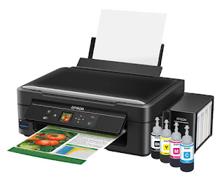
The Epson Ecotank Printer Range.

Well, it's been almost 6 months since I installed my trusty Epson Ecotank and guess what? It's still printing strong without a single refill.

Okay, maybe I'm still 18 months away from hitting Epson's 2 year promise, but I certainly can't complain so far.


This is the printer that is guaranteed to get all those home-made Christmas cards done without a problem. In fact, it's such a breakthrough in home-printing, Epson's Ecotank technology has just won the prestigious CES Innovation Award.


If you've always wanted a tablet, but you've always hated tablets...

The Samsung Tab S2 is for you.

So light and skinny, it's almost like using a phone, except the functionality is more like a real computer.

Lightning fast, super smooth operation and the battery life puts it among the leaders in its class.

Click here for my full review


Over the last 2 weeks I've put a mid-priced phone in this slot, but you can go even cheaper...

The Vodafone Smart Prime.

Just because this phone is priced low, doesn't mean it won't perform.

Sure you'll have to compromise on sheer power and storage space, but if you keep it simple when you're using your handset, there probably isn't more bang for your buck out there... unless you steal one.

Click here for my full review

And it actually looks quite cool too. Nobody has to know what a cheapskate you were.


At the other end of the scale... 

The Galaxy Note 5.


Meet the best phone I have ever used. Full stop.

I keep trying to find something this thing can't do. I've had it a while now. Haven't found anything yet.

Apart from working so well I suspect there's alien technology inside, the battery life is off the charts - not just for a phone with a screen this size, for any phone.

Click here for my full review


I can now die a happy man having used this phone.


Let's finish up with the wearable that finally got it...

The 
Huawei Watch.

I know; looks exactly like a watch, right?

What a crazy idea.


Easily the most stylish smart watch on the market, although essentially the same Android Wear device as many of its uglier competitors.

Click here for my full review

If looking good matters as much to your geek as being geeky, this is the luxury gift that tells him or her you really love their brain.


Those were this year's most addictive, alluring and downright genius tech treats.

Can't wait to find out what they'll come up with in 2016. Maybe that hover-car will finally be a reality. Hard to wrap though...


Monday, 23 November 2015

glennzb's GADGET GIFT GUIDE (Volume II)


Last week I gave you your first tech-based taste of Christmas, with some pressie suggestions for your favourite geek.

If none of those really stoked your festive fire, or if she/he already has all those toys, try this list. Check it twice if you like...

First up, something that could actually ease the pain of the most stressful time of year...

The 
Backpod.


Yes, I know it just looks like a weird, green blob, but it's a brilliantly designed weird, green blob.
If you know someone who's constantly complaining about back tension caused by hunching over tablets and keyboards, the Backpod may offer some welcome relief for them and you.


I use mine every night before bed. Nothing like a little pre-slumber crackety-crack.


Or how about something you can use in a variety of positions so you can avoid that iHunch altogether?...


The ASUS Transformer Book T300 Chi.


Is it a tablet or is it a laptop?
Yes, it is. In fact, I like to call it a laplet.

A very solid, powerful performer with a unique detachable keyboard design that won't let you down.

Click here for my full review


Meanwhile, in the mid-priced phone market...


There's always the Samsung A3 or A5


These two handsets may be missing a few bells and whistles offered by Samsung's flagship phones, but start using one for a while and you'll be hard-pushed to remember what those extra features were.


Click here for my full review

Great cameras and displays, both very slim and both very sexy phones indeed - especially for the price.


However, if you are happy to pay just a little more... 


The Huawei P8 is genuine class.

Yes, that's right. Even though it's not an Apple or a Samsung, this is the phone that can box with the big boys.

Super slim, but with a solid feel. A high performance camera that sits flush with the rear casing and a raft of built-in settings that are genuinely helpful rather than annoying.

A top-end phone that's actually a bit cheaper than those other show-offs.

Click here for my full review


Lastly, the wearable of the year...


May I present the Samsung Gear S2.


This is quite possibly the coolest thing ever in the history of everything.
If somebody wants to wrap mine up and give it to me again on Christmas Day, I'd be perfectly satisfied.

Super comfortable. Unrivaled functionality. Effortless wireless charging. IP68 dust and water resistance. I'm totally in love.

Click here for my full review

What's more, my new red strap just arrived. What could be more Christmassy than that?

If you can't find something to whet your techie's taste-buds in that lot, he/she's a hard man/woman/robot to please.

All is not lost though; I'll back with my final batch of gadgety gifts next week.


Thursday, 19 November 2015

JUST ABOUT SO VERY NEARLY PERFECT

I'm biased. There's no denying it. I'm a Samsung guy.

I'd like to think I give credit where credit is due, but come on, everybody has a favourite brand.

But now I've admitted how one-eyed I am, it's really important you believe me when I tell you the world's first faultless wearable has finally arrived. (Oh my god, I think I just basically said, "Next Is Now." I've been brainwashed!)


The Samsung Gear S2 is a truly remarkable thing. But first, some history...

Over the past couple of years I've worn more than my fair share of smart watches, and I've copped my fair share of flack for it too. Admittedly most of them looked pretty ridiculous, like something out of an old movie about the future. What's worse, many of them didn't really do much - certainly not enough to justify making your wrist look like such a nerd.

Battery life has also been a constant niggle, as people resent having to charge their wristwear too often. What's more, the various charging accessories involved have usually been cumbersome to use and in some cases, almost impossible to attach.

And yet, I persisted. So did Samsung.

They were relatively early players in the wearable market. 2013's Galaxy Gear was certainly innovative, perhaps too innovative. The camera embedded in the band was not only over the top and unnecessary, it made a device that already looked clunky and oversized seem even more so.

Meanwhile, Android Wear devices started to appear from various manufacturers - appealing because of their universal compatibility with any Android phone, but offering much less functionality than the Samsung-only devices.

Samsung fired back with the Gear 2 (and Gear 2 Neo) - more streamlined than the Gear... but not much. Still square, still nerdy.

Some round-faced Android Wear options surfaced. The Moto 360 was still too big and had that weird flat-tyre thing going on at the bottom of the screen. Then LG's G Watch R almost nailed it. Finally a smart watch that looked just like a watch. What a great idea.

Still just another Android Wear device though, so on the inside, the same as all the others.

Samsung lost the plot again with the Gear S. This was the first watch with its own sim card so it was effectively a phone on your wrist. Unbelievable functionality. Trouble was, it was the size of a phone on your wrist. Maybe the design team was away that day.

2015 and suddenly the smart watch market has really gathered momentum. Apple finally got their act together and gave their acolytes something to wear. Nifty little magnetic charger, nice interface option using the winder, but still big, square and ugly.

Activity trackers are everywhere, ranging hugely in price, quality and functionality.

Wearables have finally gained main-stream acceptance.

More recently, the Huawei Watch has wrapped up the same old Android Wear operating system in some seriously fashionable design options, with a serious price tag to match - but they do look fabulous.

Then, the one I'd been waiting for.

Samsung's design team came back from their holiday and presented us with perfection.

First up, the Gear S2 actually looks like a watch - a very nice watch too. The standard model comes in dark grey or silver, with a grey or white sports band. (Other band colours are also available) While the Classic is slightly smaller with a leather strap you can change out with any similar sized band.

The casing is a very classy stainless steel with a brushed finish and the first thing you'll notice is how streamlined the whole package is - just like any "normal" watch.

The next thing you'll notice is how comfortable the Gear S2 is to wear. Unlike some wearables with heart-rate monitors that poke into your wrist, this watch has a completely smooth glass back that settles snugly against your skin. I found the sports strap soft yet secure.

One of the many unique features separating the Gear S2 from the rest of the pack is the rotating bezel around the edge of the screen. This, combined with the go-back and home buttons on the right-hand side can be used for easy navigation, if you find dealing with a touch screen this small is a bit fiddly. Everybody who's used this watch loves, loves, LOVES the bezel controller. There seems to be something very intuitive about using a circular interface to operate a round device.

Like Samsung's previous watches, the Gear S2 still relies on the Tizen operating system, which has it's pros and cons. I've found apps designed for Tizen are generally more advanced and more interactive than the way Android Wear merely ports existing phone apps across to your wrist. On the downside, the selection of Tizen-based apps available on the Samsung Gear app store is extremely limited, compared to the ever expanding range you'll find for Android Wear devices on the Play store. In saying that, I wouldn't be put off by the lack of selection - you'll find what is there works very well indeed and from previous experience, it won't be too long before app developers come to the party and jump on the Gear S2 train. (I'm talking to you, Endomondo)

Apps already installed on the Gear S2 include a very stable media controller, which you can open with a double-click of the home button. There's also a shortcut to the media controller when you swipe down the home screen. This gives you quick access to brightness and do-not-disturb controls too, as well as battery level and connection displays.

Another great feature smart watch users have been waiting for is the ambient light sensor. Until now, to read your watch outside you had to manually ramp the brightness up, tricky if you're already outside in the sun and can't read your watch! Now, the Gear S2 does that for you. This means I never have to set my brightness level higher than 2 or 3, a real battery saver.

The heart rate monitor is the most reliable I have used on any watch to date. As I mentioned earlier, it works perfectly without protruding an uncomfortable bump into your wrist. In terms of compatibility with fitness apps other than Samsung's limited S Health, at the moment this is restricted to Nike+ Running, which is even MORE limited. I'm sure this will improve over the next few months. (Right, Endomondo? Hint, hint)

But perhaps the greatest new feature the Gear S2 brings to the table is its wireless charger. It just works. The charger is a small stand which holds the watch magnetically. Simple as that. Doesn't matter which way up. You can basically throw the Gear S2 in the general direction of the charger and it'll snap into place. Coolest thing ever. You'll get pretty good battery life too, around 36 hours on a full charge.

There are just 2 things I miss from my trusty old Gear 2 Neo. The Gear S2 has no IR Blaster, so I can't use it to adjust the volume on my telly or change channels on my Sky decoder. And I can't actually take phone calls on it like a secret agent. The Gear S2 doesn't have a speaker, so phone conversations would be pretty one directional. (There is a 3G option available in other regions that does take calls, but at the time of writing, it isn't on sale in New Zealand)

I don't want to finish on those 2 tiny downers though, because the Gear S2 is easily the best smart watch I have encountered. It's comfortable, reliable, has great functionality, good battery life and easily the best-designed charging setup ever.

The really good news is, you can now pair it to almost any phone running Android 4.4 or above. Welcome to the club, guys.

And I can change the strap to a red one. What more could you ask for?

Click here for more information on the Samsung Gear S2

Monday, 16 November 2015

glennzb's GADGET GIFT GUIDE (Vol. I)


If you have a geek in your life and you're currently racking your brain to come up with the perfect Christmas surprise, over the next few weeks I'll be compiling a review of my reviews to make things a little more straightforward for you.

On the other hand, if you ARE a tech-junkie like me, and you'd like to drop a few heavy hints in someone special's inbox, why don't you forward them the URL of this page and get the ball rolling?...

First, something fun...


The Samsung Gear VR

This is so much more than 3D, it's the visual equivalent of surround sound.
Just whack your phone in and blow your mind with an ever expanding selection of virtual experiences.


The latest edition of the Gear VR is compatible with more phones than ever, including the Galaxy Note 5, Galaxy S6 Edge+, S6 and S6 Edge.


Or how about something really useful?...

The ASUS Transformer Book Flip TP200
This bendy wee beastie gives you genuine flexibility on a budget.

The easy touch of the keyboard, the rounded corners on the casing and the dependability of its long battery life, all add up to a solid, reasonably priced alternative to being stuck with either a tablet or a laptop.

Click here for my full review


If it's a mid-priced phone you're looking for...

There's always the Huawei P8 Lite
If you need a decent phone rather than a spaceship in a tiny box, this might be the one.

An elegant-looking handset with plenty of functionality for the money. It's an option well worth considering if you can't justify the spend on the latest high-end features you might never use.

Click here for my full review


Although, if you are looking for a rocket ship, it's hard to go past... 

The Galaxy S6 Edge+
Stupidly long name and fairly pricey, but something this beautiful is worth every syllable... and every cent.

In fact, this phone was too good for me. I wasn't stylish enough to hang around with the Edge+.

(What's really annoying is it works amazingly too)

Click here for my full review


Finally, how about something to wear?...

Introducing the Fitbit Surge
Just in time for Christmas, Fitbit's flagship device is now available in blue and tangerine, not just black.

The Surge is exactly what it claims to be; a fitness super watch. A self-sufficient, stand alone device that will track your workout completely independently of your phone or computer.

Click here for my full review

While the Surge is not expensive compared to other smart watches, the slightly less functional Fitbit Charge and Charge HR models are even more economical, and also come in a new range of colours.


So that's something to get Santa's little helpers thinking anyway. But if you're still waiting for just the perfect pressie idea, I'll be back with more gadgety gift suggestions next week.

Monday, 9 November 2015

CUTE. STAMINA. BUT WHERE'S THE BEEF?


So the battle continues between tablet, laptop and 2-in-1.

Portability versus computing power.

Battery life versus functionality.

Is the Asus Transformer Book Flip TP200 the compromise for you?


One look at this 2-in-1 from Asus and you'll be impressed by it's compact design. If it's screen size you're after, this isn't the machine for you but then the TP200 is all about staying mobile. Although the device itself is a little wee thing, the physical keyboard is very user friendly. The keys are responsive and I didn't feel cramped at all.

The virtual keyboard wasn't quite as fun to use. When the TP200 is flipped into tablet mode, you get to choose if the on-screen keyboard displays automatically. Unfortunately, while the phone-style word prediction at the top of the keyboard is useful enough, it means about 50% of the screen is obscured. (Unless you swing everything around into portrait mode, but then the keys really are too narrow to use easily)

So laptop typing; tick. Tablet typing... not so much.

And I think it's either typing or watching you'll be using the TP200 for. If you're currently spending your evenings squinting at your social media streams on your smart phone, this is the device that'll give your optometrist a break.

As a laptop, the TP200 is small, light, quiet and cool to run - the ultimate screen stacker while watching telly out of the corner of your eye.

The other big feature of a 2-in-1 like this is tent mode. This is where you sit device in an "A" shape, on its edges to watch video or view pictures. I'm a big fan of tent mode because it provides real stability for your device without requiring much flat surface. (Great for cooking along with Youtube recipes, for example)

At the same time, this is no gaming appliance - there's just not enough grunt under the hood to drive any whizzy graphics. In fact, I found the TP200 quite laggy when performing too many complicated operations (downloading, streaming, browsing) all at once. A lot of this frustration can be avoided by putting the device to sleep rather than shutting it down completely, as it's during start-up the TP200 really struggles to get all its services up and running.

Sleeping instead of powering off is a totally viable option by the way, because the battery life department is where the TP200 totally kills it. This is the first Windows tablet/laptop I have used that comes close to matching the battery ability of an iPad. In fact, every time I use it I can't believe how much charge is left. As I write this, I'm getting warning messages my battery level is very low (7 %) and yet the indicator also tells me I still have an hour's use left! Come on, even the most devout Apple disciple would have to be impressed by that.

There's a surprising versatility to how you can interface with the TP200 as well; a heap of ports to choose from - both USB 2.0 and 3.0, Micro HDMI, Micro SD slot and the new Type-c socket that doesn't care which way up your plug is. I love this because I'm forever frustrated by the limited connectivity offered by most modern devices. Unfortunately, once again it's a combined headphone/mic socket but I fear this is the way of the future and my dislike of this combination is something I'll just have to get over.

The more I use this device, the more I enjoy it - there's a comfortable-old-pair-of-slippers feel to it. Whether that's due to the easy touch of the keyboard, the rounded corners on the casing or just the dependability of its long battery life, it all adds up to a solid, reasonably priced alternative to being stuck with either a tablet or a laptop.

The lack of processing power is frustrating at times, but for casual domestic use, with a battery you can rely on, the ASUS Transformer Book Flip TP200 is a safe option.

Click here for more information on the ASUS Transformer Book Flip TP200

Monday, 2 November 2015

STYLE OVER SUBSTANCE. YES PLEASE!

This year I've become a bit confused about what I'm looking for in a smart watch.

The smarter the better I suppose... but at what cost?

And by cost, I'm not just talking price, I'm talking cosmetic cost too; till recently most smart watches have sacrificed form for function.

Well not anymore...


Meet the Huawei Watch, perhaps the first smart watch to really blur the line between tech gadget and fashion accessory.

There are two contrasting stories to tell about the Huawei Watch - we'll get to the inside story soon enough, but let's go with look and feel first.

At last we have something most people would consider to be a good-looking watch in its own right. There's quite a selection of casing/band combinations, ranging from the classic silver stainless steel casing with black leather band, right up to the rose gold stainless steel casing with matching gold stainless steel link strap. Whichever option you choose, there's a real feeling of quality and traditional style to this watch and it starts with the packaging.

The Huawei Watch is sealed within a sturdy box within a box, all mounted on a padded display stand that would be sure to knock the socks off anybody lucky enough to receive one as a gift. They say first impressions last and with this device you are left in no doubt you're dealing with quality workmanship... and that's before you even pick it up.

When you do, there's a solidity and heft to the Huawei Watch that really sets it apart from its more "plasticky" competitors. The screen is sapphire crystal, the casing cold-forged stainless steel. In short, this is a real watch.

If I had to criticise the style of this watch, I might highlight how thick it is (ie: how high it sits on top of your wrist) but it's not at all over-the-top in comparison with other large-style time pieces.

No. I loved the look of this thing, from the moment I picked up its black on black box to the second I had it on my wrist.

Pairing it with my phone posed no particular challenges; there was the usual firmware update but that didn't take long at all, then I was able to fire this baby up.

Like many other smart watches on the market, the Huawei Watch runs the Android Wear OS, which has its advantages, but a fair few drawbacks too. Because of the number of manufacturers using Android Wear, when it comes to options like face styles, the list to choose from is almost limitless. Huawei has installed quite a nice selection to begin with, but there are several apps around that let you customise the face to whatever colour and style you prefer; analogue, digital the choice is yours. The display definition is very sharp and clear, so if you choose the right face the casual observer would never suspect what lies beneath.

Huawei has built in the option to leave your screen on all the time, or you can save battery by activating it with a screen tap or a push of the home button situated at the 2 o'clock position on the side.

As good as the display is, I struggled to read it in bright sunlight conditions, especially with sunglasses on which was annoying when running.

Which brings me to the limitations of Android Wear. Unlike Samsung's Tizen-based watches, or purpose-built fitness trackers like the Fitbit Surge, Android Wear doesn't really seem to install apps on the watch itself. Instead, the watch relies more on Android Wear functionality being built into the app on the phone it's paired with.

This means notifications are sent to the watch and controls are sent back to the phone, sort of like a smart remote. This arrangement seems to work very well for things like the media controller (skipping tracks, pausing video, turning volume up and down etc) but I've found it's less effective when it comes to activating fitness apps like Endomondo. Sometimes it would start, sometimes not. Sometimes my durations and progress would display on the watch in real time. Sometimes I was left with the impression the app had stopped, even though it hadn't. Of course, all this could be a programming issue at Endomondo's end, which may be resolved down the track. (See what I did there? "Track?"... Never mind)

There's a step counter built in and being an Android Wear device, you can easily sync with your Google Fit account if you have one.

What was in no doubt was the inconsistent performance of the heart rate monitor. Good on Huawei for including one at all, I'm constantly amazed when other brands don't. But the readings I got were random to say the least. I'd love to think I can make it through a whole Attack class without my pulse getting above 90BPM, but I think we all know that ain't happening.

In saying that, I really don't think many people would by this watch as a fitness device. It's a fashion accessory and despite its IP67 water/dust-proof rating, its not a watch you really want to sweat all over.

Another frustrating thing about Android Wear is while you can read texts and notifications when they come in, you can only read emails if they arrive one at a time. Once they start stacking up, you're forced to get your phone out to go back through them. Again, maybe Android will figure this out eventually, but for now, it's a real barrier to productivity.

Let's talk battery life. In my experience, wearables like this usually last about a day on a single charge. Critics are always going on about how this is the problem with smart watches but I disagree. Most people take their watch off at night anyway and the Huawei Watch's magnetic charging cradle is super easy to attach and detach. There's also an easily accessible Theatre Mode which turns off the screen and notifications, without affecting any alarms you have set. I found this useful for bedside table use as well.

As I review this review, I feel like most of my complaints have to do with the Android Wear operating system, not the watch itself. So given so many of the smart watches on the market run the same OS, you may as well buy the one that looks the best.

By the way, Apple disciples, I'm talking to you too. Whatever you've been brainwashed into thinking, the Apple Watch is still big, square, awkward and geeky. The good news is, the Huawei Watch will work with your iPhone as well.

It's not cheap, but nothing truly fashionable ever is, is it?

Click here for more information on the Huawei Watch

Thursday, 22 October 2015

MY THIRD BIT OF FITNESS

If there's one thing I've learned about the Fitbit products I've reviewed so far, it's they do what they promise.

The difference between Fitbits and other fitness accessories is that they're not accessories, they're devices in their own right.

The smart watches I've worn may be smart, but they're really only extensions of the phone they're paired with, like a remote control on your wrist.

Fitbits work the other way round. They're self centred that way...


The Fitbit Surge ain't no oil painting. It's big, it's square and it comes in black, black or black. (Although 2 new colours are just around the corner) At the risk of reinforcing sexual stereotypes, I don't think this is one for the ladies... unless the lady in question likes her wrist-wear... how do I put this?... industrial.

So if the Surge isn't going to win any style awards, it better damn-well do what it says it does.

It does.

The Surge will track your run, precisely and clearly. The GPS marks your route, your heart rate is monitored the whole time and you can set your run cues to update you of your split times. It will do this completely independently of your phone, syncing the information back to your Fitbit account once you're within range of your device or a PC equipped with the supplied bluetooth dongle.

There are plenty of other functions built into the Surge, but it's obvious to me tracking your run is the primary reason for its existence and it is unquestionably the best device I have used for this purpose.

I'm no cyclist, but I'm given to understand the way the Surge now syncs with acclaimed biking app, Strava is a real breakthrough too. The significant feature for me in either of these cases is the constant heart-rate monitoring on display - easy to read and consistent.

While the band is not particularly good looking, it's certainly comfortable. In fact, despite it's bulk, I still found the Surge's soft rubber strap wrist-friendly enough to wear to bed for sleep-tracking purposes, another feature it carries out flawlessly.

The screen on the Surge is... unusual. This is the age of high res HD, brighter colours, total blacks. I don't think anyone told the guys at Fitbit. When it's switched off, the screen on the Surge is that same dull grey colour you'll remember from your cool new digital watch in 1983. Things aren't quite so drab once you turn the Surge on; the default watch face is a kind of negative effect, black background with light characters (or hands should you chose analogue from the limited selection of faces).

But yes, everything is black and white, which is fine with me because on the bright side (excuse the pun) I found the display super easy to read in all light conditions. There is a backlight for nighttime use and when I was out running in full sunshine, I could see everything perfectly at a very quick glance.

The screen isn't completely rudimentary, you do have the option of touching it to make it work. This seems a bit superfluous to me though, as there are 3 physical buttons on the Surge's casing that carry out all the same functions.

You're not restricted to tracking your run, you can choose from a selection of preset workouts ranging from bootcamp to yoga, all of which will sync automatically back to your Fitbit account. As I mentioned earlier, cyclists can bring Strava into the equation as well. Whatever form your workout takes, the heart-rate monitor will provide clear feedback about how long you're spending in your target cardio zones.

There's a simple timer/stopwatch option which is useful for interval training, with the Surge vibrating to let you know when the timer hits zero.

You can also set a selection of "silent alarms" which wake you with a pretty violent wrist-quake you definitely won't sleep through.

All this stuff works, and works well because there's nothing fancy about it.

However, once the Surge tries to get tricky, a little inconsistency creeps in.

First, setting this thing up was a total pain in the neck. It wouldn't let me do anything until the Fitbit app on my phone had updated the firmware. No biggie, except it kept failing to update the firmware! After many attempts involving reboots of both Surge and phone, switching from wifi to mobile data and generally hitting my head against a brick wall, I finally realised I must be getting some kind of interference from other bluetooth devices in the vicinity. Once I powered off my smart watch and stashed away the Fitbit Charge HR I had been using previously the update finally began.

I was warned it could take up to 10 minutes to complete the update. Almost an hour later, it was done. Whether this is typical, or just a one-off that happened to me, I'm not sure - but what I am sure of is the Surge is a device that does not play well with other bluetooth connections.

There is a music control option which works brilliantly, as long as your phone isn't connected to any other device. The Surge was able to operate a wide selection of apps, controlling music as well as podcasts. Unfortunately, I listen to the majority of my music and podcasts one of 2 ways; either via bluetooth in the car or via bluetooth earbuds on my run. The Surge's music controller would simply refuse to connect in either of those situations making it a lot less useful than I'd hoped.

Better news regarding call and text notifications. The Surge can be set up to vibrate when you get a call or text and you can even display the text to decide if it's worth getting your phone out to reply. This function worked well, although sometimes there was a slight delay as the Surge isn't in nonstop communication with your phone.

Please note, I have only tried the Surge with a Samsung Galaxy Note 5 and it's entirely possible the updating and bluetooth issues I experienced are not as prevalent with other devices.

These small bugs aside, I did indeed find the Surge to be what it claims to be; a fitness super watch. As I said at the start, it is a self-sufficient, stand alone device that will track your workout completely independently of your phone or computer.

By the way, the battery life is nuts - in a good way. I got 5 days out of it without any trouble. That's the pay-off for a screen from 1983.

Click here for more information on the Fitbit Surge

Wednesday, 30 September 2015

SIMPLE ANSWER TO MODERN HUNCH

Today I'm reviewing a device without a screen. It doesn't make any noise. It doesn't even have an on-switch. Or a battery.

In fact, this device has been specifically designed to undo the damage being done to my body by all my other devices.

You could say, it's an anti-device...


The Backpod was designed by a New Zealand physiotherapist to address the issue of back pain and tension between the shoulder blades, commonly caused by prolonged use of computer keyboards, tablets and other devices.

Apparently the more time we spend hunched over these things, the more likely our spine is to seize itself into that position and that's where the pain and posture problems start.

As someone who's suffered from consistent and prolonged back pain for as long as I can remember, I figured this thing was definitely worth a crack. (That's a totally brilliant pun, by the way. Although it may not become obvious until a little bit later)

Not only do I spend hours a day curled over a keyboard, I also subject my torso to the regular torture imposed by a fairly large sound desk. That's a lot of repetitive reaching in rather un-ergonomic directions and by the end of the week, I usually have a lot more in common with Quasimodo than just an annoying ringing in my ears.

This condition is colloquially known as "i-Hunch," something I'm sure many of you would find all too familiar.

That's where the Backpod comes in.

But first I had to figure out how to turn it on.

Or at least where the batteries go.

As it turns out... that's not the idea here.

I eventually discovered, the Backpod is just a lump for lying on.

The trick is, it's exactly the right kind of lump.

As anyone who puts up with a bad back will tell you, there's nothing more satisfying than the crackity-crack-crack of your spine being manipulated by a trained professional. It's so annoying most of us don't have a trained professional on hand 24 hours a day.

Amazingly, by lying on the Backpod and putting my hands behind my head as per the enclosed instructions, I immediately found myself in crackity-crack-crack heaven. By working the Backpod up and down your spine for a few minutes every day, the theory is you can rehabilitate the frozen bits between your shoulder blades to their former flexible selves.

I've been using the Backpod for a couple of weeks now, and while I'm not yet about to tour my contortionist act with Cirque du Soleil, I'm definitely feeling more freed up. The Backpod's instruction booklet depicts a host other helpful exercises and massage techniques which are all demonstrated on Backpod's YouTube channel.

The best thing about it though, is the instant relief I feel each time I use it. This isn't any kind of medical testimonial, it's just my personal experience after a hard Saturday's waterblasting. To be able to go from seized up old man, to happy-go-lucky slightly-less-old man in minutes is a godsend and I owe it all to my trusty green lump.

Pity they don't come in red though. Green really isn't my colour.

Click here for more information on the Backpod

Wednesday, 23 September 2015

SPANNING THE LAPTOP-TABLET DIVIDE

It's getting hard to tell the difference between a laptop and a tablet these days.

On the Apple side of the equation, the latest iPad is their biggest yet and seems to have almost all the functionality of a MacBook without the keyboard.

Meanwhile, Microsoft keeps banging out its Surfaces of course. Physically this concept has always been tempting; from the outset, a highly portable Windows tablet with a purpose-built keyboard seems like a neat idea. Unfortunately the first few generations were hopelessly under-powered and offered such limited performance I'm sure they would have frustrated some users right away from the brand for good.

Now there a several "2-in-1" devices on the market, although often the design involves folding the keyboard away underneath the screen to create a pseudo-tablet experience - practical but perhaps not an ideal solution in terms of cosmetics or comfort of use.

The Transformer Book T300 Chi from ASUS is different again...


To look at, the T300 Chi is a Windows tablet with a detachable keyboard. But it isn't. It's a fully functioning LAPTOP with a detachable keyboard. ASUS have packed plenty of Intel's latest processing power into the tablet side of the equation and I'm convinced this device is more than capable of fulfilling most daily computing requirements.

There's an adjective I'll probably use several times in this review; "solid." With the screen and keyboard magnetically clipped together, there's a definite solid feel to the whole set-up. The keyboard is robust and responsive, with a good number of functions, although I found it a bit of a pain having to use the function key to access the "home" and "end" operations.

Close it all up and again there's a solid, safely-tucked-away vibe going on. The screen feels protected and while at 720 grams (tablet only) it's certainly light enough, there's a heft there that inspires confidence.

It took me a few goes to get the hang of detaching and reattaching the keyboard, but only because it was less complicated than I expected. There are two very strong magnetic hinges which make it difficult to do anything OTHER than line them up in the right place.

As a tablet, you are of course restricted to an on-screen keyboard, lot more limited than the one you've just removed. I'm not into on-screen keyboards so I'm not sure how the ASUS one stacks up. I'm sure it's fine, even if it does conceal half of what you're looking at - which is a shame because the T300 Chi's screen resolution is off the hook.

Wind it all the way up to 2560 by 1440 and you'll swear you can see pixels on the pixels. Handy tip for newcomers to this level of definition; (like this tired, blind old geezer was) go straight to the display preferences and opt to "make text and other items" as large as possible. Otherwise the text in your task bar, window titles and notification bubbles will be so small, you'll need a microscope to to read it. Really clear... but tiny.

There is no standard USB port to plug other accessories into, although there is a Micro USB so I assume an adapter would get around that. Unlike most other tablets, you get an SD card reader and a Micro HDMI slot too. Sadly, the mic and headphone ports have been combined into one which seems to be the trend these days - annoying when you want to use separate audio devices. This isn't a phone, there's plenty of space for 1 extra jack, surely.

I'm very confused about battery life. The ASUS website claims the T300 Chi will last 8hrs on a charge. So I charged it, which doesn't take as long as some comparable devices I have used. However, when I hovered the cursor over the battery indicator and I was told there was just 3hrs 40mins remaining. Disappointing, but I've come to expect underwhelming power stamina from such devices. Weirdly, about 2 hours later, the battery indicator told me I still had more than 3 hours left. So I don't know whether this thing will stay on all day or not.

Perhaps the confusion arises due to being connected to its keyboard via bluetooth. Depending on how constant the use is, bluetooth can be quite power-hungry. In saying that, every time I checked the level on the keyboard itself, I was always pleasantly surprised to discover it had drained hardly at all. I imagine you could go several days before having to top up the keyboard side of the ledger, which is probably just as well, because it's a bit fiddly. For some reason the ports to connect the screen to the keyboard for charging are on opposite sides, meaning an unnecessarily long cable to join the two. In practical terms, it doesn't make a great deal of difference but it seems strangely clumsy and inelegant.

I wish I could get a definitive read on the T300 Chi's battery life because as I've mentioned before, if a device like this really wants to compete with the likes of iPad and Microsoft Surface, it absolutely must last out the day.

That being said, I found this machine very usable. The fanless operation of its swanky Intel processor made for a cool, quiet experience and there was nothing I wanted it to do it didn't want to. Solid, solid, solid.

The Transformer Book T300 Chi is neither a laptop or a tablet... it does both things so well it may be a laplet. (Please tell me I just invented that)


Click here for more information on the ASUS Transformer Book T300 Chi

Monday, 17 August 2015

BIGGEST PHONE YET

I've been reviewing phones and other devices for a while now. Size-wise, the trend is usually bigger. Recently, I tried the biggest smartphone I've come across to date...


And I bet you didn't even know BMW makes smart phones! They call this one the i3 and yes, I realise it LOOKS like a car but it's really just another device. Just as well, because I don't know anything about cars.

Like many new BMW's, the i3 comes complete with its own sim card, so the car itself is permanently connected to the Vodafone network. This doesn't necessarily mean you'll be browsing the net from your steering wheel... But only because BMW's browser software is terrible.

That's about the only thing wrong with the i3 though. This was one device I desperately didn't want to return and not just because I could drive it to work and back.

The main advantage of the 3G connectivity is you can stay in contact with the car wherever you're using the BMW iRemote app on your phone. This app will tell you the charge status of the i3's battery, whether the doors are locked and you can turn on the air conditioning while you're on your way back to the car so it's ready to go as soon as you hop in.

If you want to be really silly, you can surprise passersby by turning the headlights on and honking the horn from your phone too... Not that I'd ever do anything like that. (Well maybe one time, just to try it)

BMW's ConnectedDrive concept means the service department can keep an eye on your vehicle too, notifying you when it's time for any maintenance instead of the other way around. There's even a 24/7 concierge service to help you with all those essential motoring questions like, "Will I need my umbrella when I get to the game?" or, "Where's the nearest tapas bar?"

Admittedly I only called the concierge once. By mistake. I'm not flash enough to require service at that level. Pretty cool though.

Like I say, I'm no automotive guru, but there are a few other gadgets worth pointing out.

As you may have realised by now, the i3 is electric powered with a backup petrol motor BMW calls a "Range Extender." I can't tell you much about the range Extender because I never managed to run the battery down, even though I live more than 30kms from work. The electric drive was quiet, smooth and surprisingly peppy, although admittedly I have been told I drive like a Nana. Repeatedly. (No offense, Nanas)

With an electric range of about 125kms on a full charge, it's easy to worry you're going to run out of juice somewhere inconvenient. Apparently this paranoia is known as "range anxiety." But it turns out any range anxiety I was suffering from was completely unfounded; like other smart devices, I just got into the habit of plugging it in whenever I wasn't using it. After all, it's not like I was trying to get to Queenstown for a skiing weekend; my longest trip was driving Monster Number 2 to her soccer game in Ellerslie. I got there and back no worries, thanks also to a very user friendly GPS shown on one of the i3's two large flat screen displays.

When I say large flat screens, I don't mean 52 inch plasmas, but they're definitely big enough and clear enough in all conditions, and pretty customisable too.

The cruise control also really blew me away. You set your desired speed just like any other car, but utilising the front collision detector, the i3 automatically maintains a safe following distance. This means the car will slow you down if someone changes into your lane in front of you, then speed you up again when the way is clear. I actually drove from Silverdale to Ellerslie (approximately 40kms) without setting foot on either the accelerator or the brake. That's about half a step away from driverless driving - all I had to do was steer.

Of course, you don't even have to steer when it comes to parallel parking now; like a lot of new cars the i3 will do this for you. Not that I can't do my own parallel parks... I mean, I'm a grown man. What idiot can't park his own car after 25 years driving experience? Right? Right?...

Anyway, if the worst happens and you somehow manage to crash the i3, the car will call the emergency services for you, letting them know where you are and that you've done something stupid.

All in all, this car is a nerd-mobile of pocket protector proportions and it probably looks it. But hey, nerds are hip these days, right? It certainly turned heads wherever I went and I received nothing but compliments from the passengers queuing up to experience a quiet ride. The really cool thing about the i3 is it's good fun; if you're into gadgets like me, you may as well drive something that's jam packed with them.

Oh... And yes, there is a dock for your phone.

Click here for more on the BMW i3